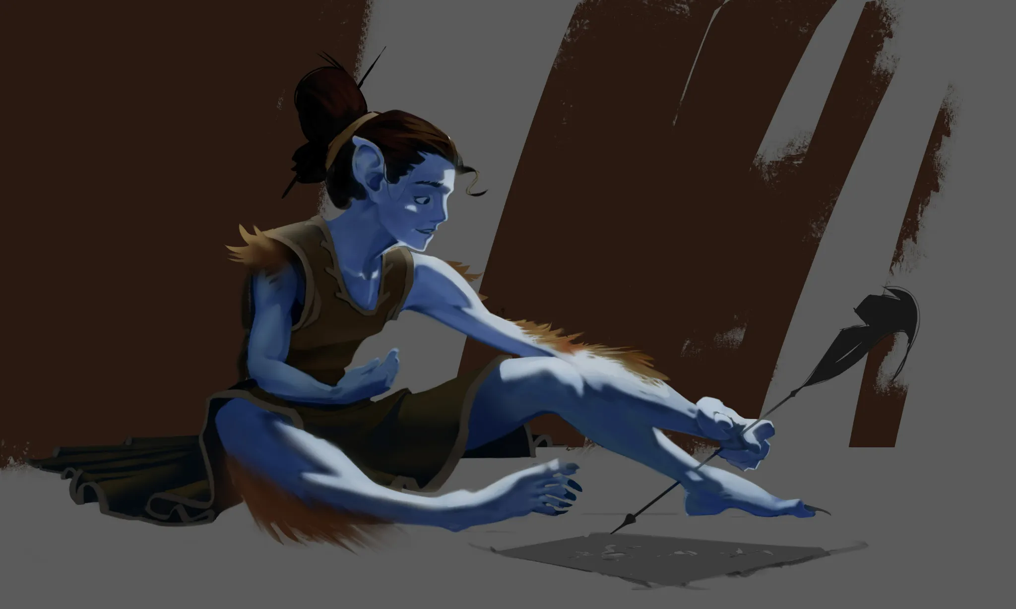
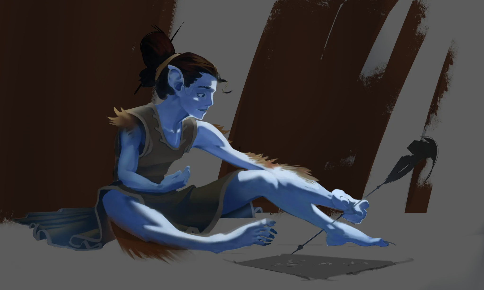
(part 2 of 2) your post mentioned the relationship of the clothes’ and the feather’s values relative to the rest of the piece. one way to help heighten the contrast between these elements and their environment would be to lighten the clothes and feathers while darkening the background. to combat the similarity in values, i used 2 additional layers. the first is a layer set to the multiply blend mode. on this layer, i used an airbrush to darken the brown parts of the background using the character’s skin color; and rather than simply overwriting the hue from brown to blue, the multiply effect simply darkens the color without completely changing it (there is a somewhat bluer tint to the brown now, but the brown is not completely gone; this changes things more subtly, especially because the airbrush is naturally a more transparent brush anyway, helping the character’s blue vibe to be reflected more in the background as well, which hopefully adds even more cohesion to the piece). for the second layer, i set it to the add blend mode and used a selection tool so that it would only color the clothes, hair, feather, and skin. on this layer, i again used the airbrush; but since it’s on an add layer instead of a multiply layer, the airbrushed blue brightened the selected elements rather than darkening them. overall, the goal was to help differentiate the foreground from the background while also helping push the cohesion in the illustration even further via use of the same color (the character’s skin color) for both the multiply and add effects. like i said in my first post, you have a really cool design here. i hope my suggestions are helpful! ♡
Participez à la discussion
Inscrivez-vous pour donner votre avis sur cette œuvre.