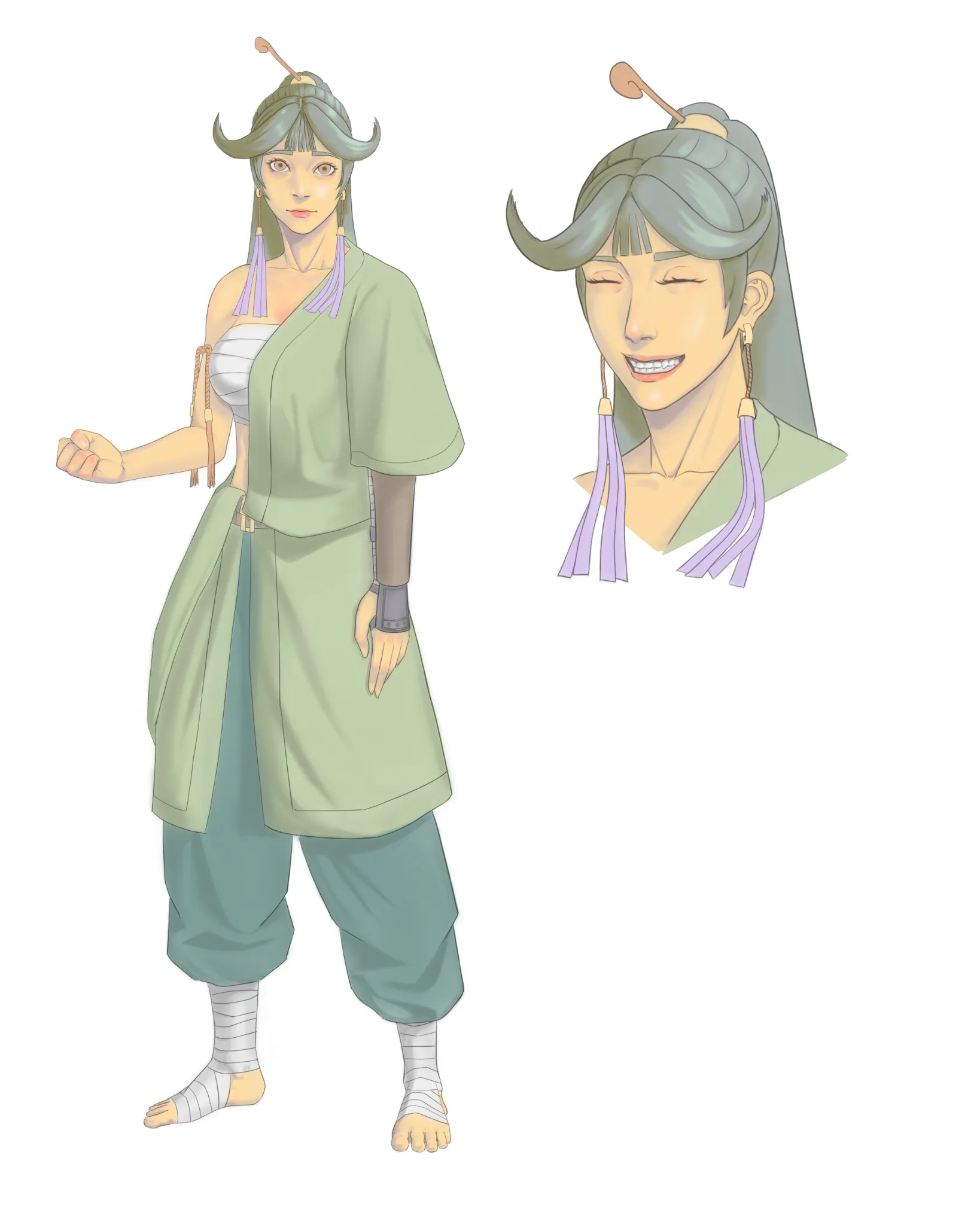
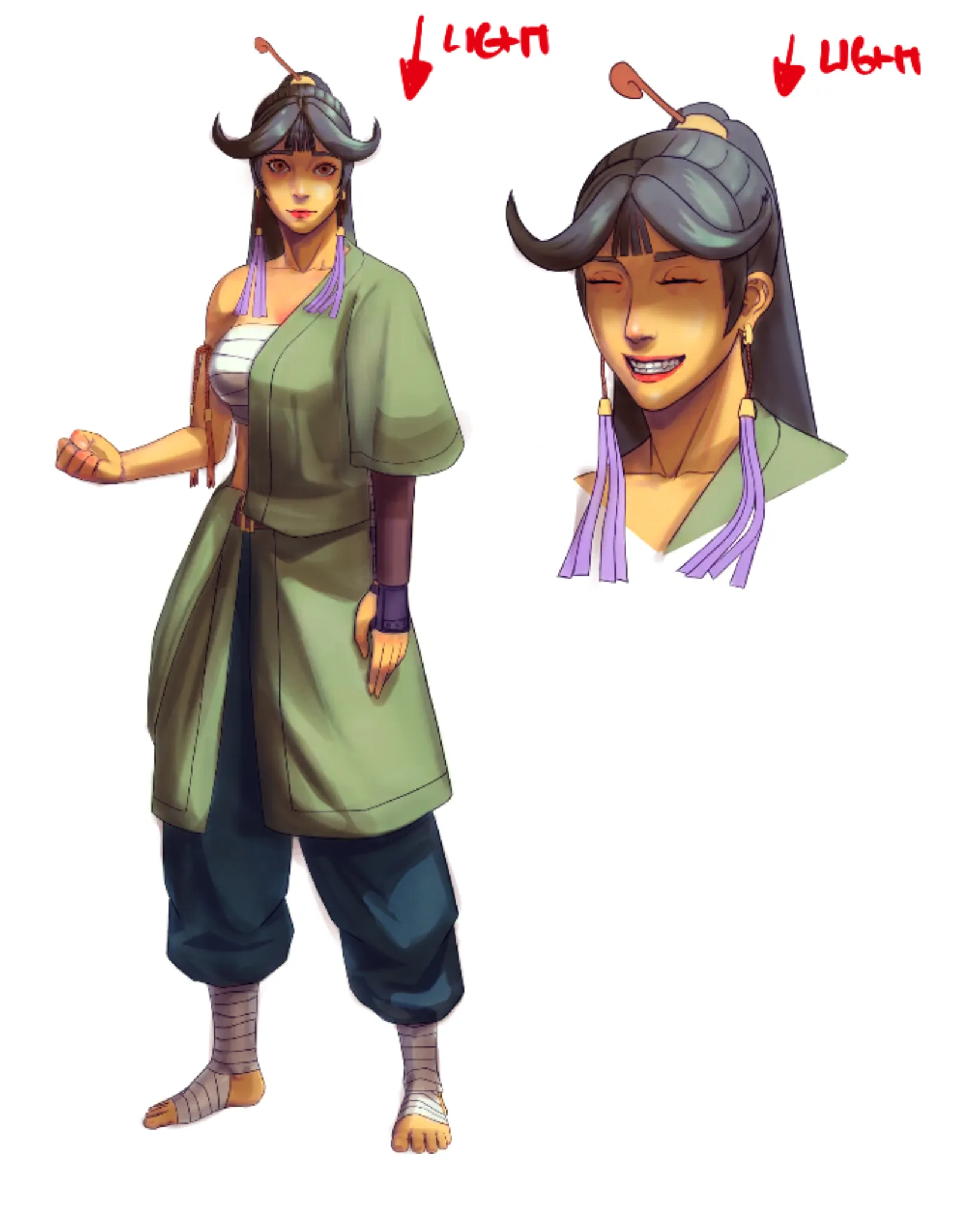
Very cool character and well done with figure! Love her personality and you executed the pose correctly! Bravo! Here will be only minor adjustments in colors and shadows. I used Photoshop's Levels adjustment layer—which is present in practically all digital drawing programs—to increase the light levels before beginning to add shadows. After that, I use color balancing to make colors less "washed up" and more saturated. A good render requires setting up a light source, in this case the light from the top. Use a neutral color for the shadows (usually warm for cool light and cold for warm light), arrange the shadows on several levels, and match the character elements with the primary shadow. During the final touches, you can play around with textures on the light side of the drawing. When putting artwork, use caution and try not to overdo it so that viewers will not hear it. I applied the Multiply layer for shadows and the Overlay layer for light. Both must be balanced (not too dark or too saturated) over flat colors that should not be excessively bright or dark. Additionally, you can experiment with light-colored textures, but take care not to overdo it. Hope it helps!
Participez à la discussion
Inscrivez-vous pour donner votre avis sur cette œuvre.