Tu veux enregistrer ton avis ?
Enregistrez tous vos commentaires au même endroit sur votre compte. Vos commentaires seront privés et non publics.
Peintres
Paintoover Notes
Choisir un vernis
Choisissez un avatar pour voir ses notes et en discuter.
Tu as aussi besoin d'aide avecle rendu ?
Améliore tes valeurs et tes mélanges, 3 min de lecture
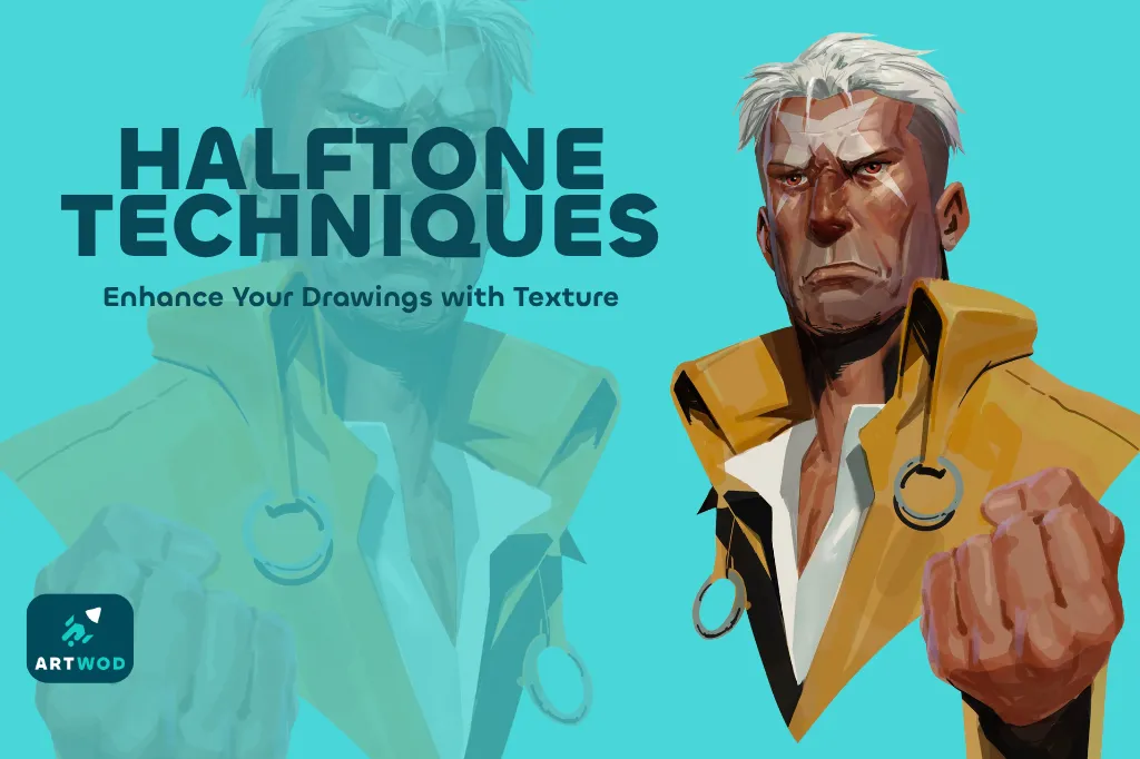
Halftone Techniques: Adding Texture and Depth to Your Artwork
Master halftones by establishing shapes, volumes, and shadows first, then practicing on beans, noses, portraits, and posters to add texture and depth to your artwork.
Rendering
Tu aimerais aider quelqu’un qui attend encore ?
Portraits
Pas encore de réponse
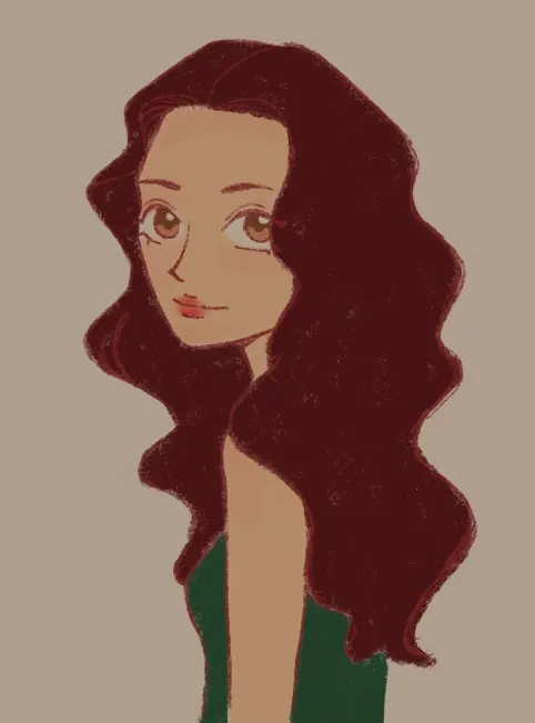
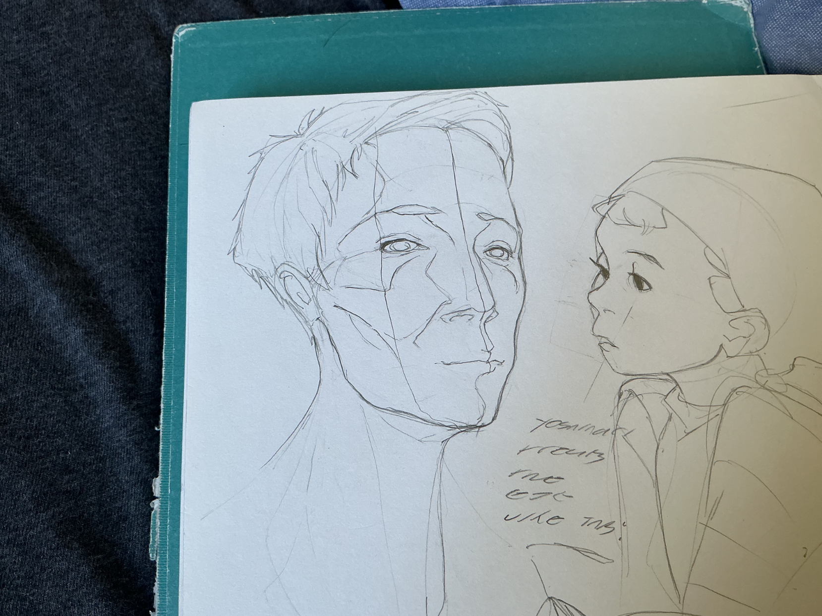
NA-NA-MIN! NA-NA-MIN!
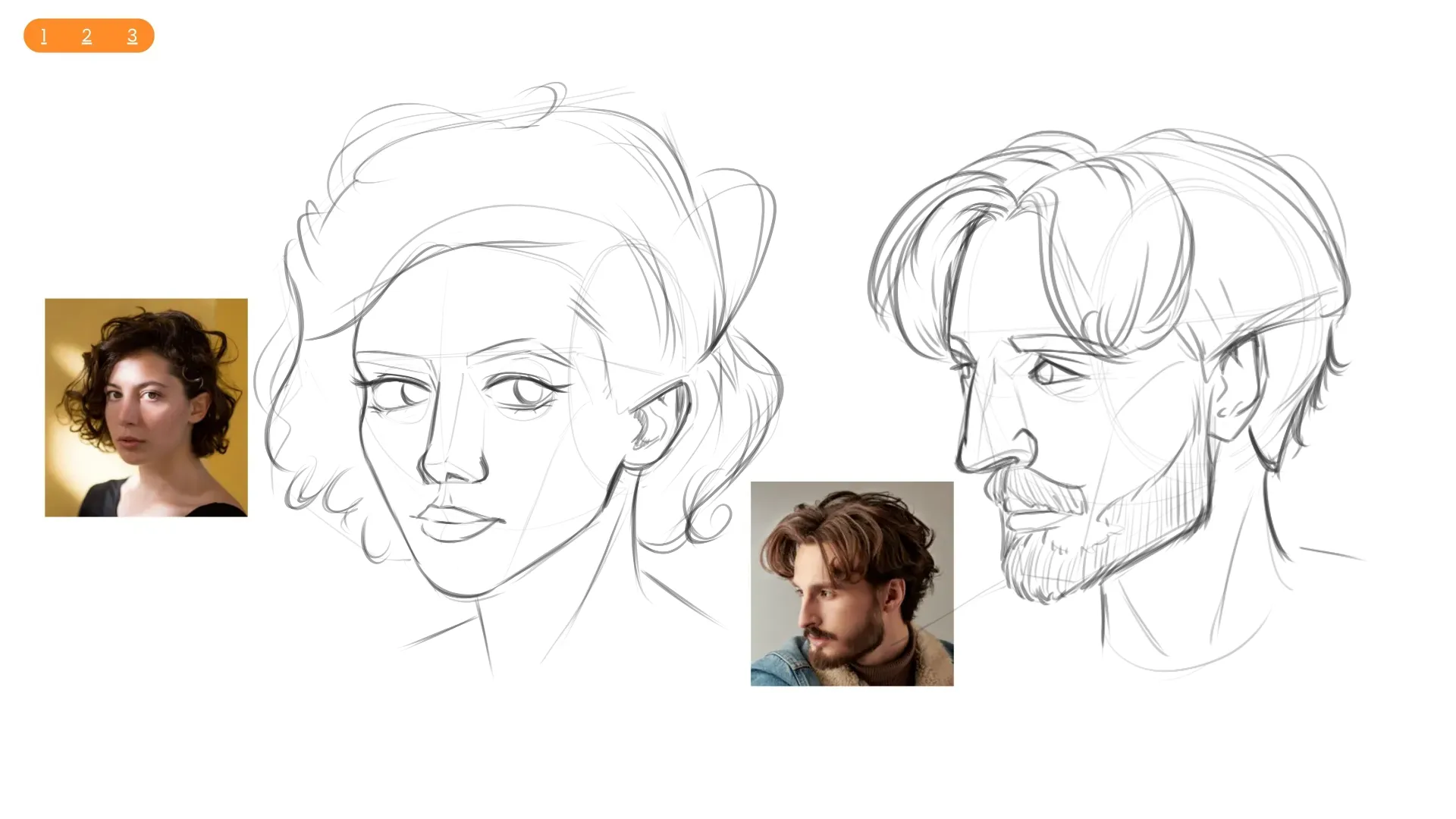
During the weekend, i was studying yoh yoshinari's book of rough sketches (it's one of the most valuable things i can have, it's an absolute masterclass, would definitely recommend!) and in between those studies i drew up this quick portrait of a man from imagination. Now, i know a common mistake artists make when drawing portraits (just got possessed by excal for a second there) is missing that overlap from the nose in a three-quarter view. With that being said, does what i drew even count as a true 3/4 view, and does the overlap depend on how much space each side of the face has? To help answer this, i divided the face and deduced that the portions of each side are roughly equal to each other. Would that mean that this wouldn't qualify as a 3/4 angle, alleviating me from the lack if overlap being completely wrong? If anyone has an answer, please let me know!
Il y a 43 minutes
Vue
Portraits
Pas encore de réponse
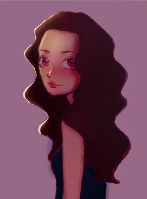
Intro to Portraits, Section 4 (For real this time)
The last submission was section 3!! I finished the intro to portraits roadmap today, and here's the final workout. I always had trouble with construction because I skipped steps in a hurry to get to the details and then the whole drawing fell apart, and I think I finally learned how to approach it calmly and correctly. The biggest problem I can see is the hair, I think I rely too much on lots of lines and it ends up looking unnatural. I'm not very good at likeness, but that wasn't the point of the exercise. Any other feedback about the construction, form and anatomical detail is welcome!
Il y a 3 heures
Vue
Rendering
Pas encore de réponse
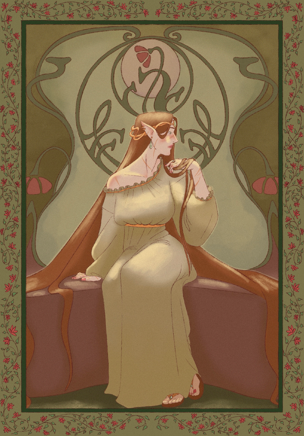
War worn princess
What can I do to improve the rendering? It looks too flat. If you also have something to say about the anatomy I’ll take it too
Il y a 3 heures
Vue
Rendering
Pas encore de réponse
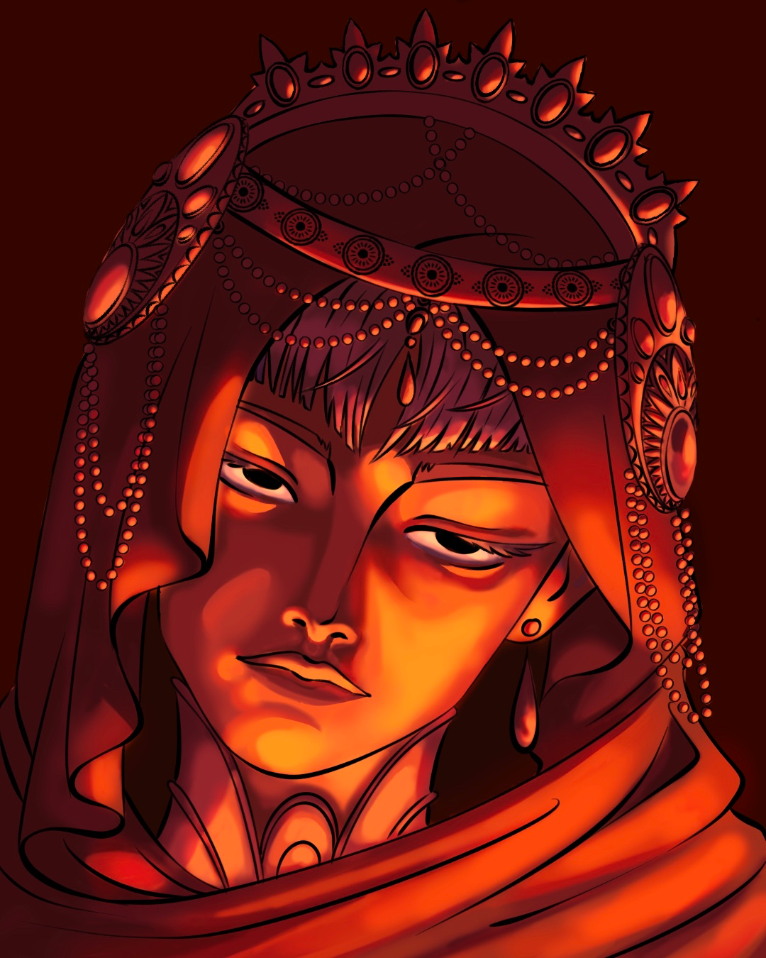
Fire lady
What do you think of this painting of me? I really struggle with light and colour theory so feed backs are always welcome
Il y a 3 heures
Vue
July Before & After Art Challenge
Pas encore de réponse
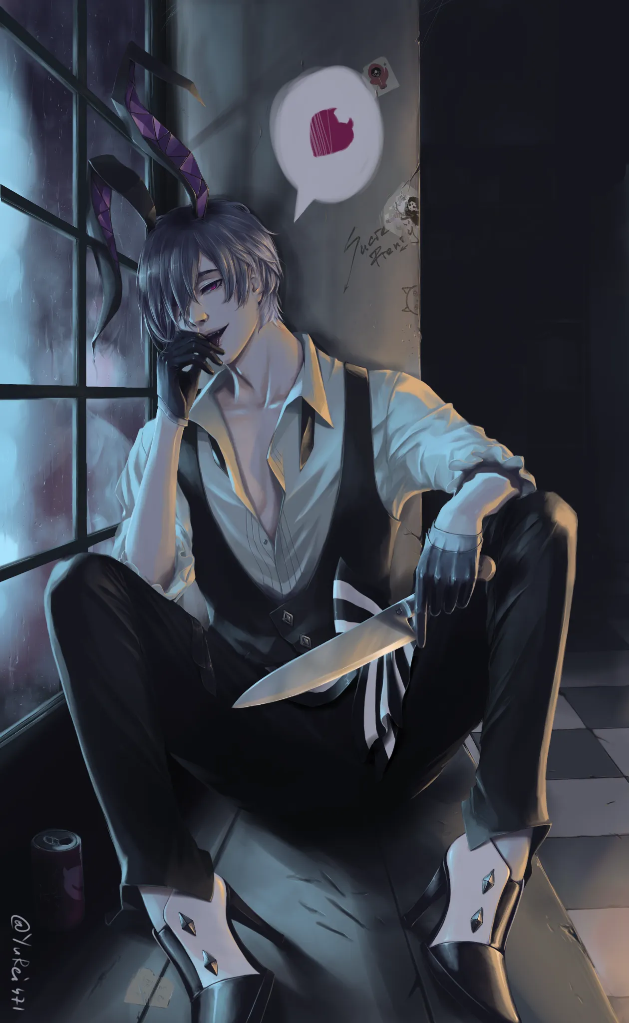
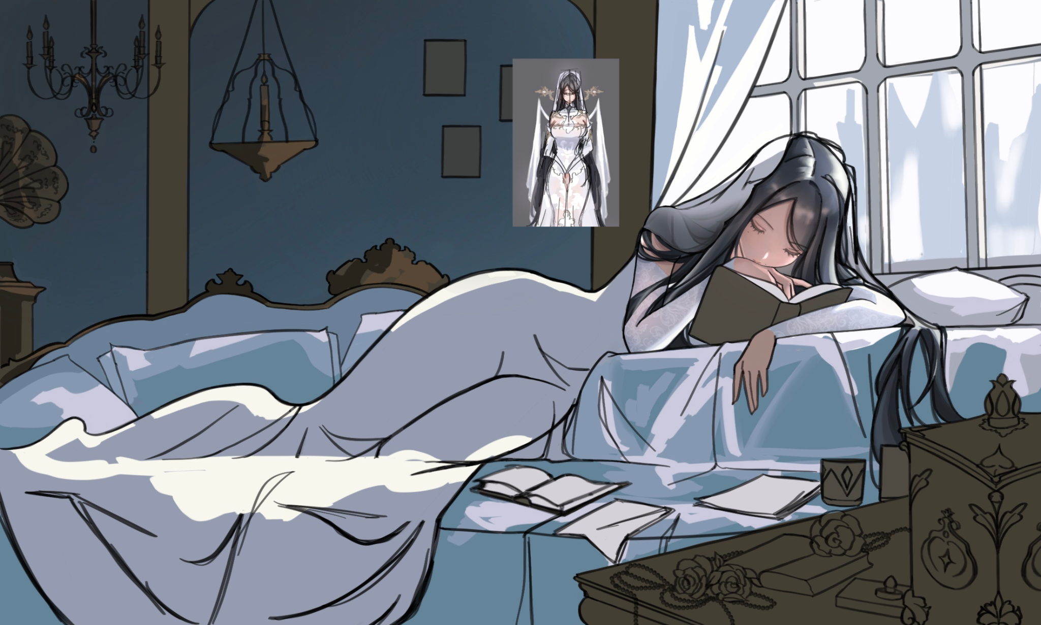
Redraw of an old piece - yandere bunny Belphie
This is a piece from 2023 that I want to redraw for the monthly challenge. While the colors are fairly good, the anatomy and composition could be improved 🫣 Plan is: 1. Find better composition 2. Use current anatomy knowledge to build underlying structure 3. Render the illustration
Il y a 4 heures
Vue
Perspective and Form
Pas encore de réponse
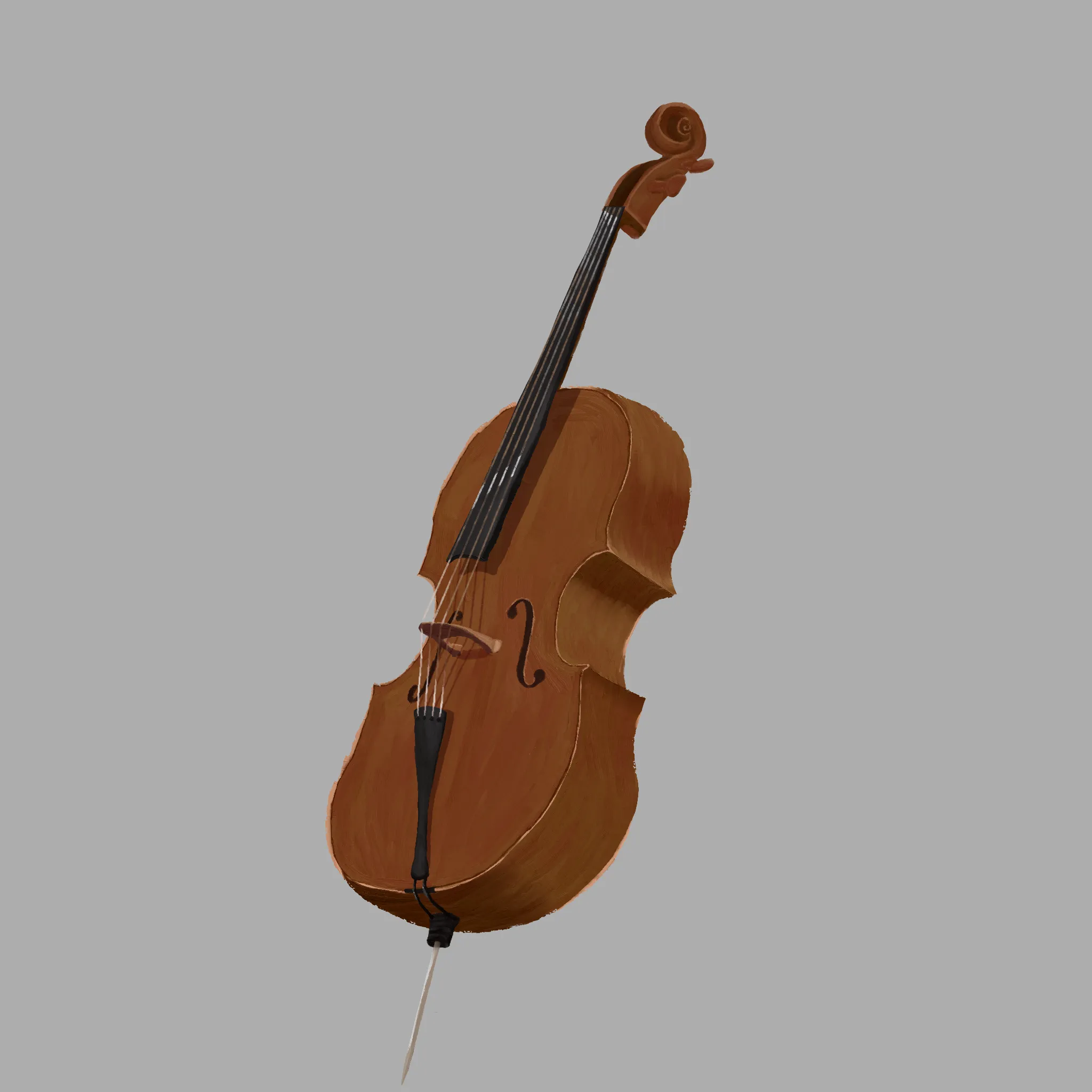
Cello
Hey. I'm having problems with the cello and perspective of it.
Il y a 8 heures
Vue
Portraits
Pas encore de réponse
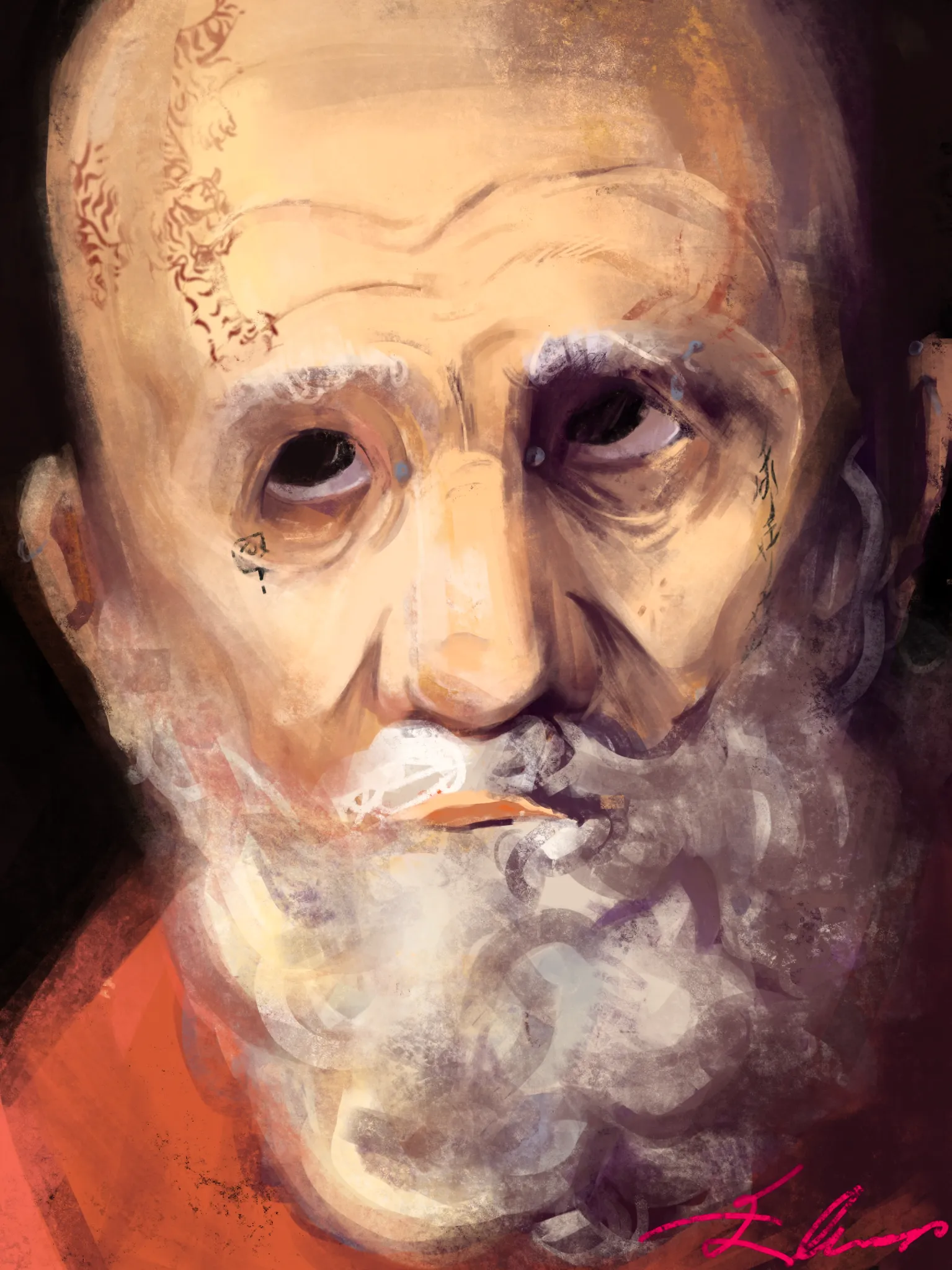
untitled, in progress
i'm struggling to identify the anatomy issues because i dont have a reference. lighting wise, i think maybe i need more constrast and struggling with hair+ wrinkles. Kind of hesitant to work on ears and the piercings on his face
Il y a 8 heures
Vue
Rendering
Pas encore de réponse
Full art rendering struggle
Hi ! I’m new on this app and I came here because I need help on the rendering. It’s my first time doing a full art and I struggle with lighting, contrast and texture :( I’m not satisfied as it’s not what I imagined when drawing the reference of the character in the picture. Thank you for any help or suggestions !
Il y a 8 heures
Vue
Environment
Pas encore de réponse
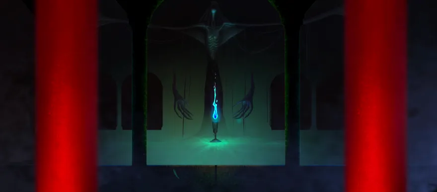
video game final boss
i can't get the composition right in this scene. the lighting is completely off, but i don't really understand why and why the colors don't really compliment each other that well. i want it to be like when u reach the final boss chamber in a video game and there's this reveal of this horrifying monster in the dim light... maybe its the composition that's not fixable at all?? ty in advance for your advice!<3
Il y a 9 heures
Vue