Tu veux enregistrer ton avis ?
Enregistrez tous vos commentaires au même endroit sur votre compte. Vos commentaires seront privés et non publics.
Peintres
Paintoover Notes
Choisir un vernis
Choisissez un avatar pour voir ses notes et en discuter.
Tu as aussi besoin d'aide avecles portraits ?
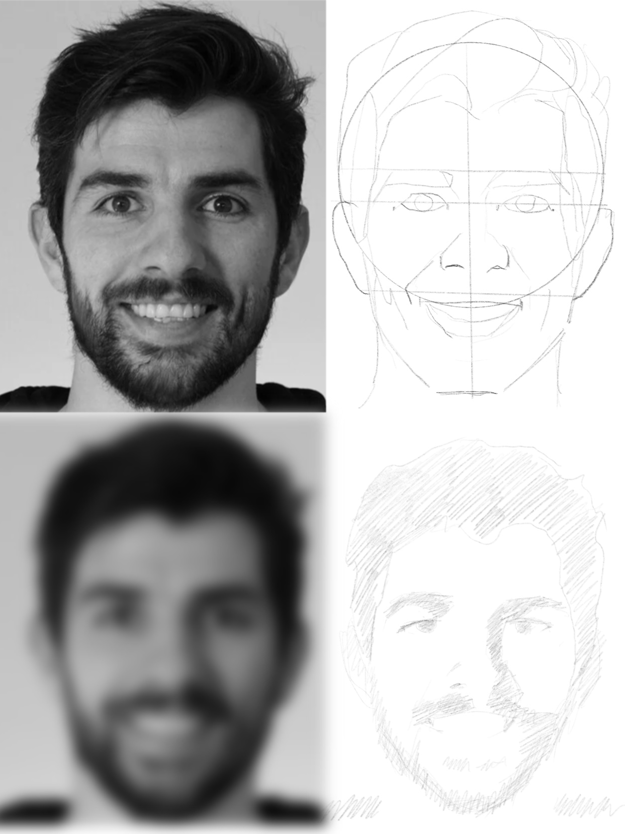
Améliore les traits du visage et la structure, 3 min de lecture
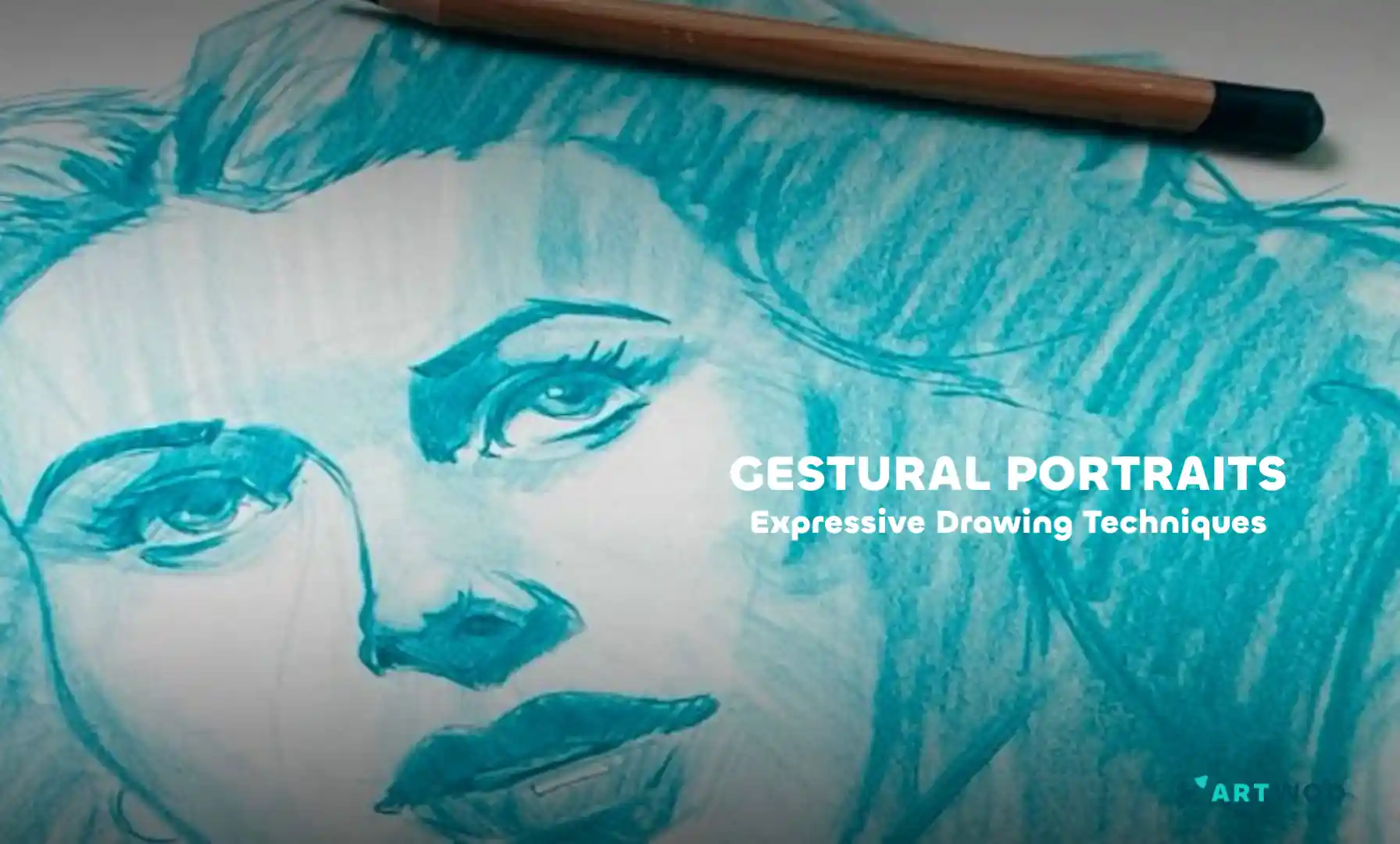
Gestural Portraits: Capturing Expression and Movement in Quick Sketches
Build expressive portraits using the Loomis head method, Reilly rhythms, and shadow mapping to establish structure, flow, and clear lighting before adding final details.
Portraits
Tu aimerais aider quelqu’un qui attend encore ?
Figure
Pas encore de réponse
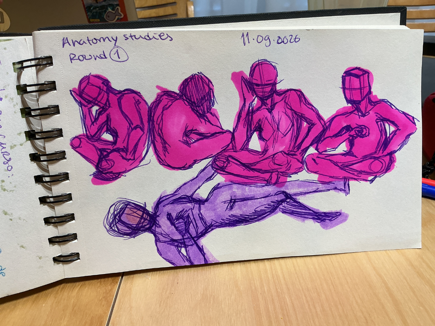
figure drawing 1
i did some figure studies with alchohol markers and bic pens, but there are so many parts of this that don’t make sense😭 i did all of these with a reference but it’s harder to compare with traditional methods…
Vue
Rendering
Pas encore de réponse
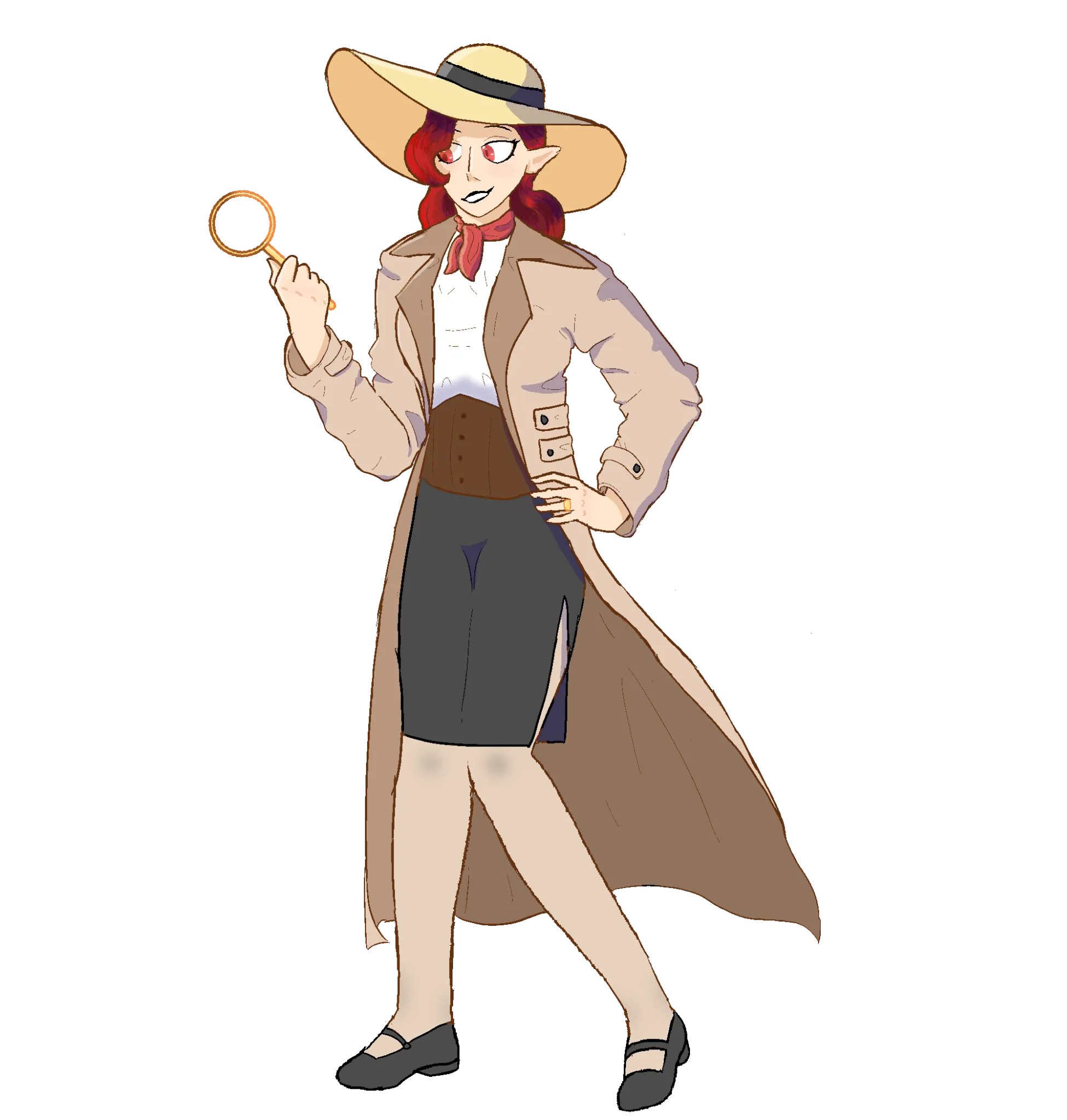
Shading (Robyn "Bobby" Octavius)
I'm really struggling on shading her clothes. I only recently started experimenting with adding folds and such to make my clothing feel less flat. I also feel like the color of the shading itself is off in some places. My shading also feels really sharp when I feel like that's maybe not right??
Vue
Portraits
Pas encore de réponse
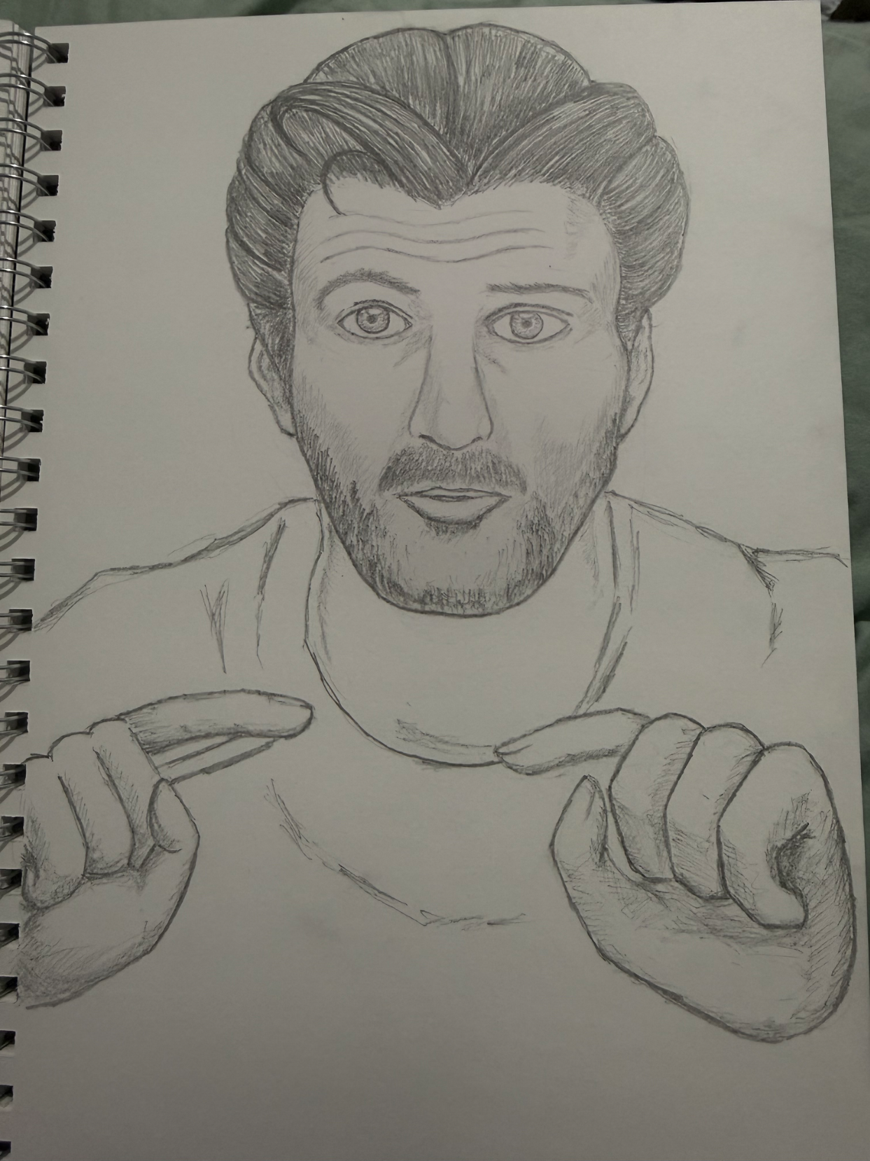
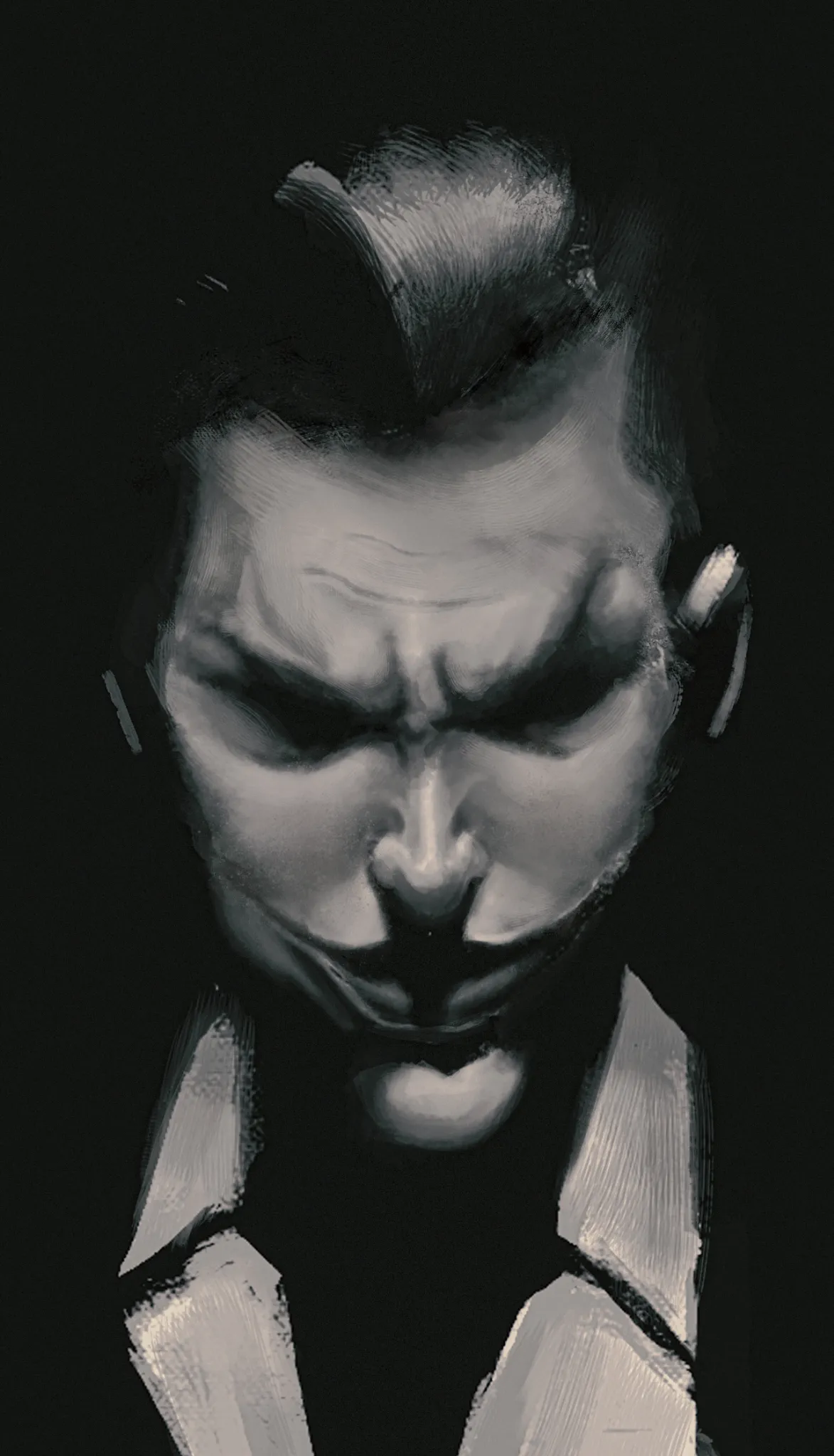
joker study
I believe there is an issue with the head position I observed. Additionally, I would appreciate any tips on form and rendering, as that was the main focus of this study.
Vue
Playing Cards Challenge
Pas encore de réponse
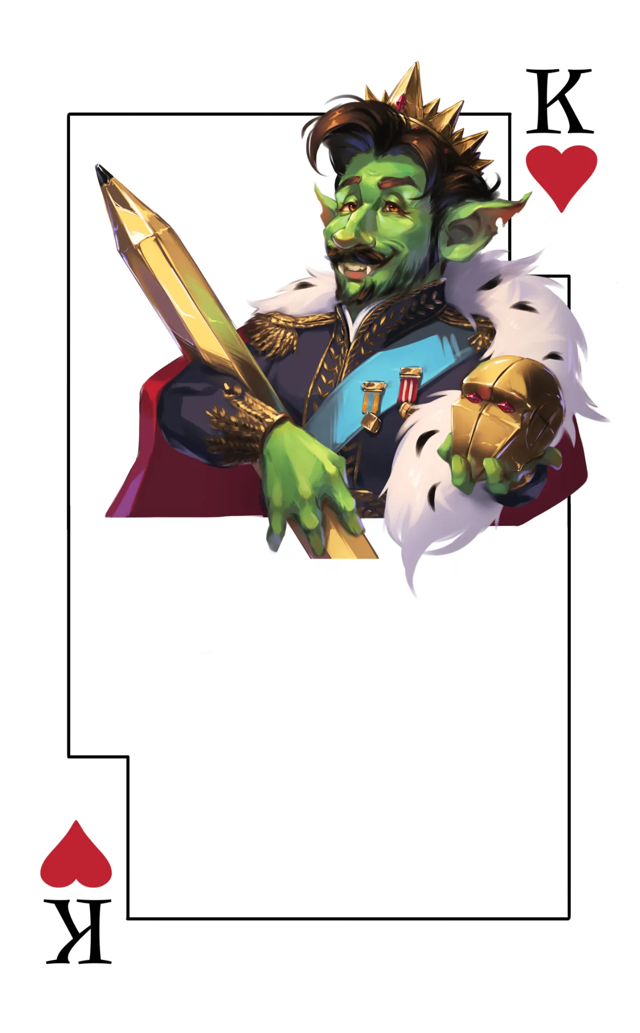
Gobtonio
Decided to draw Antonio as Artwod goblin for the monthly challenge. We heart our sensei hence the King of Hearts. Definitely struggled with design there - I feel like it is the biggest challenge of this month, so any suggestions in that department are welcome. Also, feel free to draw another half :3
Vue

Environment
Pas encore de réponse
Big bird in high lands
Help (@_@)
Vue

Figure
Pas encore de réponse
Torso form practice
I would like to know if the boxes and form being placed over it for the torso can be improved ? Thank you!
Vue

Environment
Pas encore de réponse
Floating crystals
I’m really struggling with landscape stuff. Any help would be appreciated thanks in advance.
Vue

Anatomy
Pas encore de réponse
Hair structure / Shirt draping
I'm struggling with anatomy / body rendering / hair placement. I'm looking to Improve
Vue

Figure
Pas encore de réponse
the enemy stand user could be anywhere
im working on getter better character desing goind, my clothes are probably one of my biggest weakness followed by heads closely, any opinions or tips are more than welcome
Vue