Tu veux enregistrer ton avis ?
Enregistrez tous vos commentaires au même endroit sur votre compte. Vos commentaires seront privés et non publics.
Peintres
Paintoover Notes
Choisir un vernis
Choisissez un avatar pour voir ses notes et en discuter.
Tu as aussi du mal avecles portraits ?
Améliore la ressemblance et les proportions du visage, 3 min de lecture
How to Draw Portraits: A Step-by-Step Guide for Beginner Artists
Master portrait drawing by progressing through head structure, simplified features, anatomy, stylistic exploration, observation practice, and imaginative creation.
Portraits
Tu aimerais aider quelqu’un qui attend encore ?
Animals
Pas encore de réponse
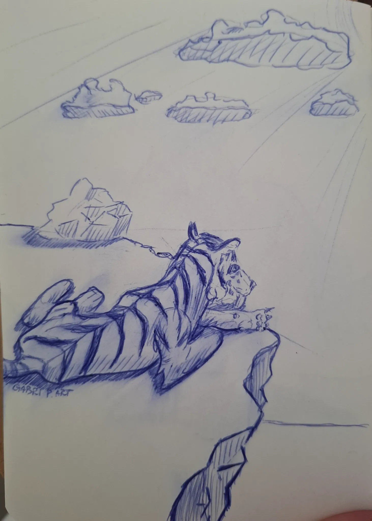
Tigre che guarda l'orizzonte
I have a problem with the head of the tiger, how do you guys simplify it?
Il y a 12 minutes
Vue
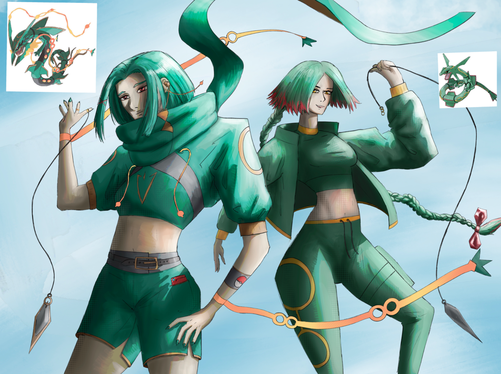
July Before & After Art Challenge
Pas encore de réponse
Mega Rayquaza as a human
The revision and revamped concept. I did the after as a draw over, but now i am resubmitting this as a revision, just to make it easier to understand and see and stuff. More details on the drawing are on the revision
Il y a 4 heures
Vue
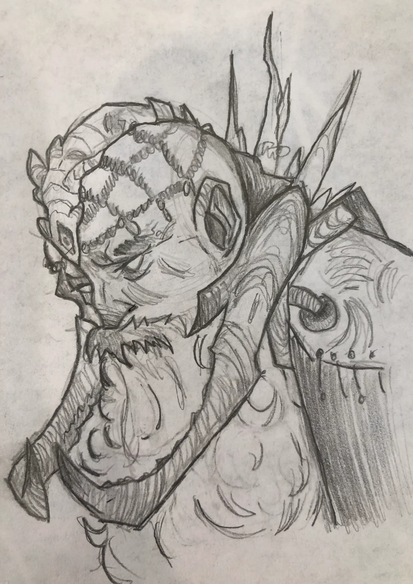
Portraits
Pas encore de réponse
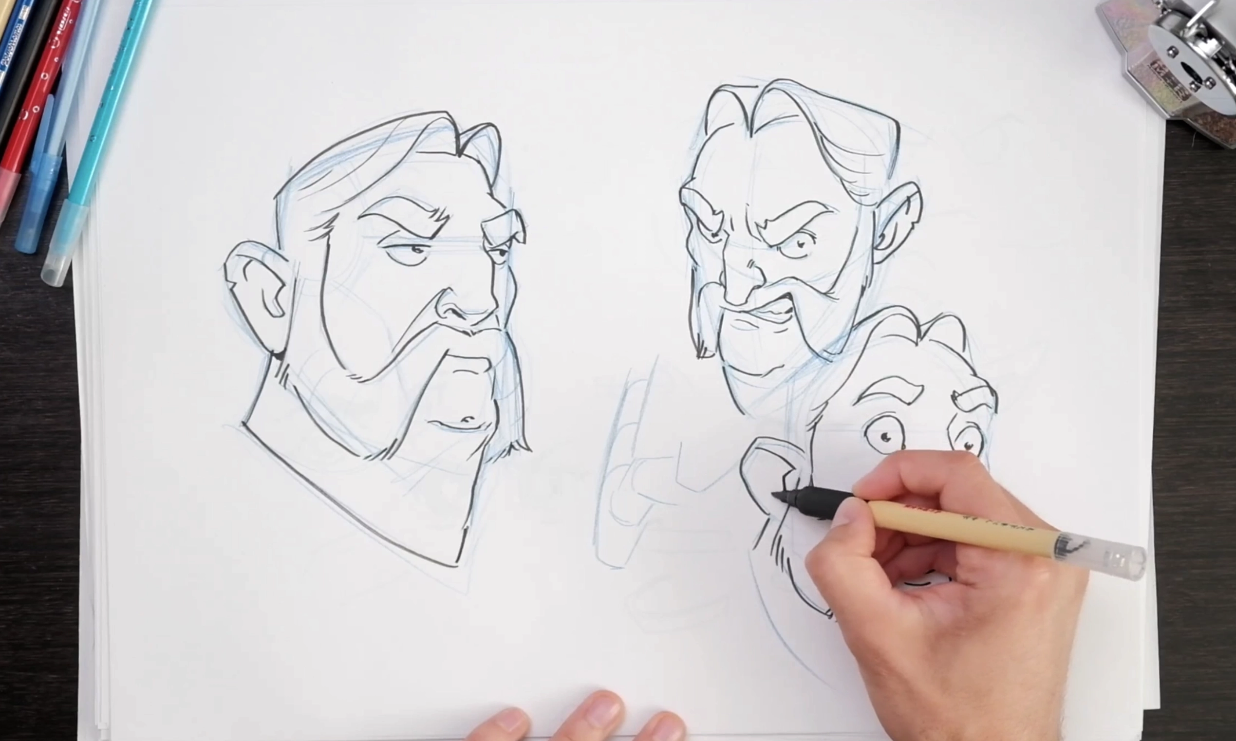
Dwarf
What do you think I could fix/change?
Il y a 8 heures
Vue
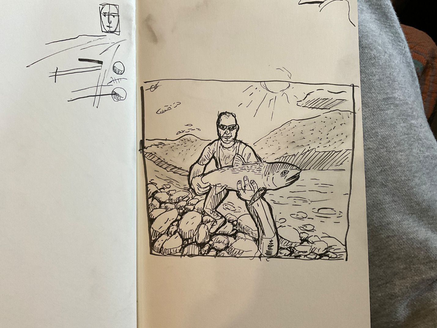
Perspective and Form
Pas encore de réponse
Pretty big fish
With this drawing, I’m struggling with thinking before I place a line and hands
Il y a 8 heures
Vue
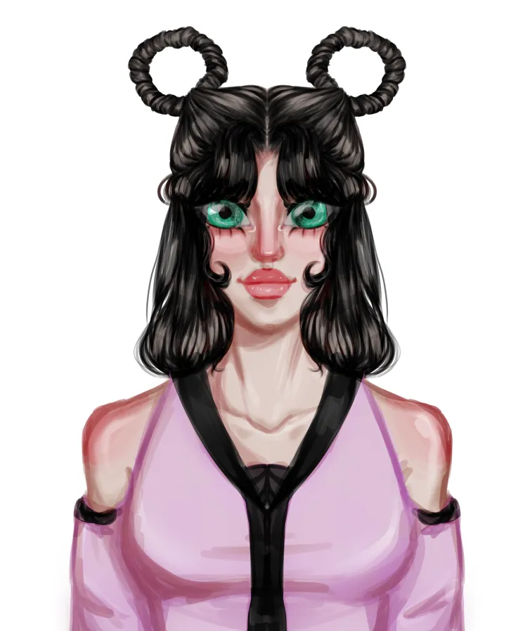
July Before & After Art Challenge
Pas encore de réponse
Redraw of my first gray-scale painting
2022 Vs 2026
Il y a 13 heures
Vue
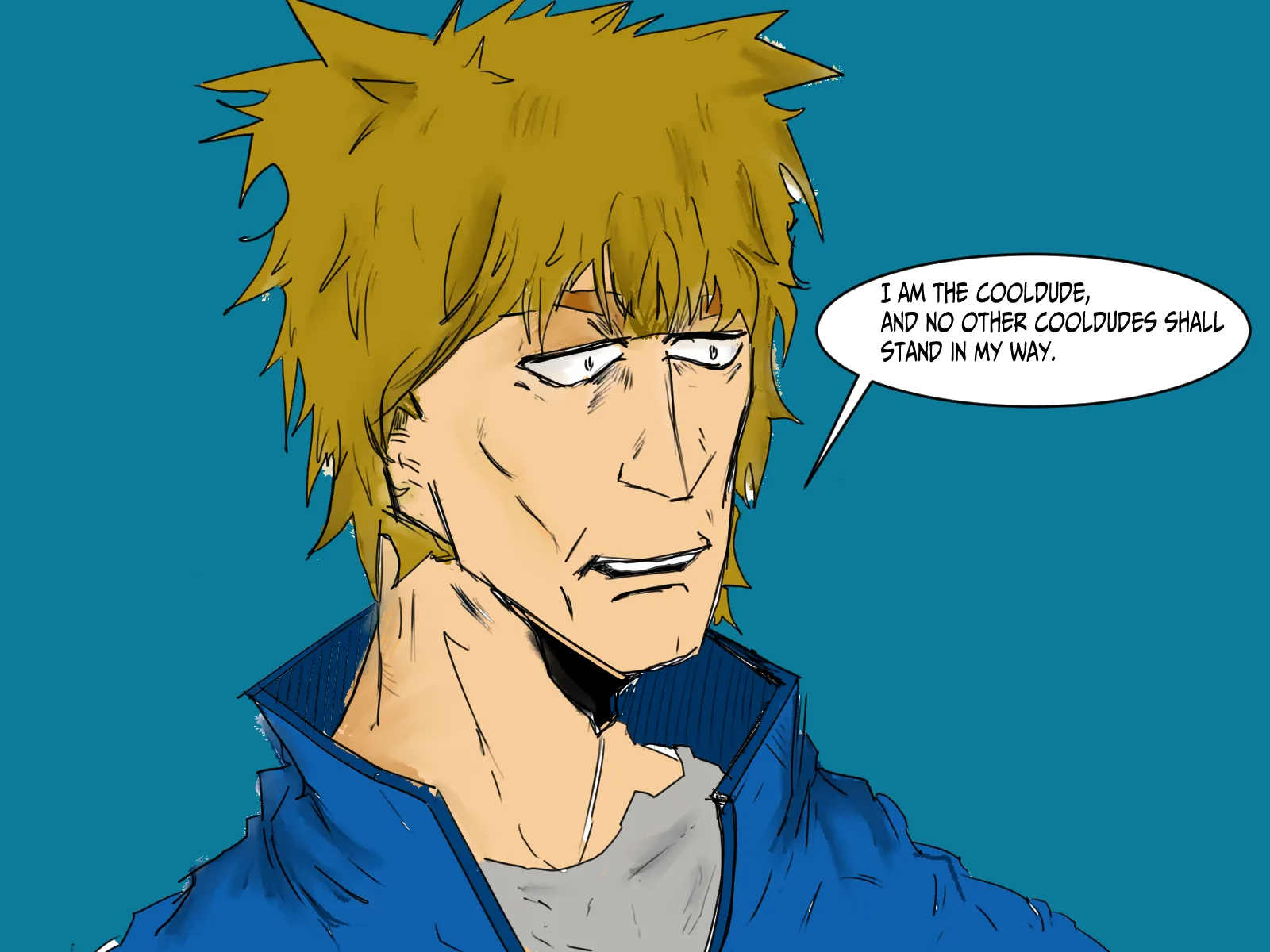
Portraits
Pas encore de réponse
help with heads
I was trying out my new display, and I drew this head. I have been trying to get a more realistic manga style, but this drawing for me is kind of bad. So, if anyone can see a way to keep it less realistic but still better, please share. Tips for coloring are good as well, but I am more focused on the actual drawing.
Il y a 13 heures
Vue
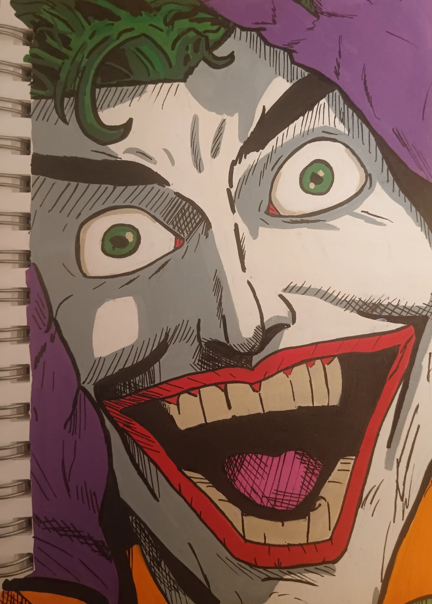
Perspective and Form
Pas encore de réponse
Joker
Hello,I drew The joker (traditional Art using acrylic Markers) I kind of like how it came out but I think maybe the color needs fixing, maybe cross hatching and maybe anatomy.
Il y a 13 heures
Vue
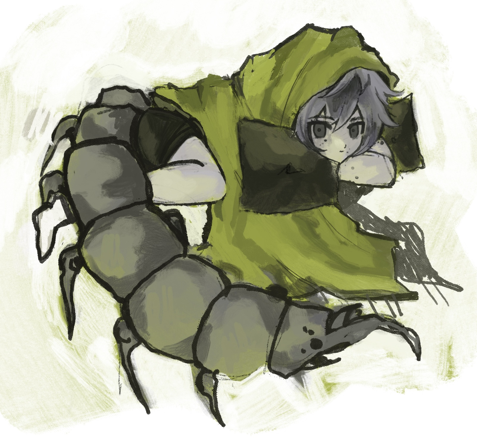
Anatomy
Pas encore de réponse
hi
proportions, making the blanket and pillows more accurate
Il y a 18 heures
Vue
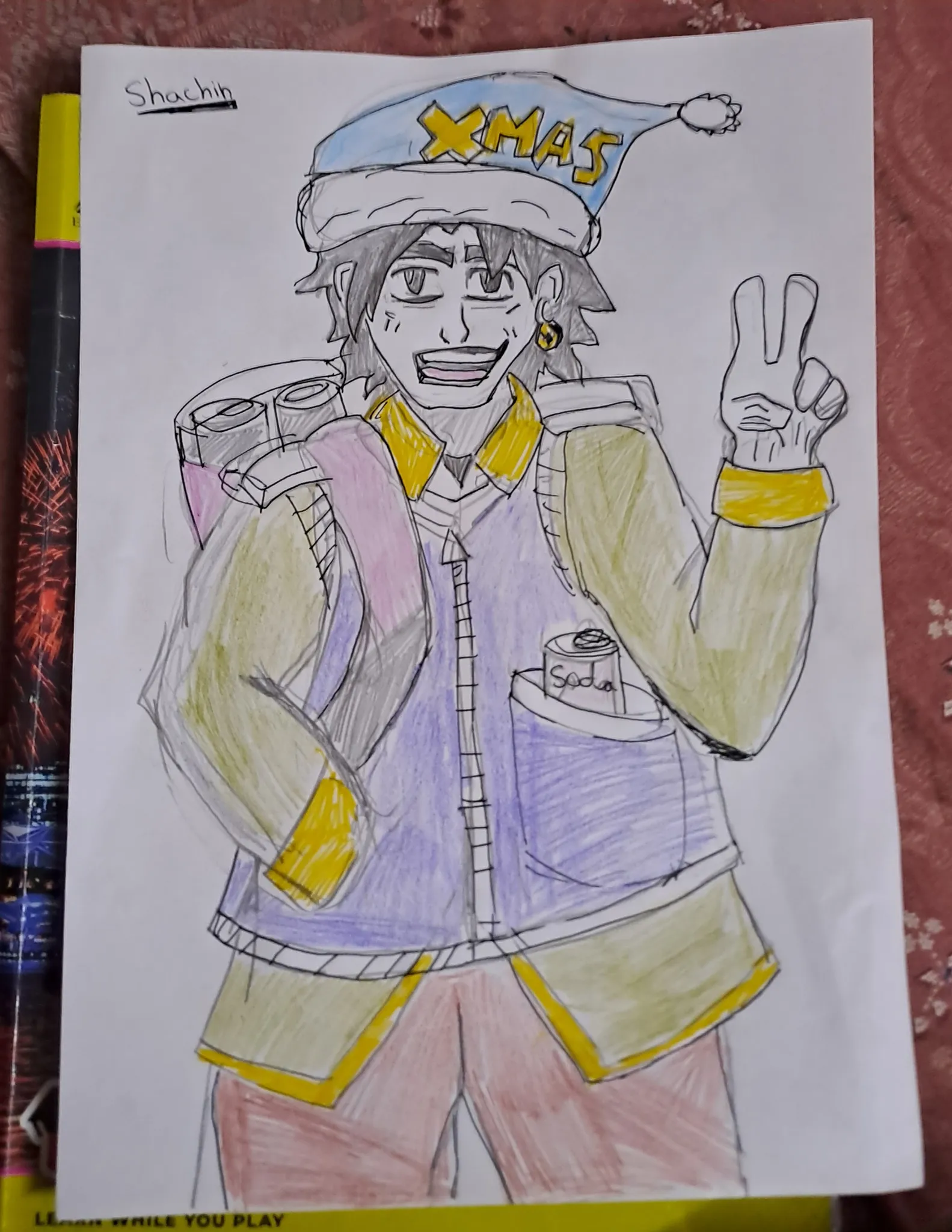
July Before & After Art Challenge
Pas encore de réponse
old version of oc
this is the old version which was drawn 2 years ago
Il y a 18 heures
Vue