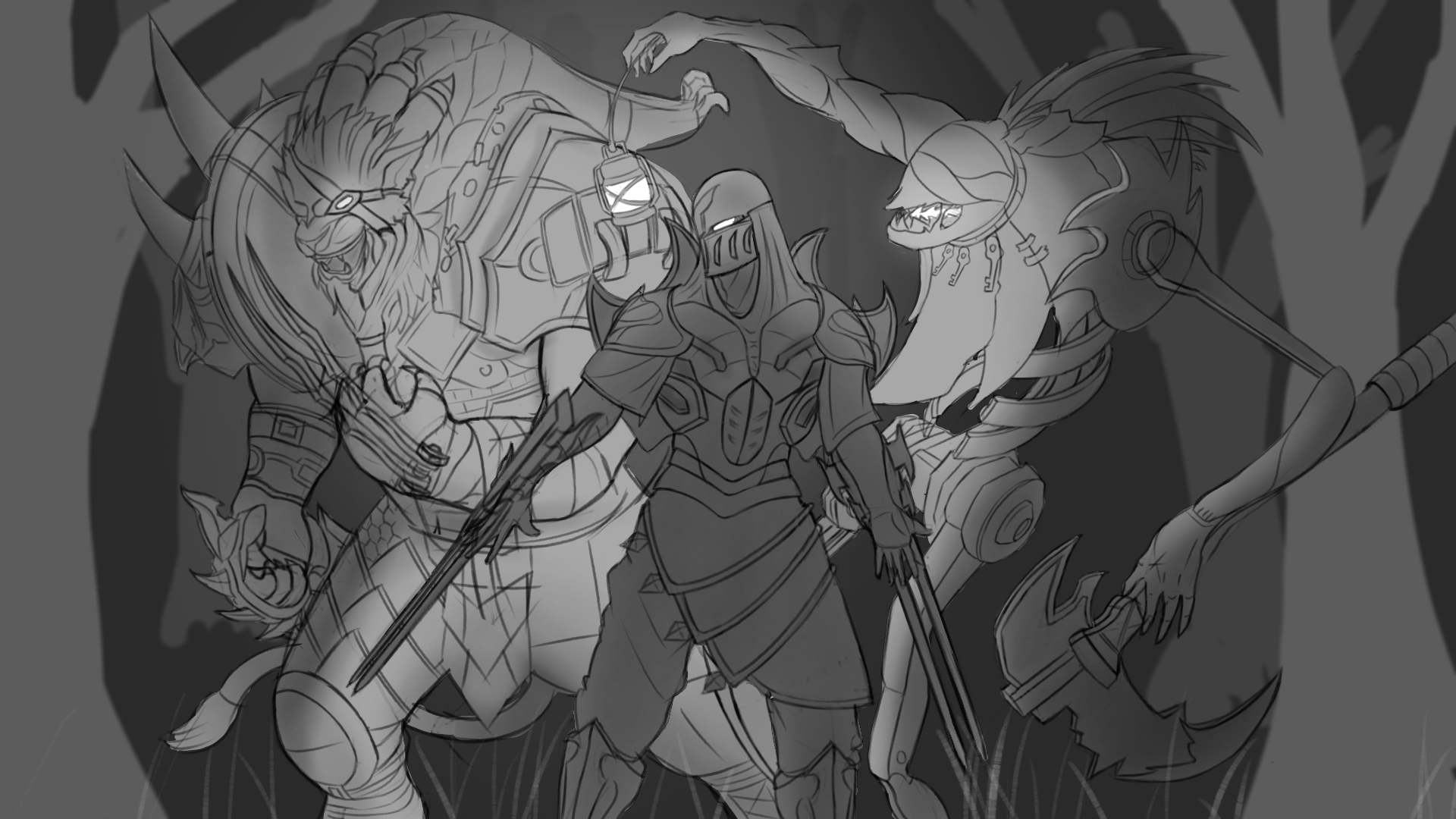
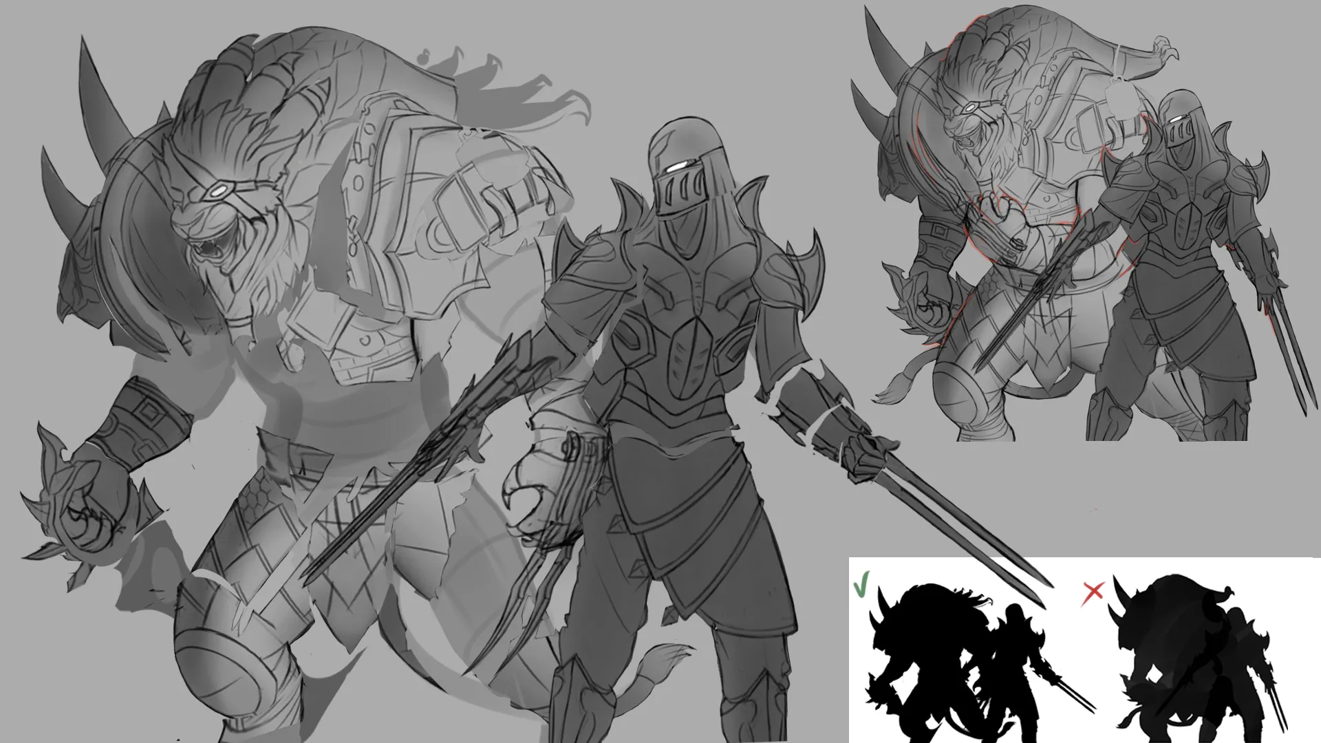

Yo that's lookin awesome! I am a fellow splash art studier enthusiast and I think your headed in a good direction. Tho I can't give you feedback on the lighting, as I am not quite confident in that area for my self. I can point out a few design problems I can see holding back your character designs. For starters, Tangent Lines. These are lines that intersect or overlap one another flatting the depth your trying to achieve in your image. For example I can see you've tried darkening the lines for the lions arm to indicate it is in front of his body, but regardless his arm still feels like its blending into his mid section. The first reason why is we can't clearly identify the separation with your character Infront, there are several intersecting lines from both characters line art bleeding into each other. Especially seen in the lions arm, armor platting, and even in the lions own extended wolverine like claws creating too much line busyness in this area. Here on the top right I highlighted in red a few of these blending tangent lines for you to better see. As well as fixing it by moving your 2 characters a little farther apart as they felt pretty squished together and didn't over all have breathing space to showcase there awesome weaponry and fine details! Now Tangents are always going to happen in art and are never 100% avoidable, It's a push and pull game, but ultimately your going to want to avoid creating them as much as possible to make a stronger design read. And I highly recommend checking out Sinix's video on tangents to better understand how to design around them. With that said, design problem #2 is stacked and unclear silhouettes. Something you've got to remember about art is we always see the silhouette of a design First, before any other details. Splash art is built on creating the best read to deliver the idea as quickly and clearly as possible So here I've outlined the silhouette for your design in the bottom right as well as my alteration version next to it showing the 2 characters more spaced apart and using the negative space between them to further convey they are 2 separate characters, for a cleaner read. All in all, I really loved your designs and hope this little focused demo helps point you in a good direction as your looking to learning more about splash art. Keep up the great work!
Almost forgot, Sinix's video on tangents is titled: What is a Tangent? (in art)