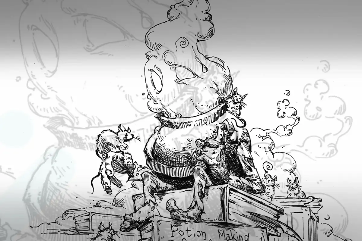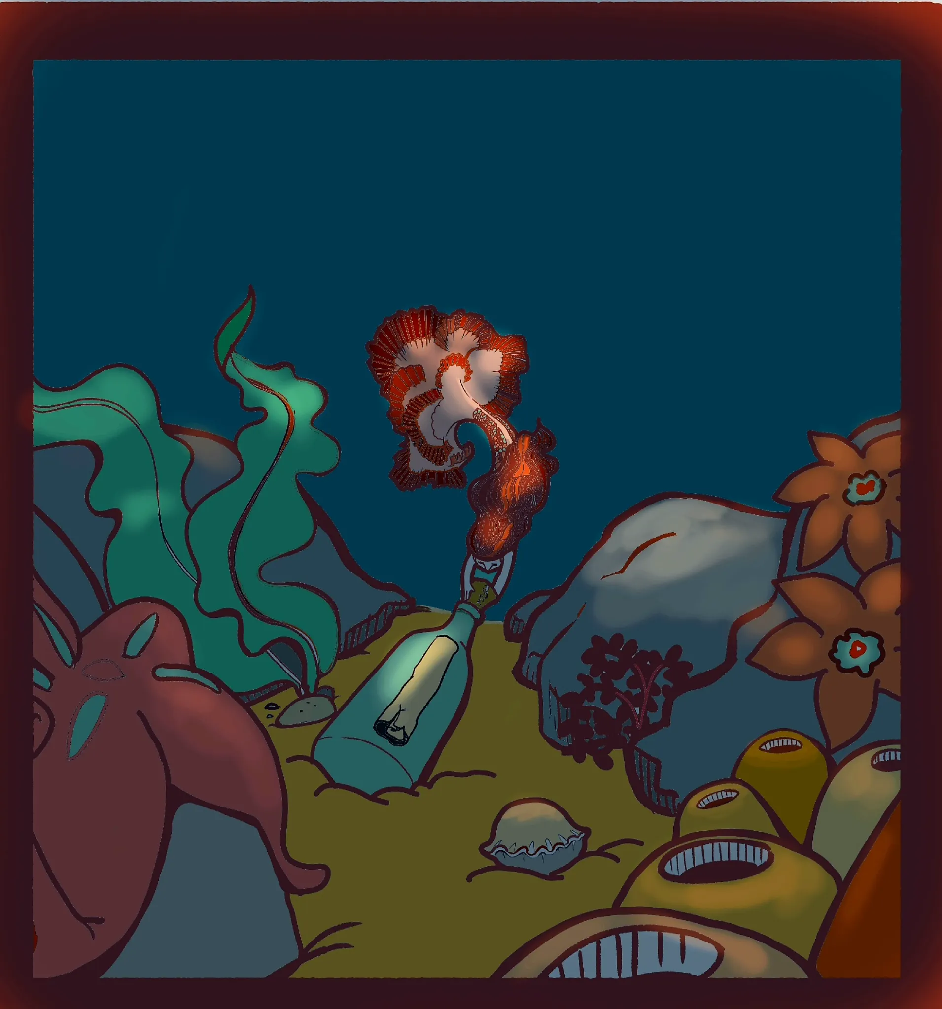
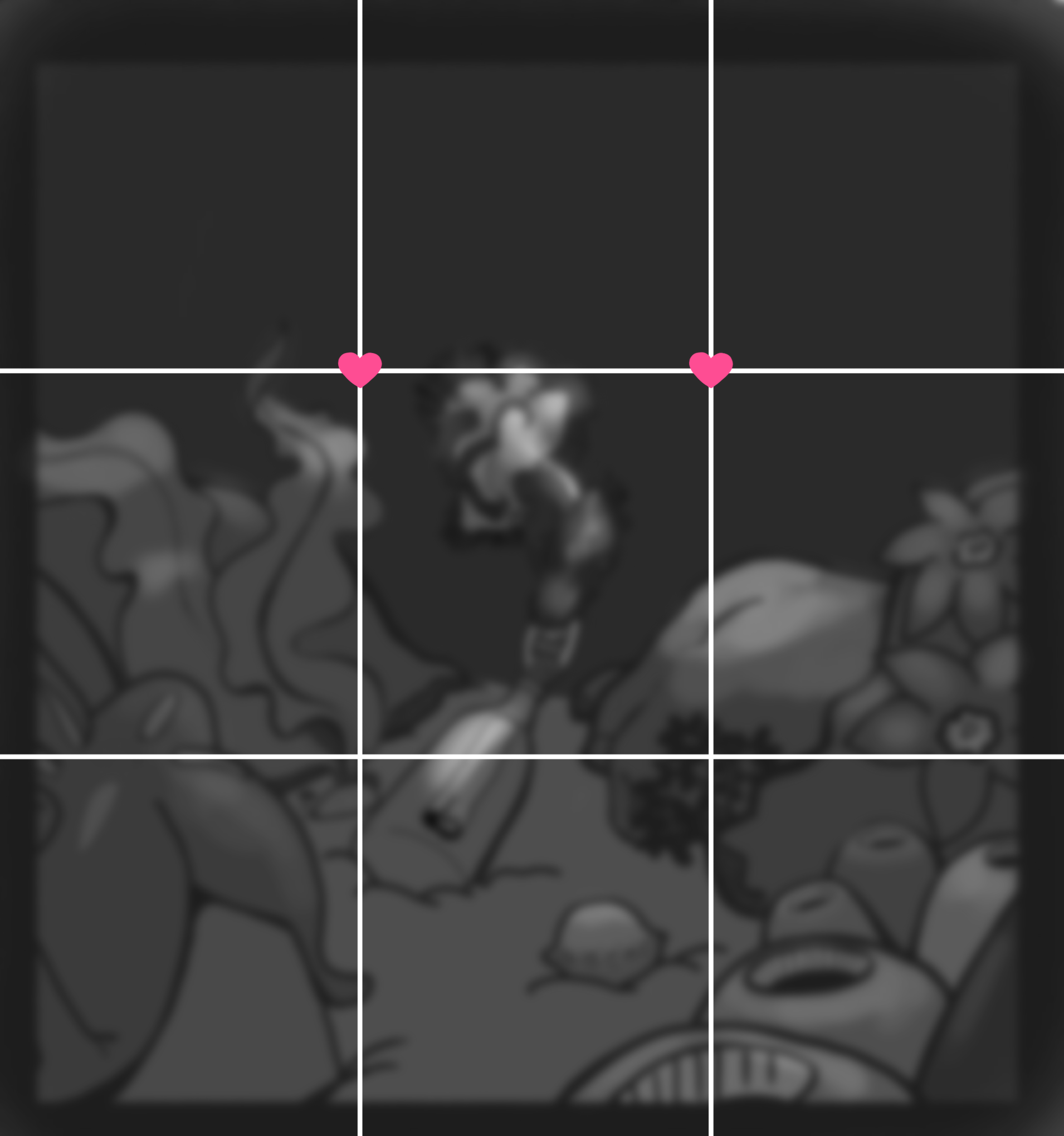
this is beautifully illustrated so far; the linework and color variation both offer structure and contrast to the piece to really amplify the visual intrigue. another dimension of contrast that you could possibly add might be in the area of values (basically, the amount of darker versus lighter shades of color in the piece). using a pitch-black layer on saturation mode (which should work in most digital painting softwares), we can determine that many of the colors in this illustration tend toward the darker end of the values spectrum. ideally, you’d want to see a balance of lighter and darker values; so one way to increase the visual interest of this illustration would be to try for a more varied amount of really dark, really light, and in-between values throughout the piece. (i’ve included the black saturation layer in the draw-over so that you can see the darker and lighter values of the illustration; as you notice, the values tend much more toward darker rather than lighter ones). also, with regard to composition, a commonly used practice is to try designing the layout using a rule-of-thirds grid: using straight lines to split the illustration horizontally and vertically into thirds, then placing particularly interesting parts of the art as close as realistically possible to either the lines themselves or to the intersection points. special attention is often paid to the intersection points where the top horizontal line crosses the two vertical lines. (i’ve included the rule-of-thirds grid in the draw-over as well, with hearts on the two intersection points that are often considered priorities; placement of key elements at these points is widely thought to enhance the balance, intrigue, and beauty of an illustration). again, great job with the concept and design on this art so far. i hope this feedback helps ❤︎
Participez à la discussion
Inscrivez-vous pour donner votre avis sur cette œuvre.