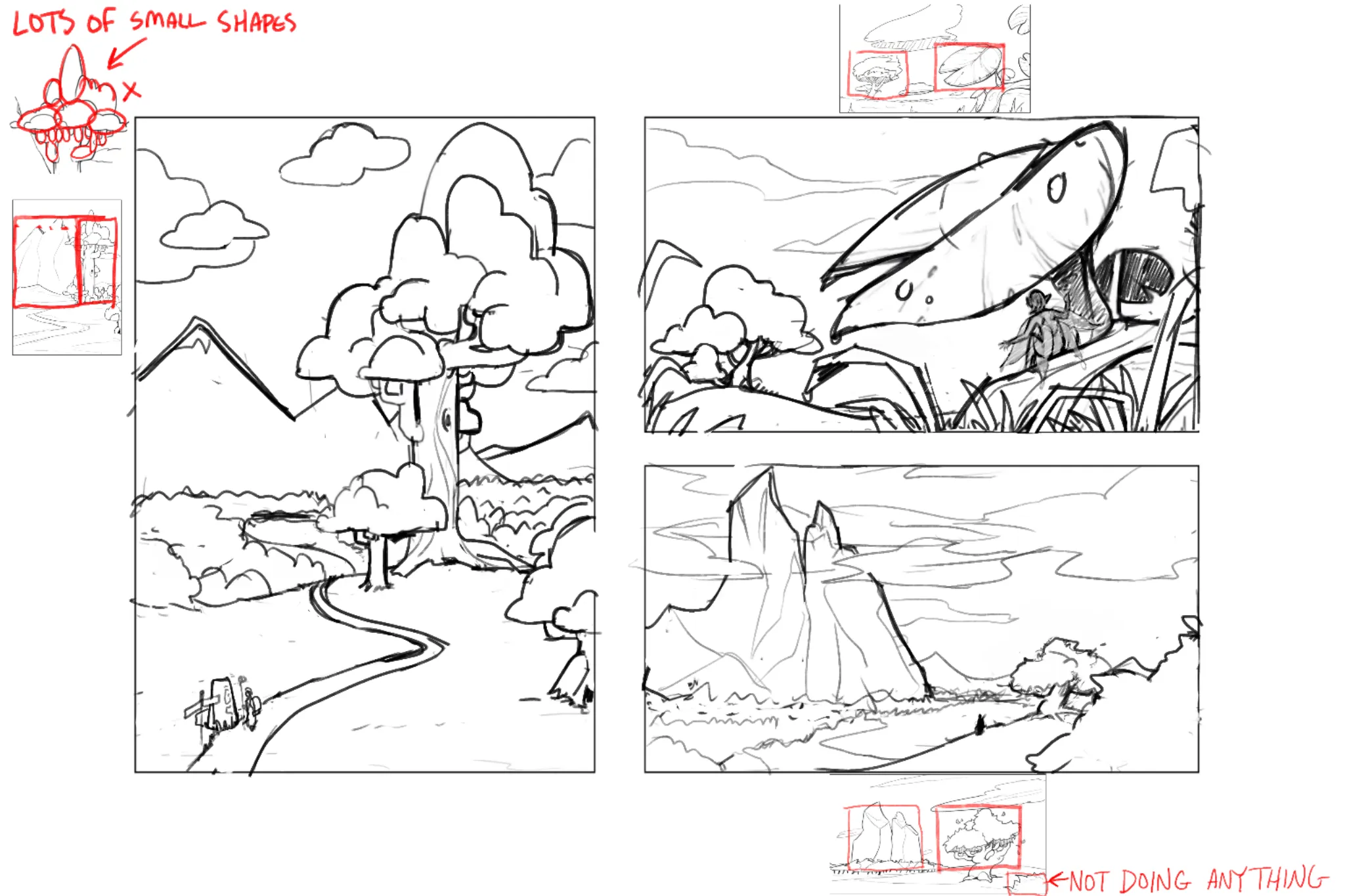
What cute ideas! I think there are multiple reasons it looks a little uninteresting. The first is that your focal points are at the same size and at the same level on the page. The second is that your designs of the mountains and the trees all use about the same size of shapes. In the first image, you have a tree with all the same size branches and same size groups of leaves. You should have a mix of big, medium, and small shapes. The third thing is you sense of scale. All the elements look very close together. You can get a better sense of vastness if you overlap elements and emphasize the size difference the foreground elements have from the background elements. I think the last thing that could be done is adding some sort of narrative element to the piece. I decided to add a wanderer character to each piece. You could add other things like dragons, birds, a distant castle, anything that could imply the world is lived in. Hope this helps!
Participez à la discussion
Inscrivez-vous pour donner votre avis sur cette œuvre.