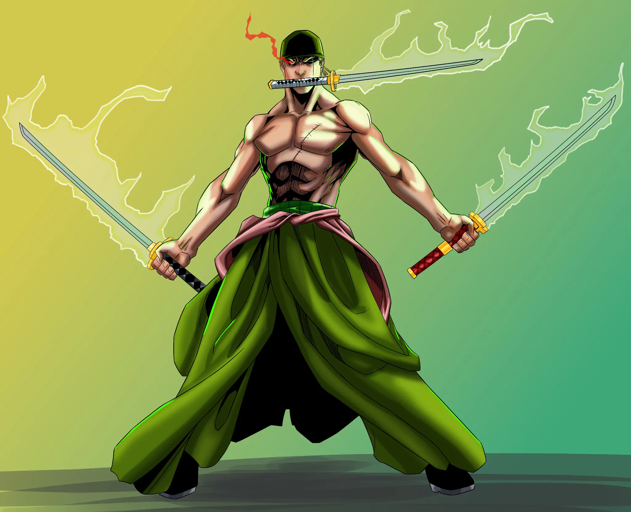
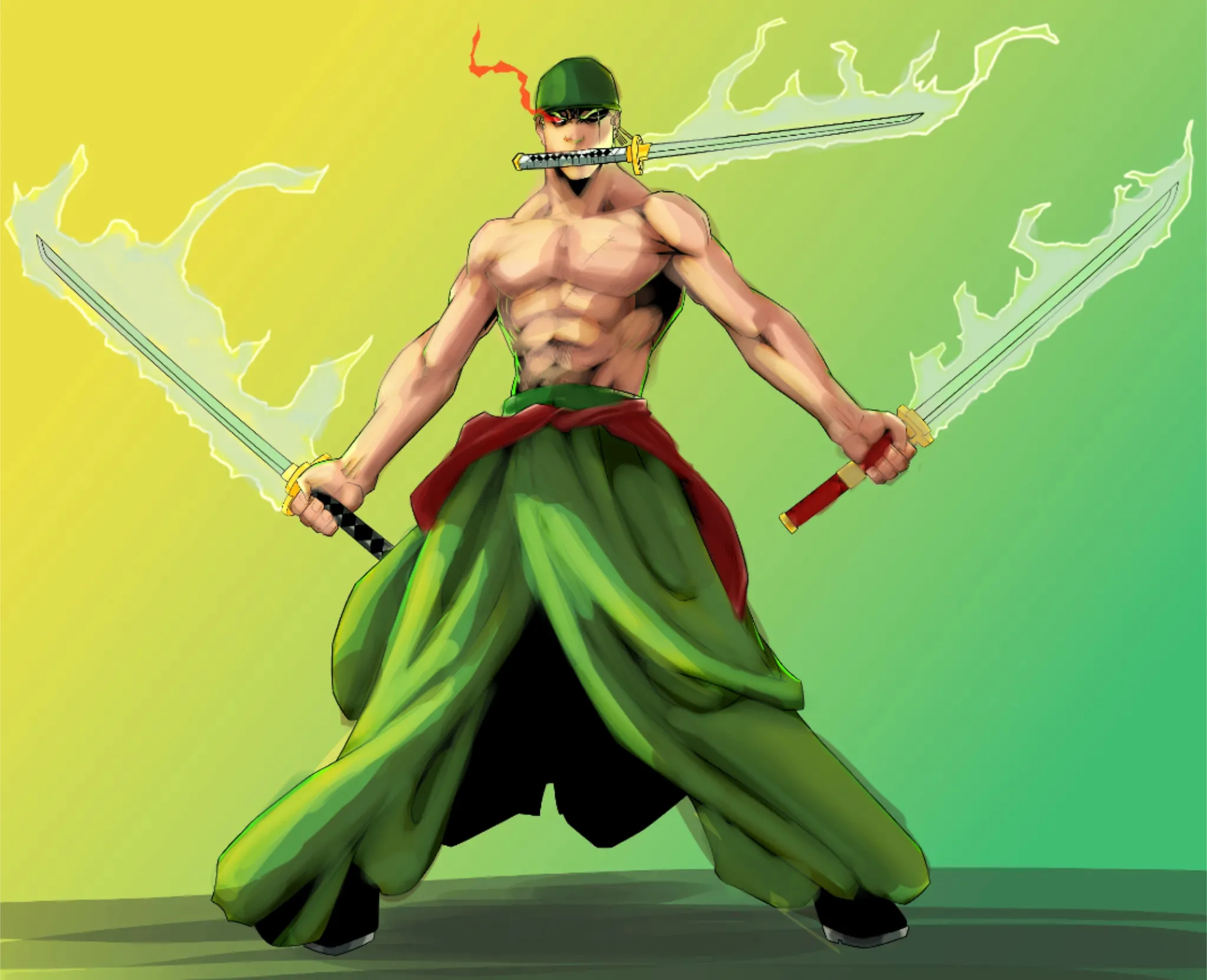
Hi hi! Very cool Zoro pick! I like comic approach to it!. What you have now is overly saturated and dark picture. Dark colors should be avoided when generating shadows because they will make the artwork look muddy and artificial. Change to either cold colors (mostly blues but avoid purple) or warm colors (a mix of orange and yellow), depending on the type of light you are using. Each stage—linework, flat colors, shadows, light, and background—should be kept separate for a cleaner finish. Remember the volume of each artistic feature. When using light and shadows, treat each as a three-dimensional form. You can have black spots and some hatching but dont overdo it if you want to incorporate cell shading. Also have in mind where the main light source comes from. Here I picked side and aligned my shadows to follow it. That way you will get a sense of volume and correct placement. In the end you can play around with light from special effects to make art more powerful. For conclusion,I encourage you to look up comic artist as your guide (manga artist as well). They mastered coloring and graphical approach to drawing.
Participez à la discussion
Inscrivez-vous pour donner votre avis sur cette œuvre.