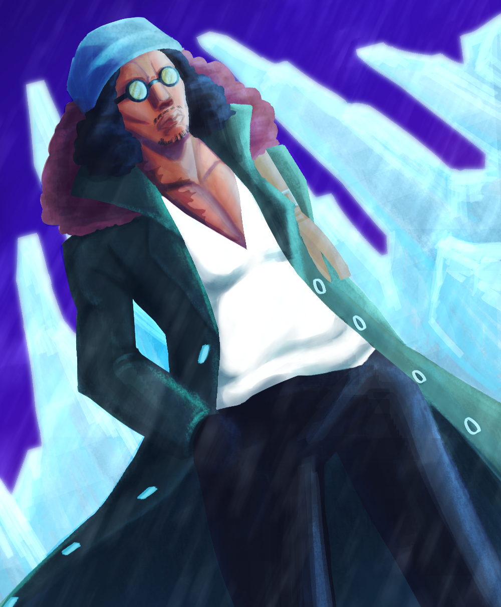
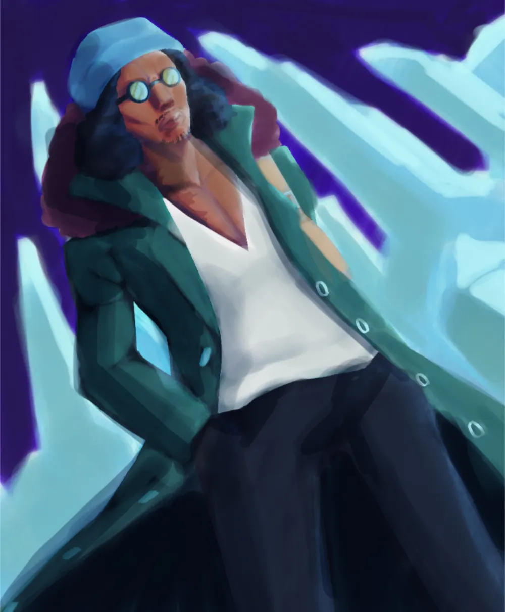
Hi Hi! Badass character! I like the diagonal positioning as well! A solid light source should be set first. Identify the light source; areas facing it are dark, and those facing it are bright. Create a full range of tones, from bright highlights to deep, saturated shadows, to prevent art from appearing flat. When creating shadows, avoid using very dark colors as this will make the artwork appear muddy and unnatural. Depending on the kind of light you are utilizing, switch to either warm colors (a combination of orange and yellow) or cool colors (mainly blues but stay away from purple). For a cleaner result, keep each phase distinct: linework, flat colors, shadows, light, and background. Keep in mind that since the figure is three-dimensional, we must see its volume. When painting different characters, outfits,hairstyles and skintones, always have references on the side. As for background: always try to shape it to appeal to the character in focus. Here I reduced the intensity of colors because it was overall too distracting. You can keep the turquoise pallet but dont go over saturated, especially if spikes are set to be far away from character. Hope it helps!
Participez à la discussion
Inscrivez-vous pour donner votre avis sur cette œuvre.