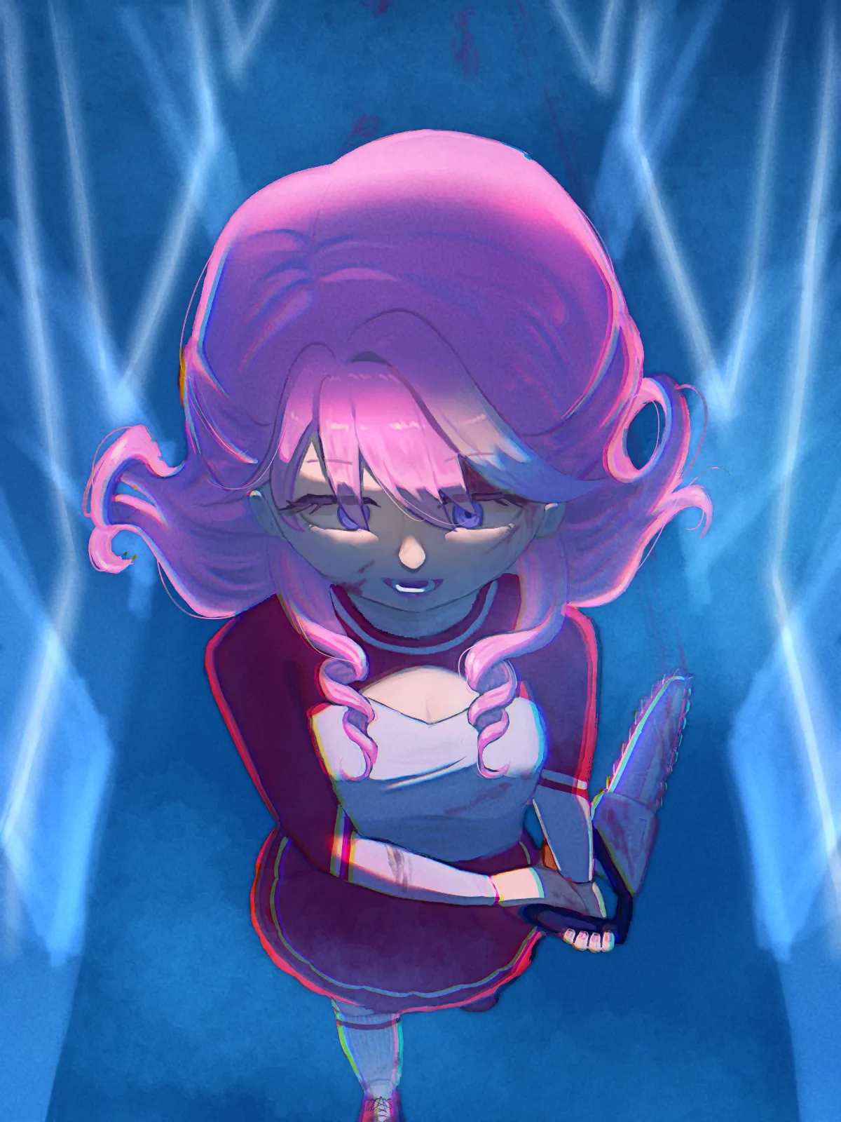
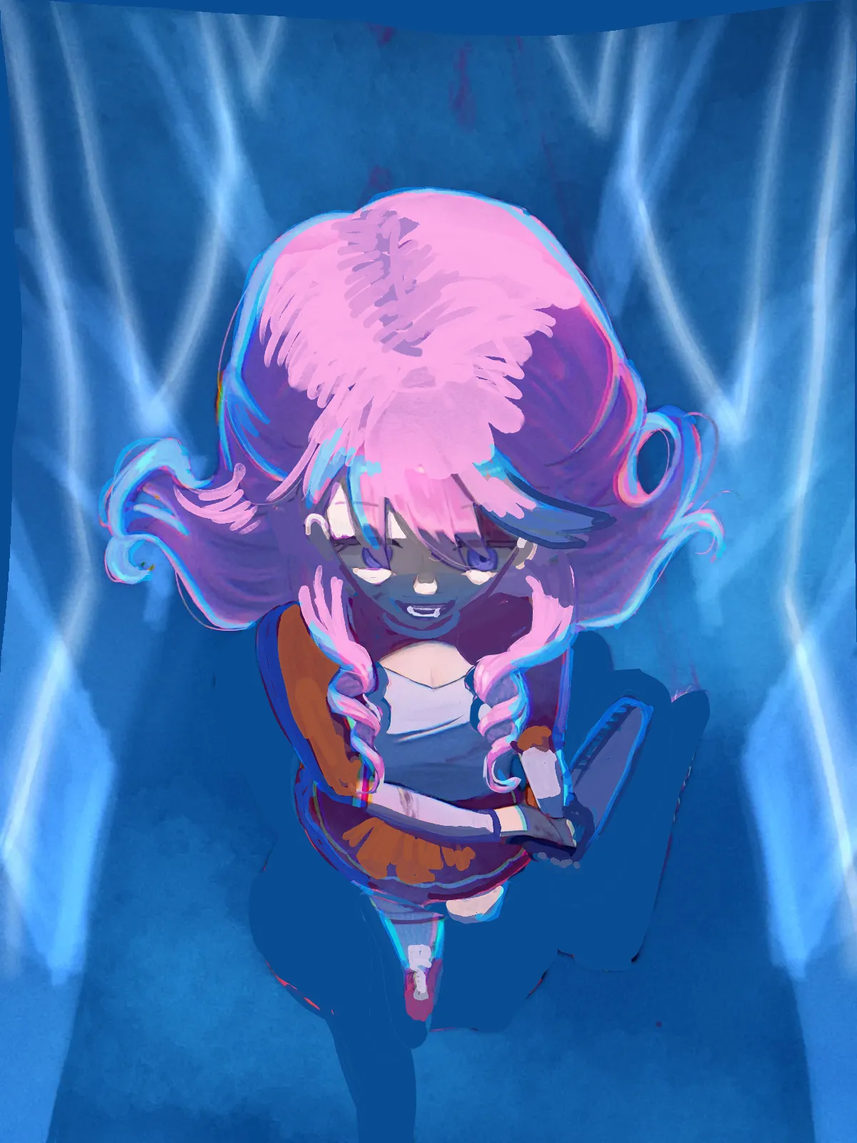

Saw huge potencial, but everything was halfway there so here's my fix! (ignore the messy background) Perspective: I think I made the face too narrow for your artsyle, I'm sorry for that, but the idea is to narrow the face to follow the perspective. The head needs to be more on top of the shoulders in this perspective. The left fingers wouldn't be that visible. The leg needs to be more on the center, to keep balance. Lighting: I saw in your drawing two different ideas for lighting, both unfinished. One is a white light from the top, the second is rim lighting. I turned the rim lighting blue because of the enviroment. I added the top light on the top of the head and on the clothes where it was missing.

Ahh this makes sense! Thank you for the feedback 🙏