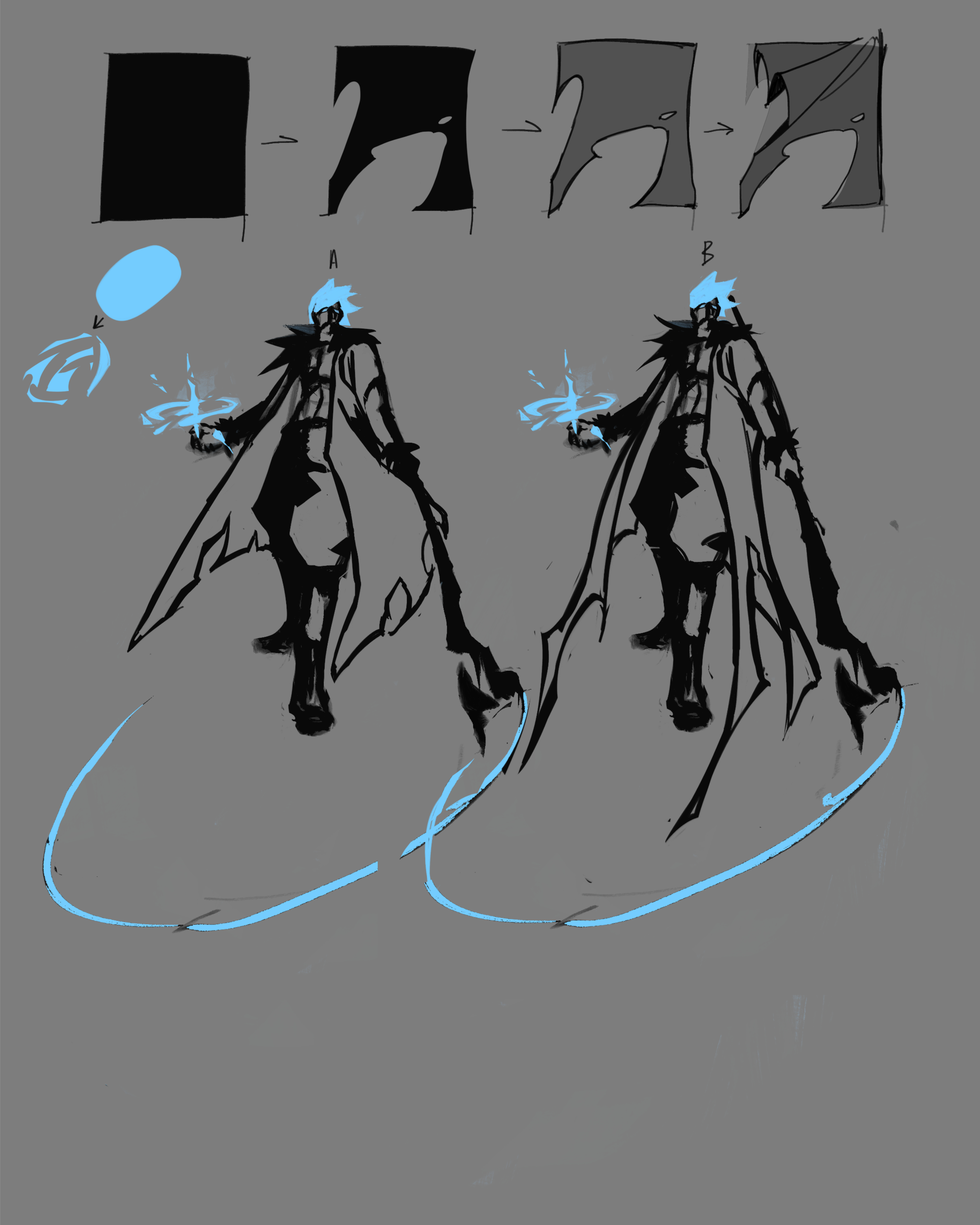
I forgot to mention! This is probably something you already know, but an easy way to get cool shapes is to start with a solid colour/shape and then carve pieces out of it with your eraser. So instead of trying to go straight into lineart, I find it easier sometimes to block out the shape and then carve away at it until I get what I want. And THEN you add line art.
So something like this would be really useful on the hair or like the cloak or magic effects or fur-- lots of things. Thought i mention it in case you hadn't tried it before.
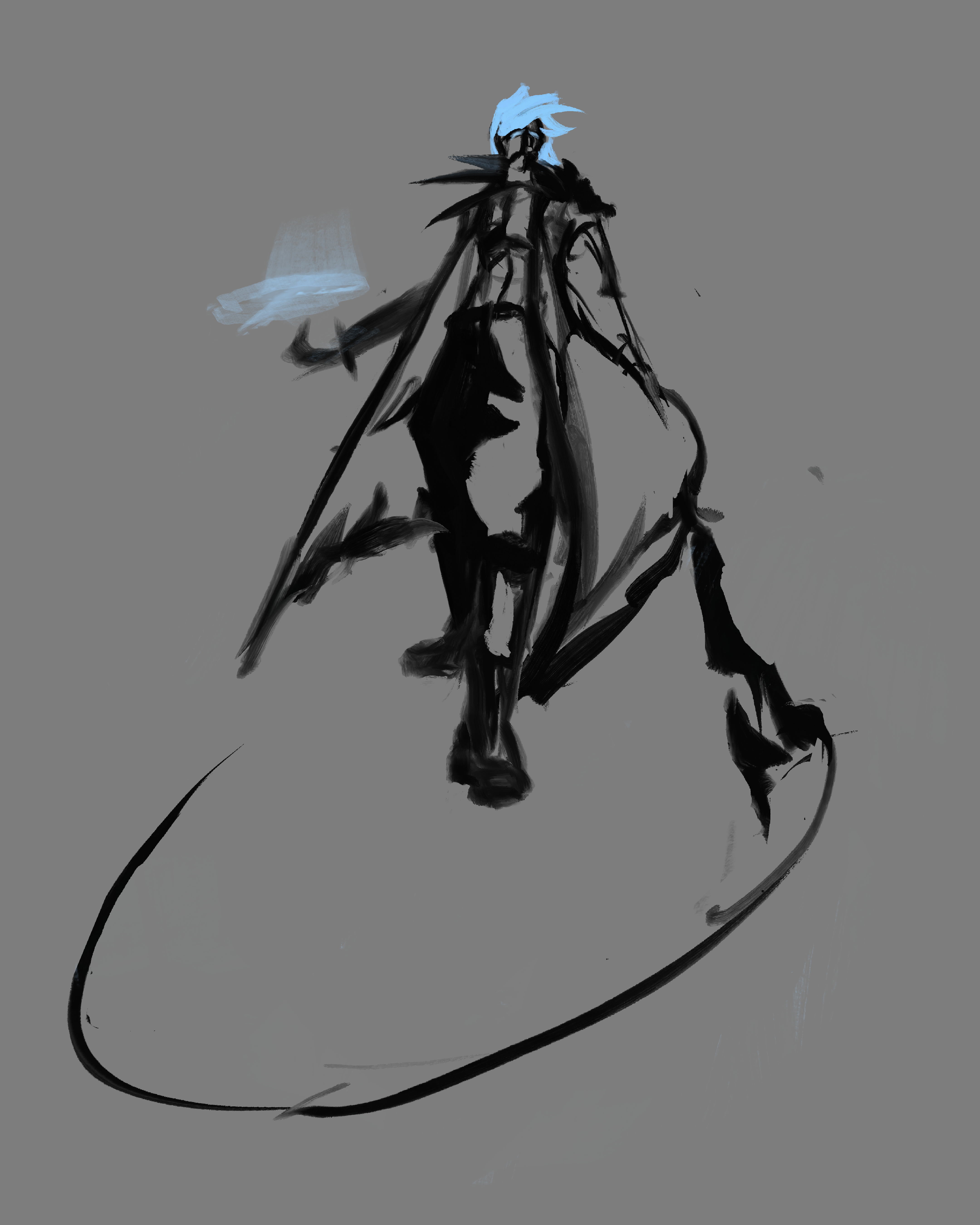
The fact you were able to apply that so well and instantly is actually insane! Yeah, that's exactly what I meant! You can literally break anything down into basic groups of geometric shapes and use it to make your piece look cool.
I even applied it to the tears in his coat and the shadows on his pants (yeah shape design even effects shadows). I think your design of his staff is actually perfect so I didn't touch that. It had this sort of sharp visual language that I wanted to incorporate into other parts of the design so I changed the cloak to match it. It also looked a bit too symmetrical in (A) and I thought it might be more interesting this way. You can decide which you prefer.
I think you did a really good job on the shape language of the hair too! I did worry it might blend a bit with the fur of his coat though so I shortened it just slightly. Speaking of the fur, I think it could've been chunkier and the shape design a little less made up of repetitive and thin strokes. Remember to mix and match big, medium, and small shapes and avoid repetition in organic forms!
I know this is still and early draft so there's a chance you would've noticed these things as you kept rendering. It's a big improvement upon your previous piece and I'm glad I was able to help a bit.
Honestly, the rule of cool trumps everything and I could forgive any minor errors because your art has so much style.
As for my portfolio, I don't have one. I actually haven't posted art in 3 years because of insecurity in my art. Trying to help other's improve has made art fun again and I'm glad it's worked for you.
Keep at it. I can't wait to see how you improve!
The fact you were able to apply that so well and instantly is actually insane! Yeah, that's exactly what I meant! You can literally break anything down into basic groups of geometric shapes and use it to make your piece look cool.
I even applied it to the tears in his coat and the shadows on his pants (yeah shape design even effects shadows). I think your design of his staff is actually perfect so I didn't touch that. It had this sort of sharp visual language that I wanted to incorporate into other parts of the design so I changed the cloak to match it. It also looked a bit too symmetrical in (A) and I thought it might be more interesting this way. You can decide which you prefer.
I think you did a really good job on the shape language of the hair too! I did worry it might blend a bit with the fur of his coat though so I shortened it just slightly. Speaking of the fur, I think it could've been chunkier and the shape design a little less made up of repetitive and thin strokes. Remember to mix and match big, medium, and small shapes and avoid repetition in organic forms!
I know this is still and early draft so there's a chance you would've noticed these things as you kept rendering. It's a big improvement upon your previous piece and I'm glad I was able to help a bit.
Honestly, the rule of cool trumps everything and I could forgive any minor errors because your art has so much style.
As for my portfolio, I don't have one. I actually haven't posted art in 3 years because of insecurity in my art. Trying to help other's improve has made art fun again and I'm glad it's worked for you.
Keep at it. I can't wait to see how you improve! | Artwod Feedback