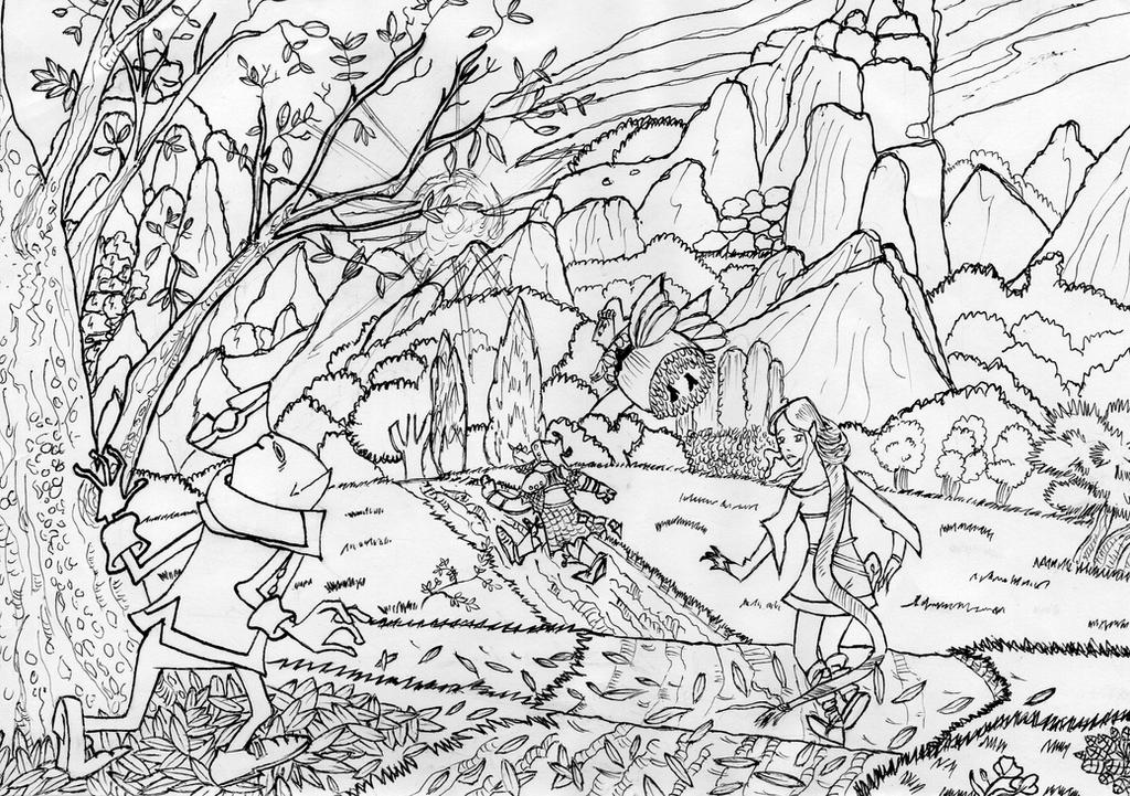
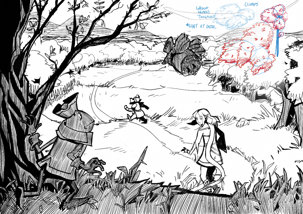
I think you really nailed the proportions of all your characters in relation to one another! I'm not sure what controlled edging is, but I assume you're talking about your lines? I'll try to help to the best of my ability. I think it's really good that you're going through the effort to add so much detail! But actually outlining everything like the individual leaves and the grooves of the mountain and the sun beams can actually make your drawing less readable. Instead I think you should focus on shading and IMPLYING detail. This means that instead of actually drawing every leaf or strand of hair, you'd simply group details together and let other areas rest. A person's brain will actually automatically fill any gaps you leave. I did this for the trees and patches of grass. You can my example in the upper right how I made big circles and then drew leaves around and within those forms and then shaded it to give it a little volume. And as for shading, I think it would benefit you to try hatching! I did a little bit in my drawoever to show you how it effects the image. I used straight lines going in the direction of the form I'm rendering when I wanted that form to stand out and I hatched across the form in the same direction without regard for the form to make it not stand out. I think the last thing that might help you is to think about your line weight. You can see that I used heavy black lines on the toad character and tree to render it instead of the thin lines that you had used. This is because doing so will make your work more clean and more readable and is help understand the volume of the subject. I hope this helps with what your were having trouble with.
Participez à la discussion
Inscrivez-vous pour donner votre avis sur cette œuvre.