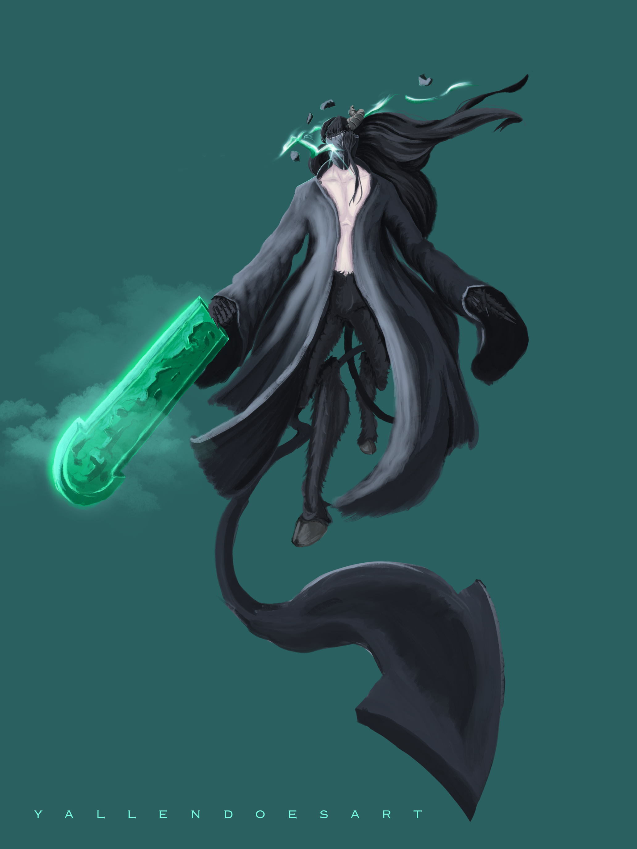
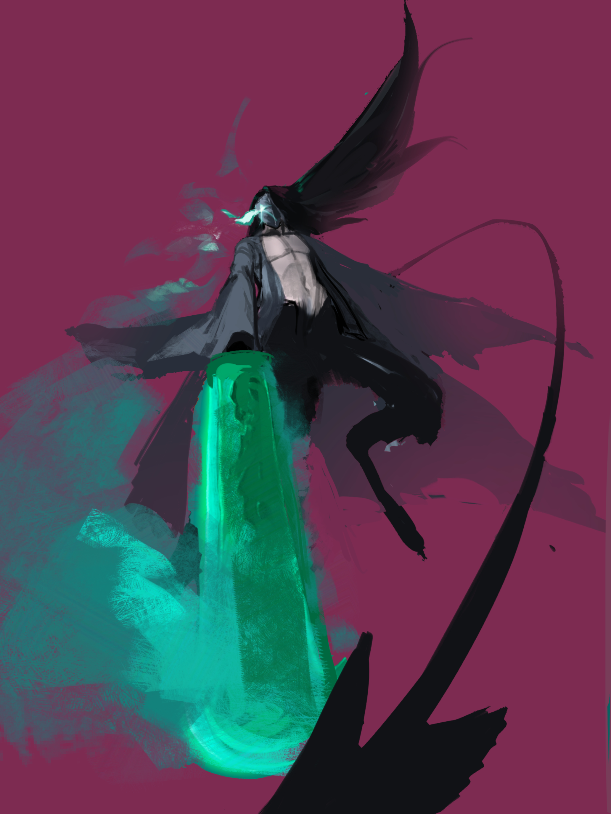
That is a super cool design! I love the sword. I also like that you're trying to add 3 dimensionality with the tail, that was a really good idea that could've been applied throughout the image to push the dynamism. -For example, I changed it so that his sword was also coming at us and was more centered to really lead the eye toward your character. I noticed that you did have a sort of triangular compositon with the arms, robe, and sword all angling toward his face so I just pushed that further. I spread his legs to make him wider on the bottom, billowed out his robe, and his hair follows through the curve of the smoke coming off his sword. All elements in a drawing should be doing everything they can to enchance the focal point! Another change I made was to the background colour. By changing it to a red/pink that the green really pops out. If you ever want to make something green really stand out then use a red and vice versa. I think the last thing was I simplified all the shapes. You should think about shape design when drawing in your elements like the robe, hair, and even the whisps of light coming from his mask can have shape design applied to them. And easy way to do this is to break down an object into a big, medium, and small shapes. You should simplify everything that isn't the direct focal point. Focus on putting small shapes and areas of hight contrast where you want your viewer to look. Hope this helps!
Participez à la discussion
Inscrivez-vous pour donner votre avis sur cette œuvre.