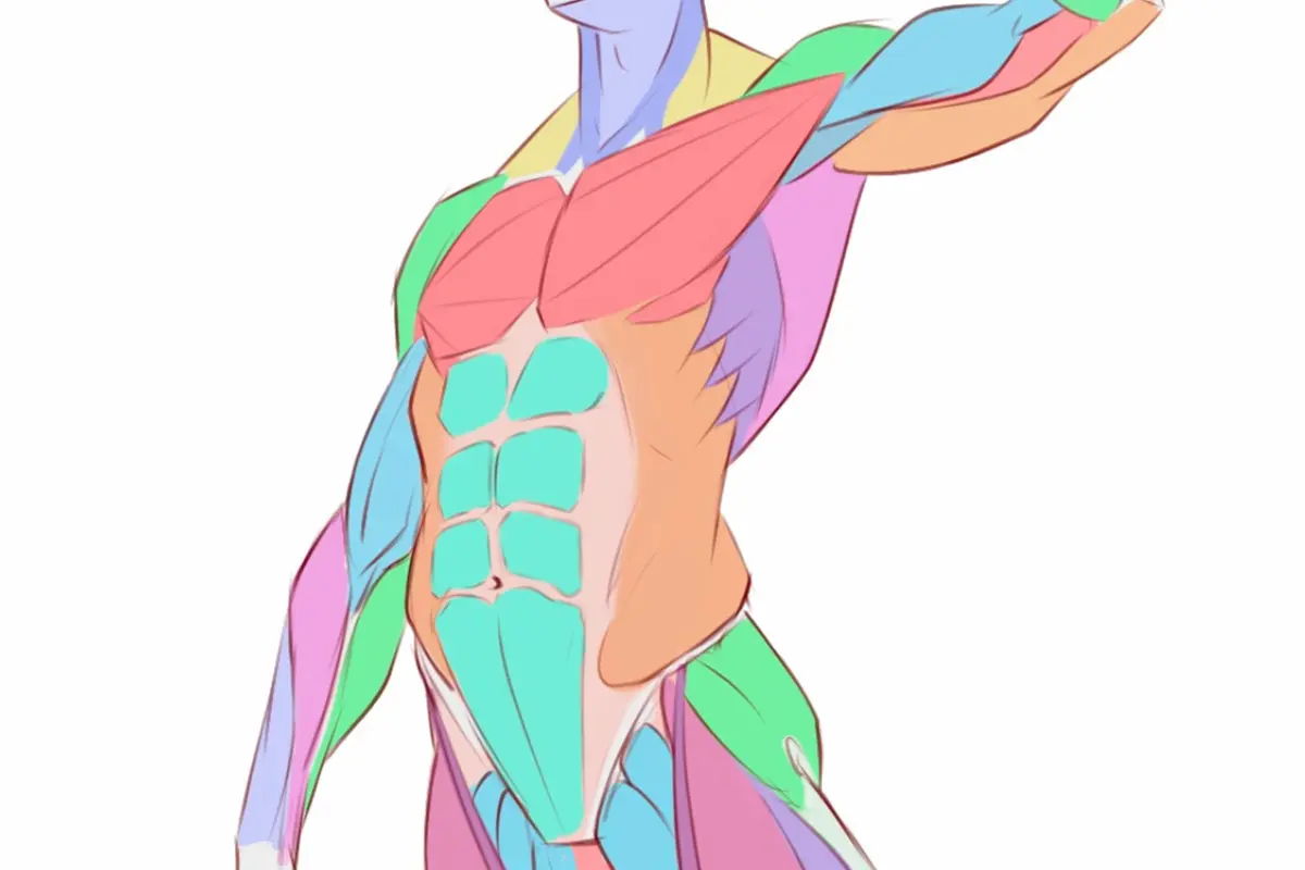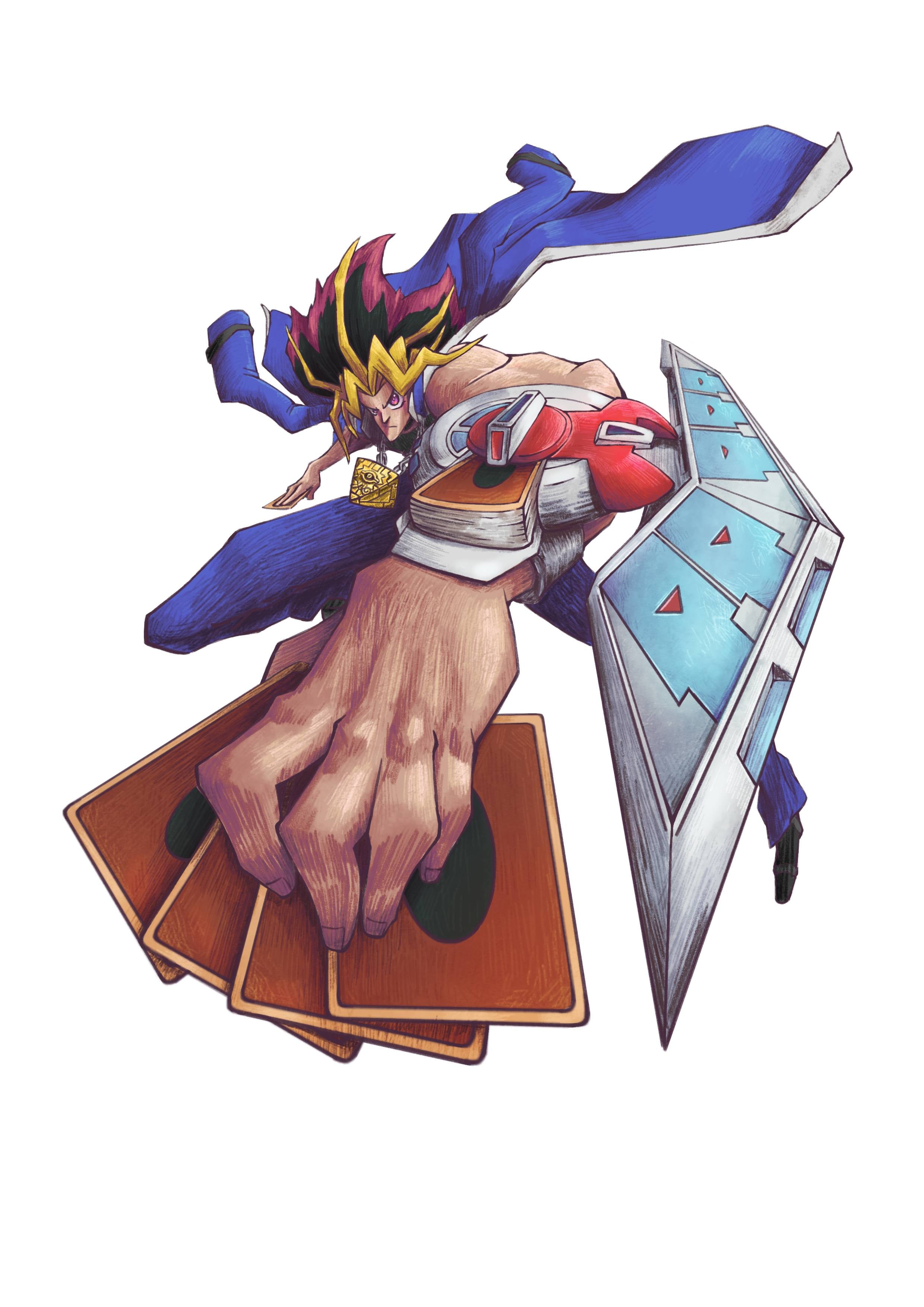
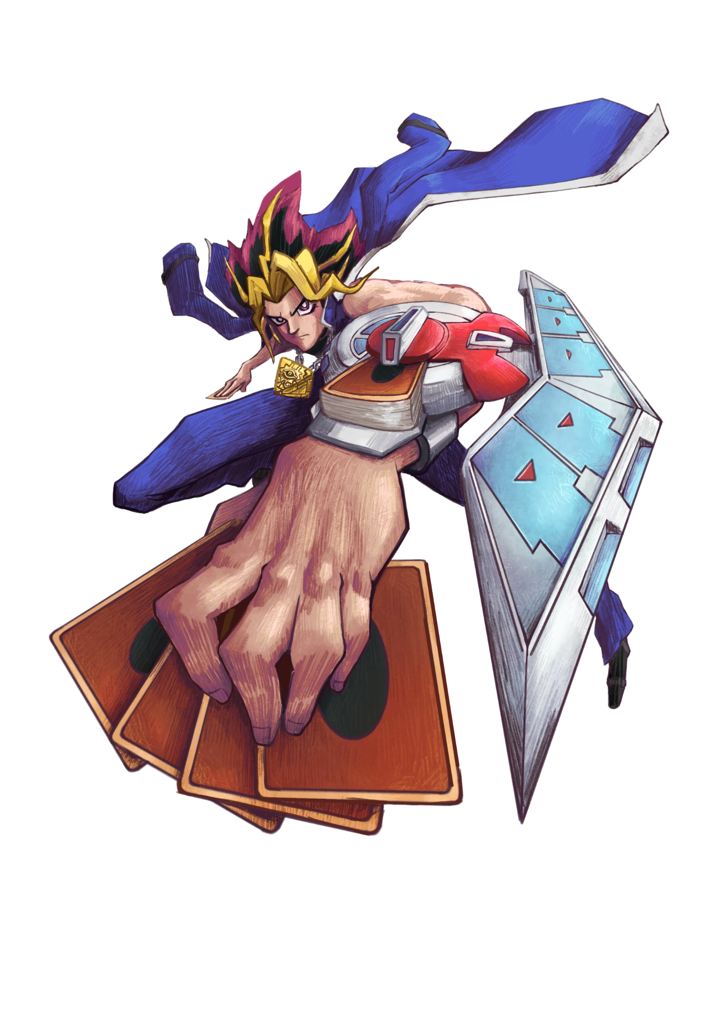
Your foreshortening is so good! And I love how you rendered that hand. It looks great! I think maybe the values could have a bit higher constrast and the head is a bit small but it's a really good piece. I think the biggest thing you could do to improve it would be to be mindful of your lineart colour. I noticed that you used dark purpleish colour to line everything in the drawing even when it clashed with a darker value area. This is most noticeable on his bent leg. The line gets really lost in the shadow there. I think the line art should be a darker value and a tone that compliments the colours used otherwise is can make it look muddy. This also happens in the desk of cards on and the duel disk itself. So for the leg I changed the line colour to a darker blue that the shadow to help it and did that in a few other random places. Of course I think this needs to be applied everywhere. Another thing I noticed is that you're hatching isn't correct in some areas and I think it's because you didn't understand the form that you were working on. Hatching should always follow the form of an object unless you're trying to push that area out of focus. It's a really cool drawing and your style is very cool!
Participez à la discussion
Inscrivez-vous pour donner votre avis sur cette œuvre.