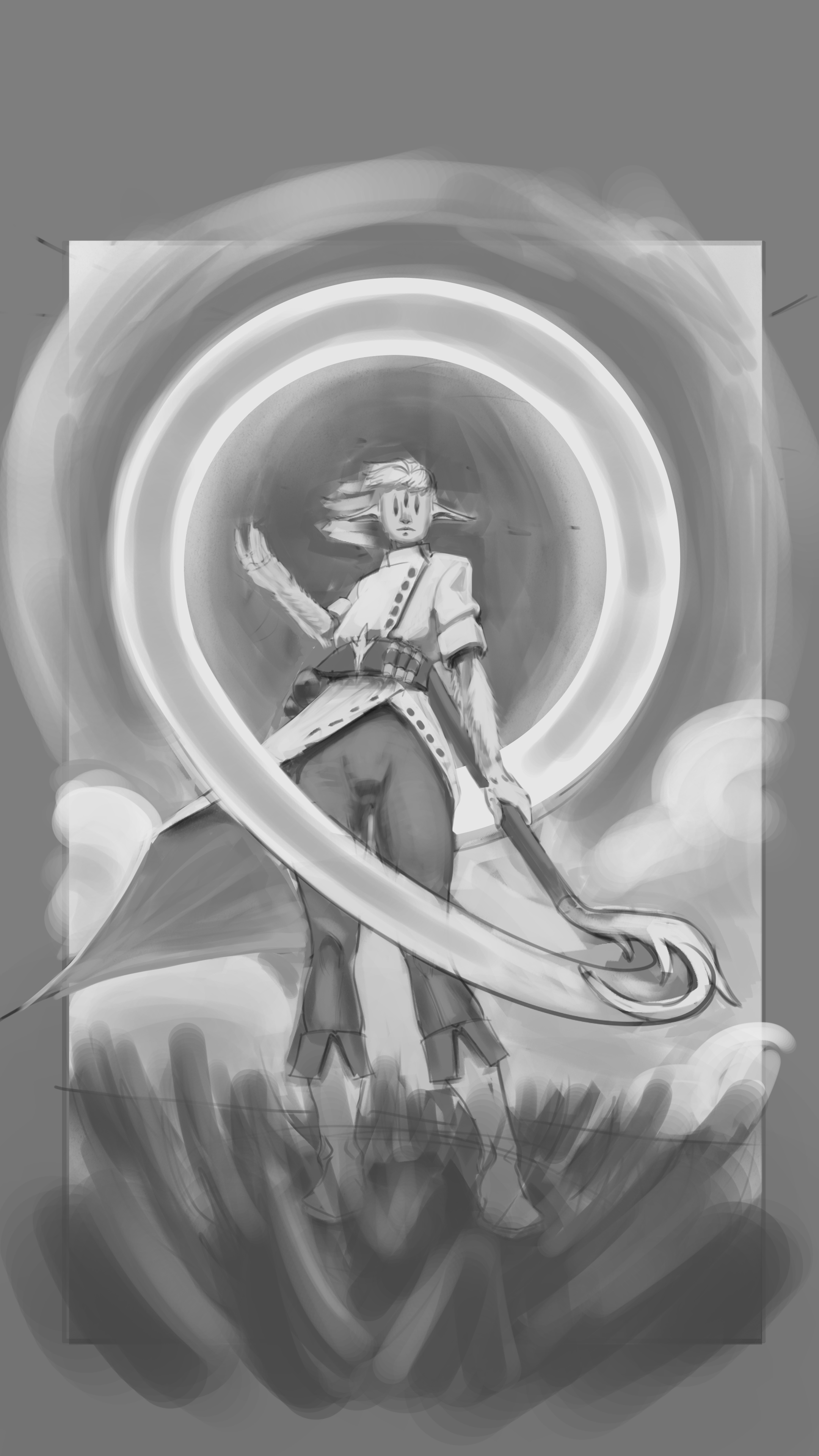
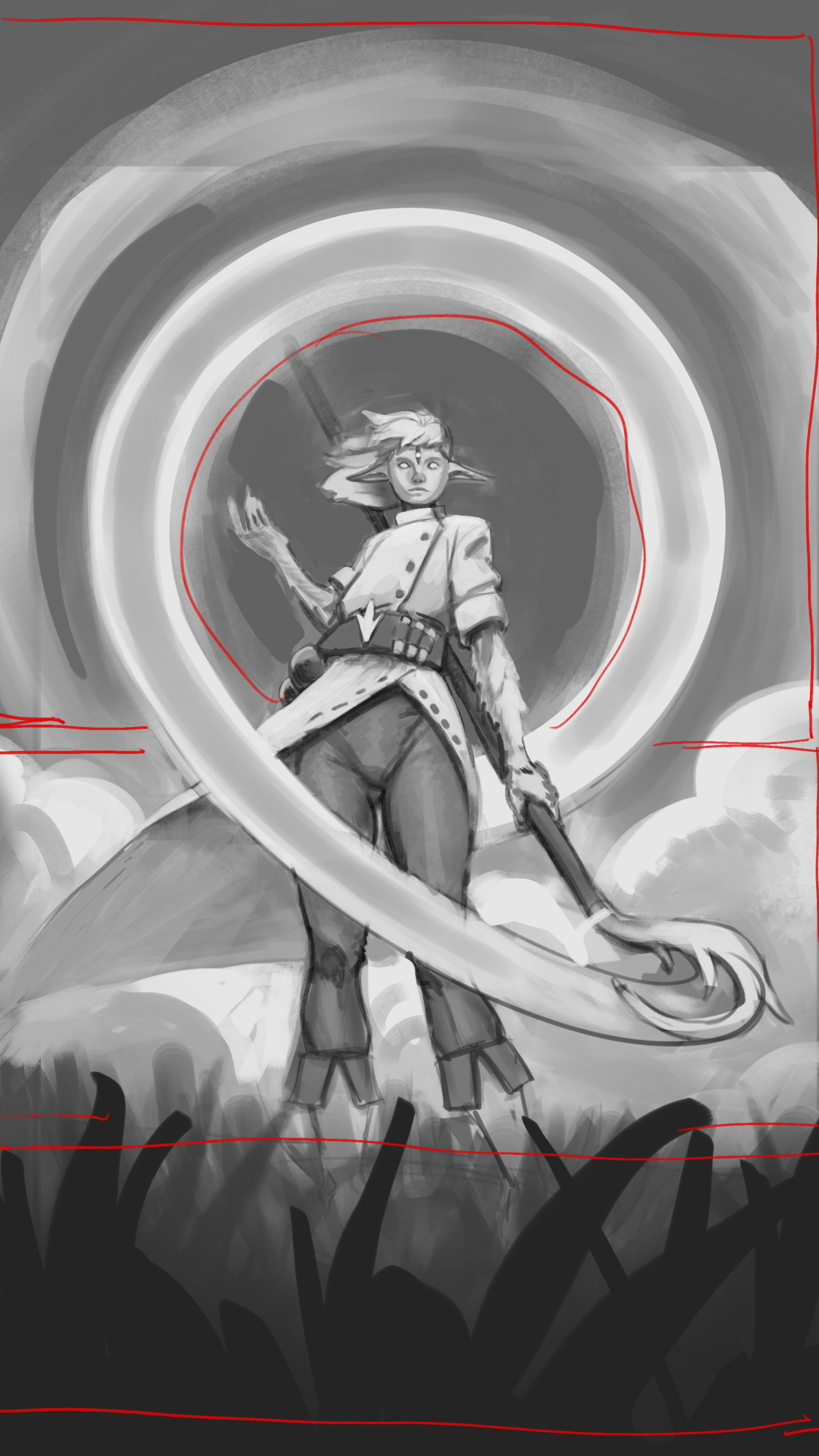
What a cool piece! The character is really cool! Something that might help you is to think more about how your values are focusing the viewers eye. -The character is the focal point and you've done a good job of using your evironmental elements to frame them, but you values are all very much in the medium grey range and there are areas that are competing with your character for attention. -For example, push the dark value of the sky so it contrasts with the light values of the character's robe push the light values of the clouds so that it contrasts with their dark pants. -Remove unnecessary light values or areas of detail and contrast if they are drawing too much attention. A place where this happens in your piece is the grass. You have lots of light values in there that creates unnecessary detail and draws attention. I went ahead and blended it all together into one value and further framed the character by painting in some foreground grass in a darker value. (notice how I only used one value!) -Objects in the foreground will usually have a dark value than those of the midground and background. -I also extended the staff as another element to draw the eye to the characters face. -Add contrast where you want your viewer to look. I added higher contrast to the face to draw the eye there. (I did change the face just to help me understand the planes better. I noticed you didn't have much there and i think it's because you didn't understand how the skull changed with those long 3 eyes. You should draw your character's skull and work out how their face would work logically to help you render it in the future.) In short, learn to manipulate areas of light and dark so that they layer on top of each other to emphasize the parts that you want to showcase. You're very good and I look forward to seeing you improve!
Participez à la discussion
Inscrivez-vous pour donner votre avis sur cette œuvre.