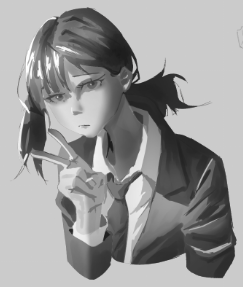
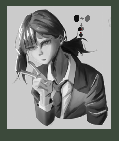
I think you're doing great, good work! and you're definitely on the right track! you're lacking a consistent core shadow in your values (darkest shadow) and some areas where that shadow is normally applied it's missing, and adding darker values will really help indicate form and make the drawing/painting more readable, the same goes for highlights and light I did a quick paintover but not much just to show how light and shadow will help indicate form through darker values and i could've gone much darker in many areas, especially around the suit and hair there's plenty of room to add darker values there especially around the face and neck area you'll see how much of an impact it makes to have darker shadows and distributing light more intentionally, hope this helps you! just use it as a general rule of thumb going forward, have a "core shadow" a "mid tone" and a "light value" and then working from those you can basically get any effects you want, bounce light, diffusion of light depending on how far away the light source is, and getting values from in-between is something you get through blending 2 values to get a third value and more this way you'll always work from values that always ensure good contrast i recommend going back and looking at tutorials and guides for rendering spheres with value, and looking up each term in depth, getting familiar with them all and that should make it a lot easier to apply when doing studies or renders in general!
Participez à la discussion
Inscrivez-vous pour donner votre avis sur cette œuvre.