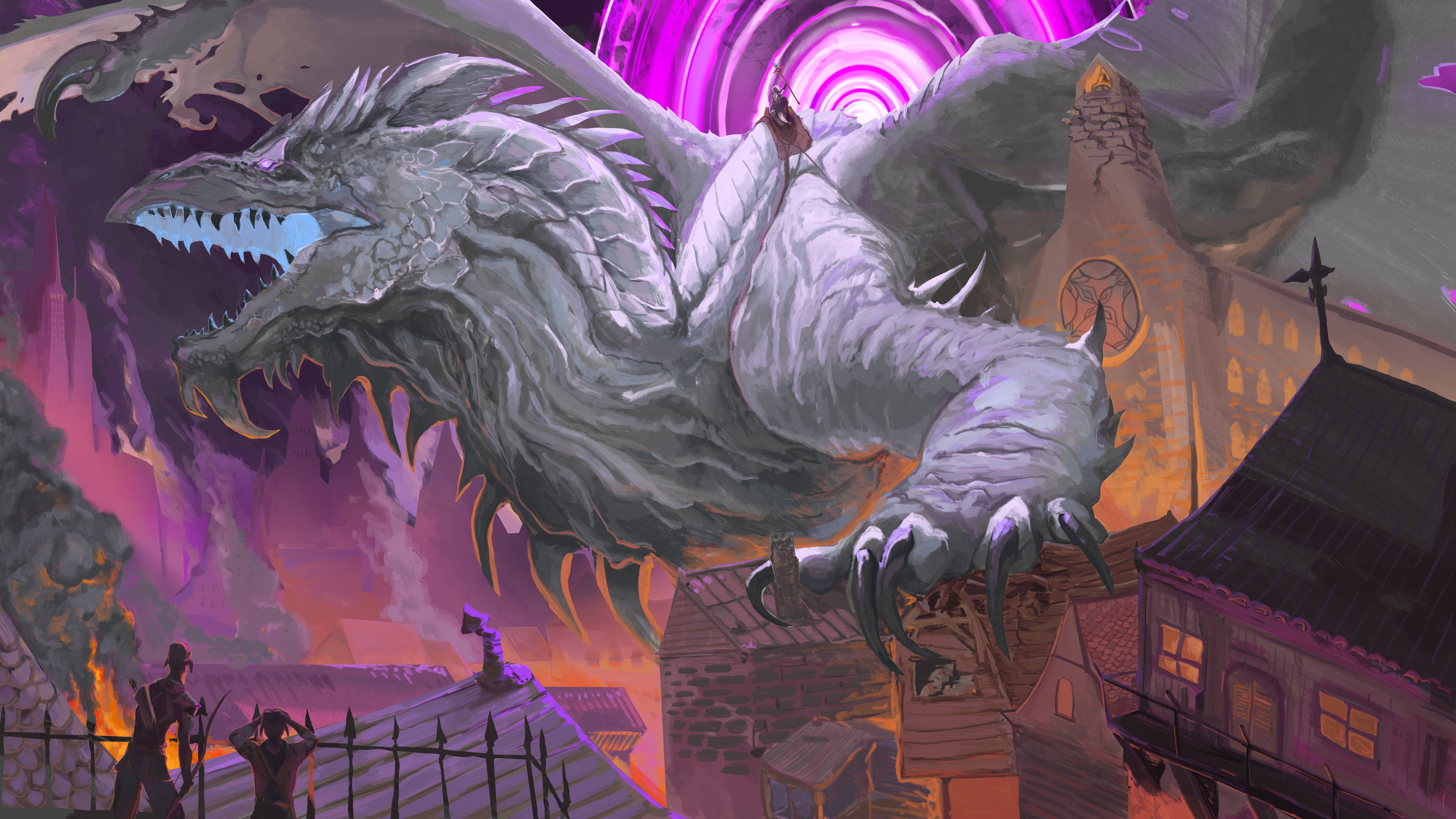
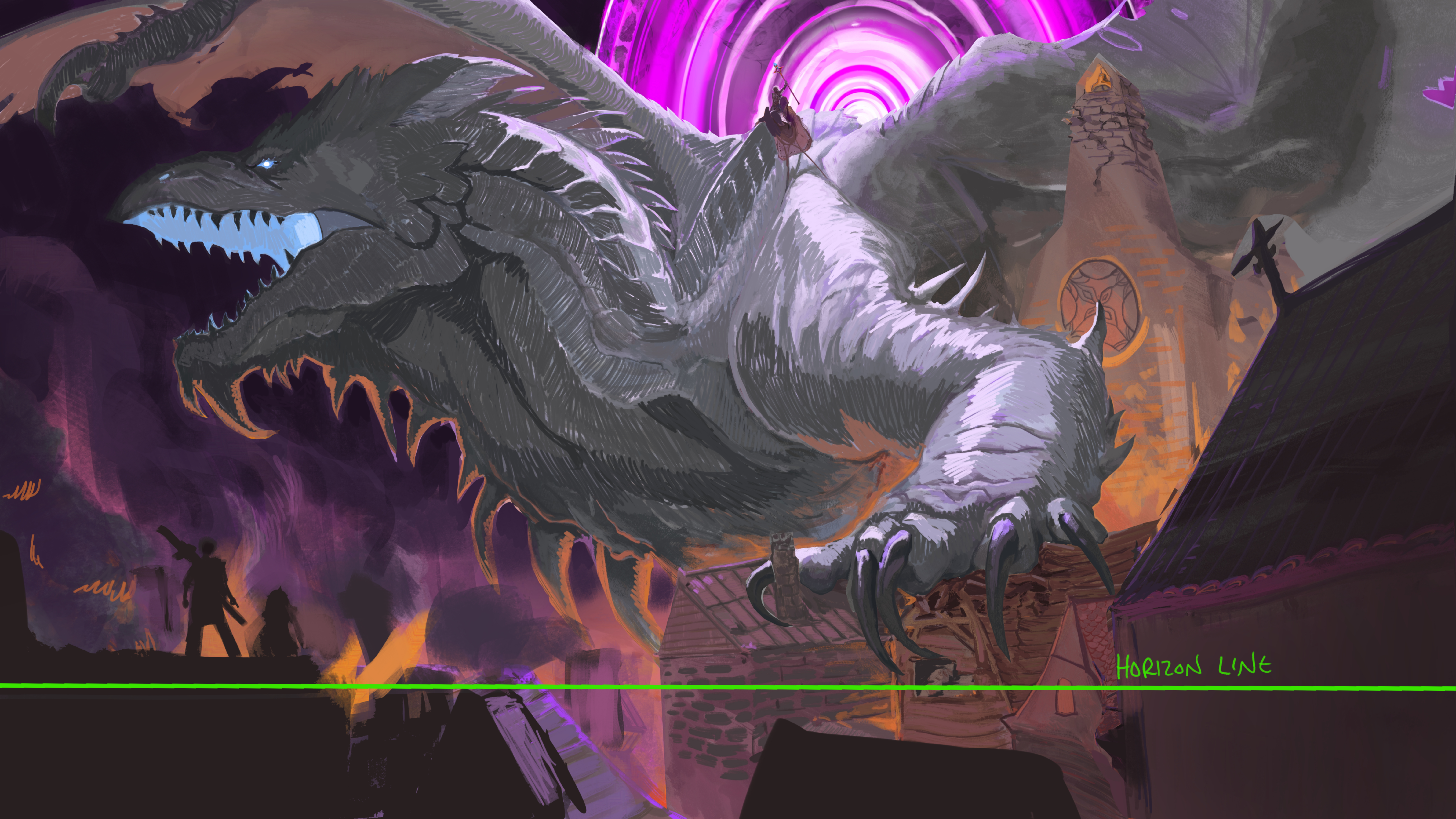
Wow your art is crazy! I wasn't sure it was worth critiquing bc anything I say will be minor but I'll try to help get that last 10% you mentioned. I do agree with you that the values don't lead the eye to where you probably want the viewer to look. I think this is because you are balancing so many light sources. You have the fire in the city and the glowing mouth and the portal, it's a lot. So what I've done is push everything into shadow to balance those things out. Strong light sources will cast dark shadows and you can simply define forms relying on bounce light in some instances. I do see that you had tried to do that, but it doesn't work as well because everything in image is so bright. Usually those rims of light would help guide the eye and pop out shapes but it can't with everything being lit. There is also a lot of detail everywhere which can also draw the viewers eye away from your focal point. Any detail that is not directly enhancing the focal point should be taken out when you can. I removed a lot of the light sources like in the windows of the buildings to also remove things that could draw the eye away from the dragon and its rider. Another thing that could have improved the piece is using the environment to lead the eye toward the focal point. But to do that you might've needed to establish some perspective to believably pull off. I drew one in and quickly enlarged the building on the right to fit into the newly established perspective and used the slope of the roof to angle toward the dragon and draw the viewers eye. I also used the lighting on the dragon's arm to lead up to the rider. I also darkened the foreground to create some distance from our 2 civilian characters and made them smaller so they attracted less attention and to enhance the sense of scale and make the dragon feel like an even larger threat. Doing thumbnails before starting a piece can help with a lot of these issues! I think the last thing I did was fix some of the rendering on the dragon. Your shading and lighting of the dragon sort of indicated that you might not fully understand it's anatomy and form. There are a lot of thin lines and random colours and textures that flatten his form so I simplified it and really focused on following the contours of his head and arm. I noticed that you framed his face nicely with the dark sky and I pushed that further to give it the little bit extra it needed to pop. I hope this helps you in future illustrations. You're already a cut above a lot of artists out there for sure!
Participez à la discussion
Inscrivez-vous pour donner votre avis sur cette œuvre.