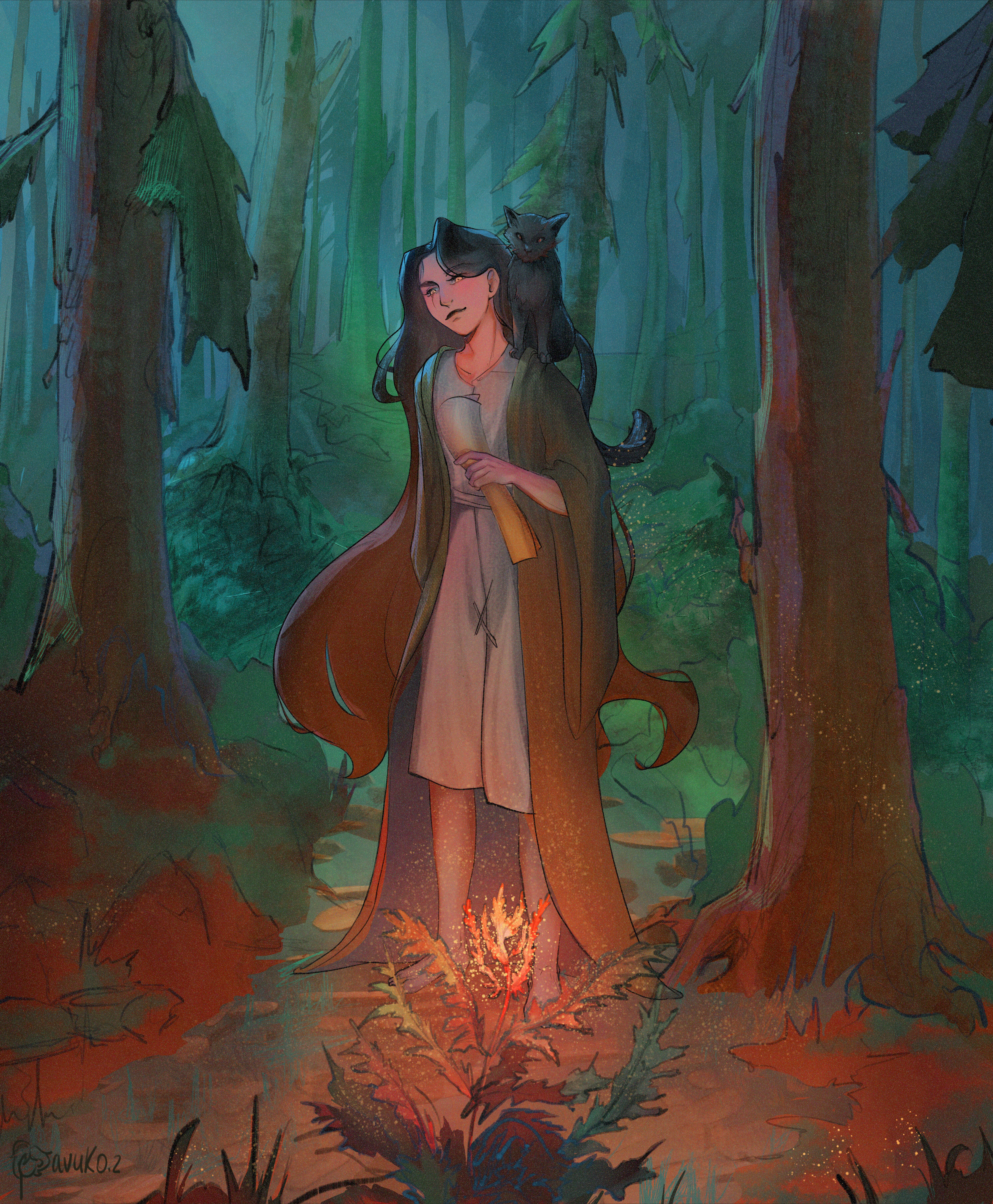
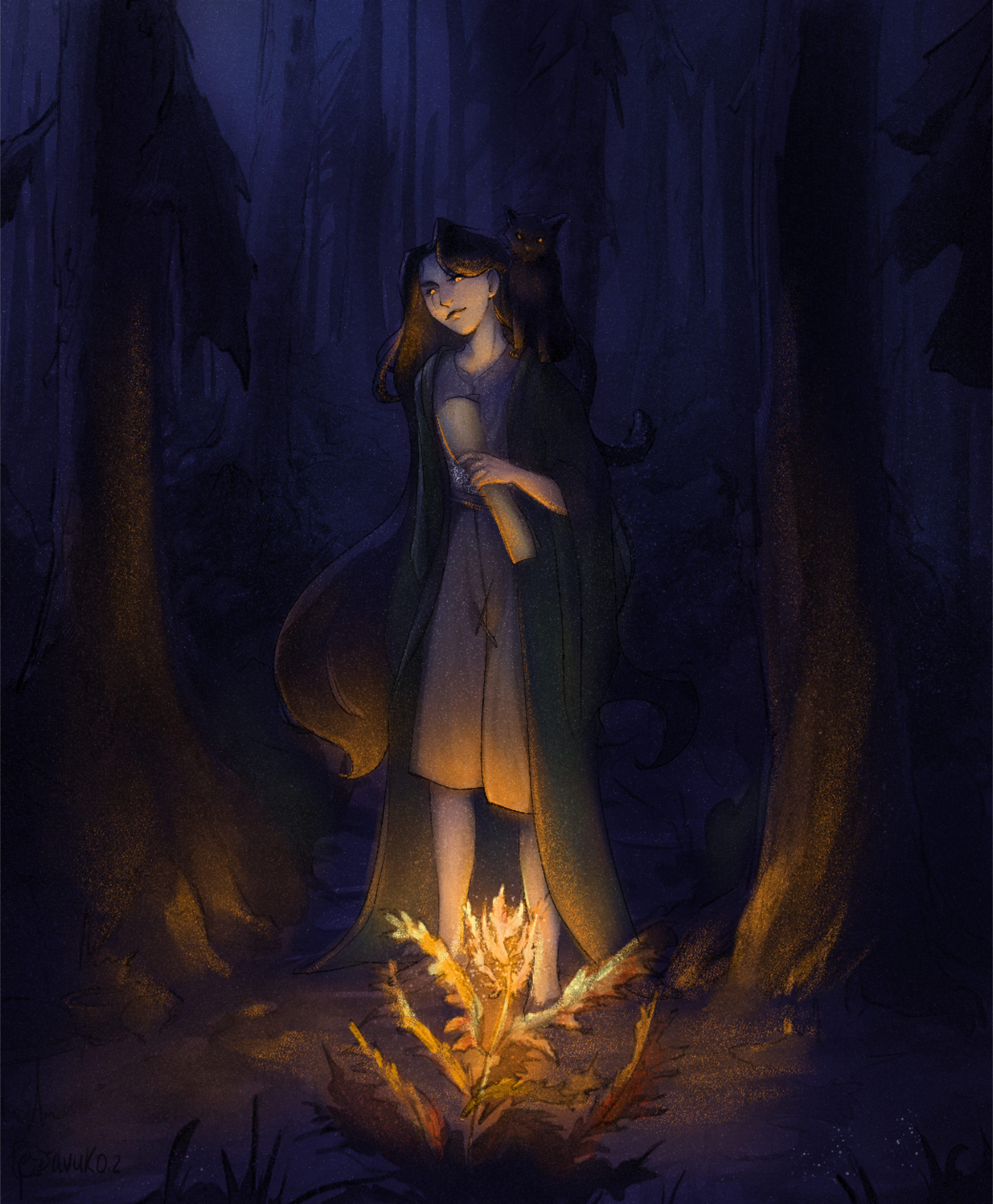
I hope this helps, and sorry it took me a while... Firstly, when you are painting you are painting light, and as such you must first understand how light works. When you are painting night-time scenes you must determine what the light source is, if there is moonlight if there is a campfire, candle or something else. In this case you have a fire-flower. Its glow looks like a campfire. so you will light the surroundings according to the rules of campfire light. Secondly, light has something called 'Light-falloff' (do look this up its hella important) but in a nutshell it's how light behaves when you place a subject closer and farther away from light. This means there is a point by which the fire flower's light will 'fall-off' and darkness will be dominant. It also affects how sharp the cast shadows are as well. another thing is that light tells you what color something is. Its because of our ability to see light why we perceive colors. And depending on the intensity of said light it will affect the intensity of the color we are looking at. This is why leaves and trees look like dark blobs at night because there isn't enough luminescence to light them which is why I place a bit of green on the plants by the feet of your character and why the cloak which was originally green still looks green if not a little desaturated. Also, I didn't change any of your brush strokes all I did was remove the colors you had and added them back on a separate layer so you can see the difference. I advise you to do more experiments with light and color. Happy Painting. <3
Participez à la discussion
Inscrivez-vous pour donner votre avis sur cette œuvre.