Dibuja con más de 100 000 alumnos
DESBLOQUEE EL CURRÍCULO ARTWOOD
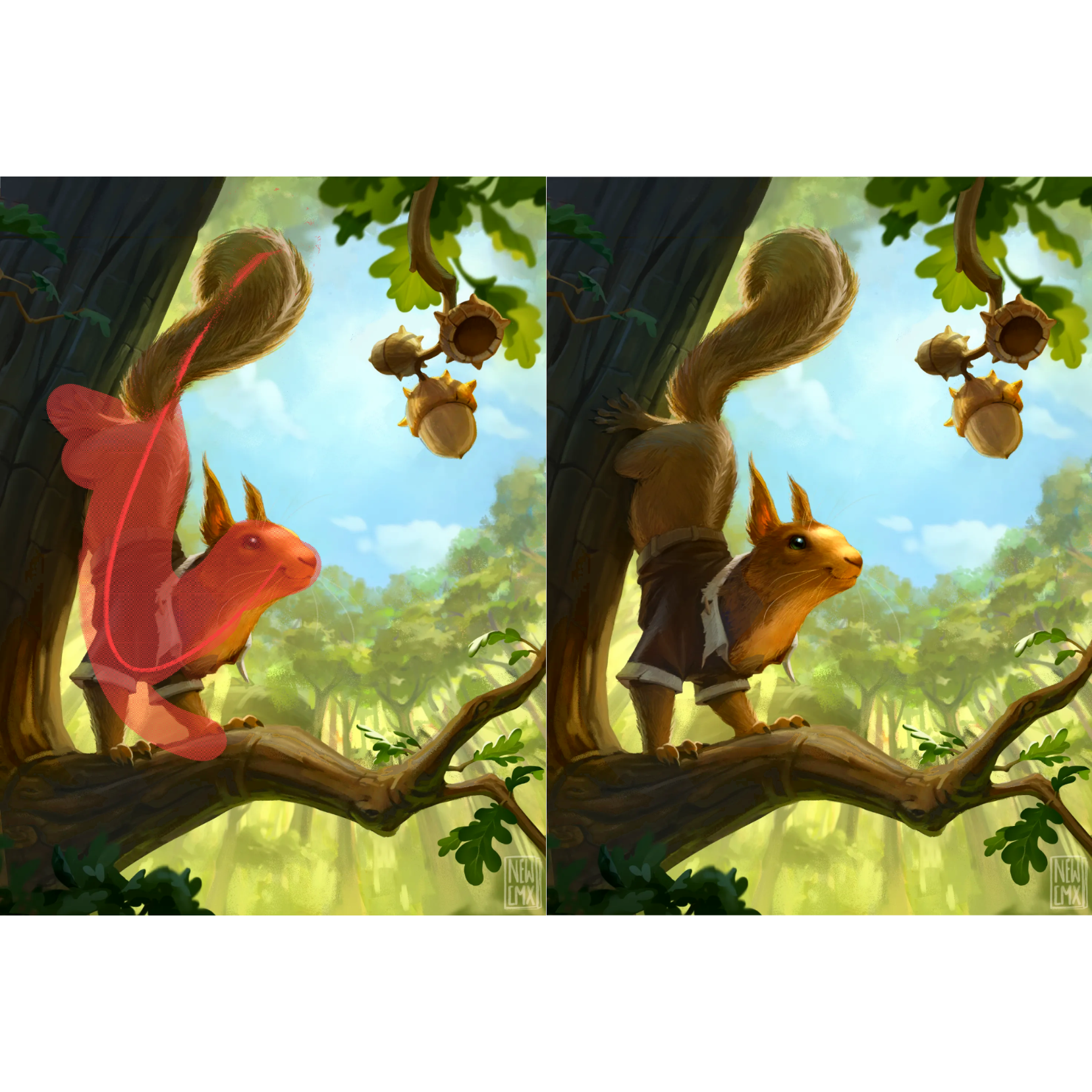
Artwod está aquí para guiarte durante todo el proceso de dibujo para que nunca estés solo y nunca te sientas atrapado. Recibe comentarios instantáneos sobre tus tareas de dibujo para aprender de tus errores y mejorar más rápido
Empieza a aprender