Looks very good
Pinturas (1)
Comenta 2

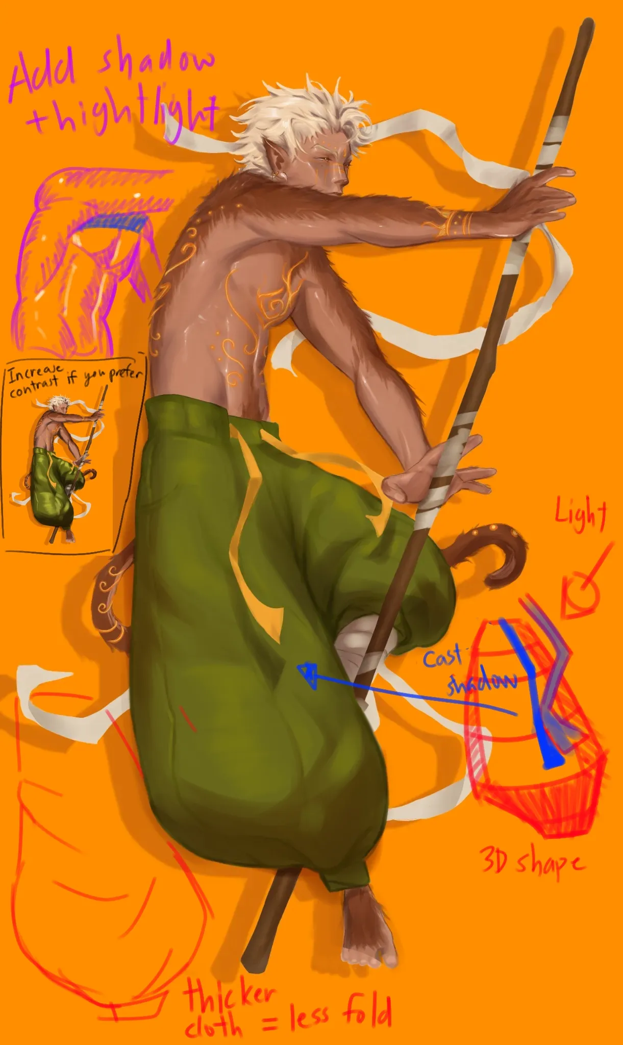
I think what you have right now is pretty solid. The pants look fine to me, you just need to think of it in 3D from and space and make parts that is facing away from the light darker. For the folds, what you have looks decent since it looks like the pants is made of a thicker material which just creates less folds. I would just recommend adding darker shadows, adding more highlights and be try to add more cast shadows with harder edges. I tried make it less contrast because it seems like that's what you are going for but if you want something more readable, just increase the contrast of light and shadow.

Thank you, you saved my life here!! I had totally forgot about shadows, guess i need to remember checking my values too because now i see it looks very flat🤕
Responder a @ caos
One more thing. Turn the background to red. Not too much saturated. Red is complimentary to green. And it won't mixup with the orange inscriptions on your character.
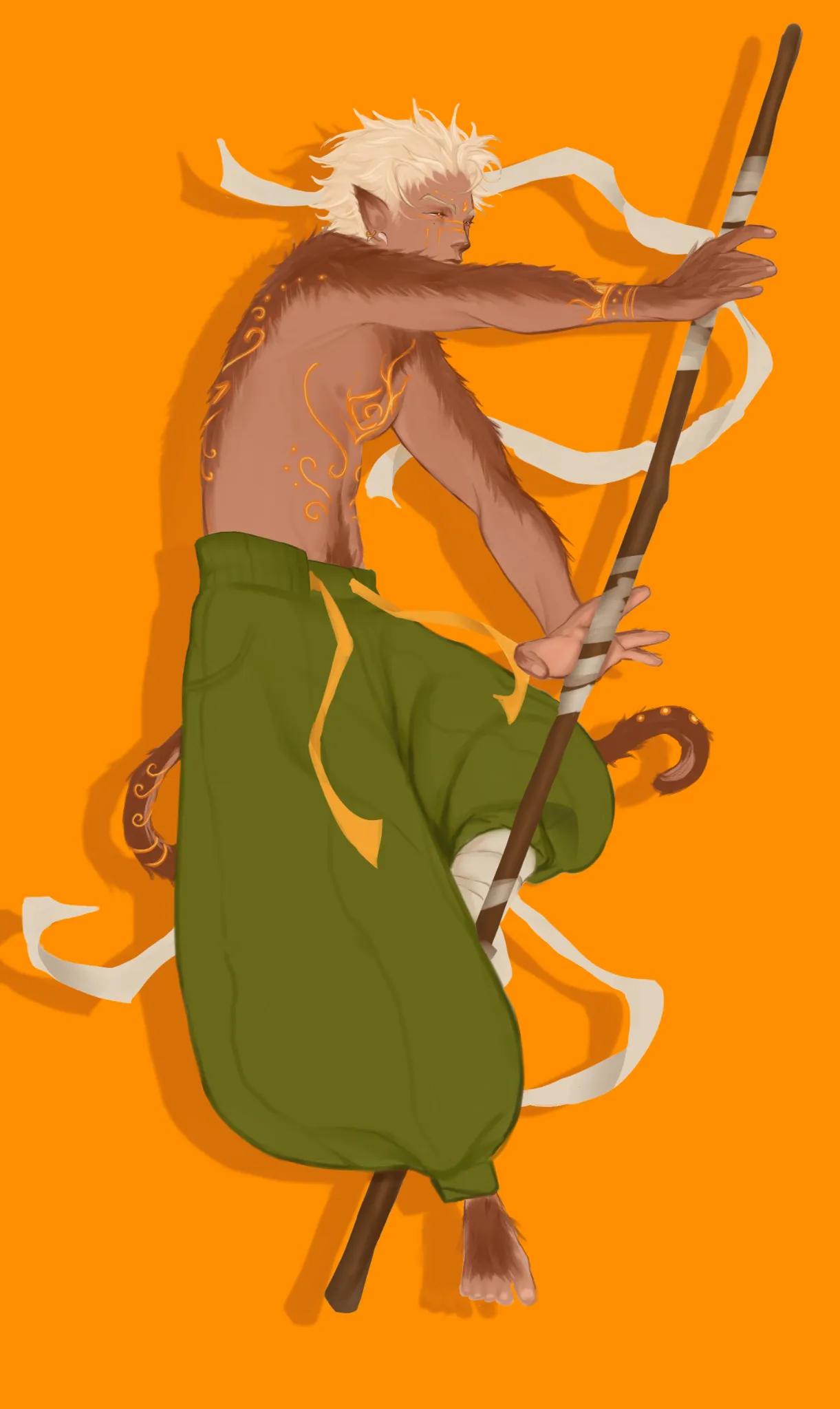
Big pants
Notas de autor:
I tried a more simple paint style, the fur on him its not the best thing ever but i like it anyways, but im having a struggle with the pants, i dont think the rendering matches the rest and the folds look wrong, overall it looks boring and flat to me
11