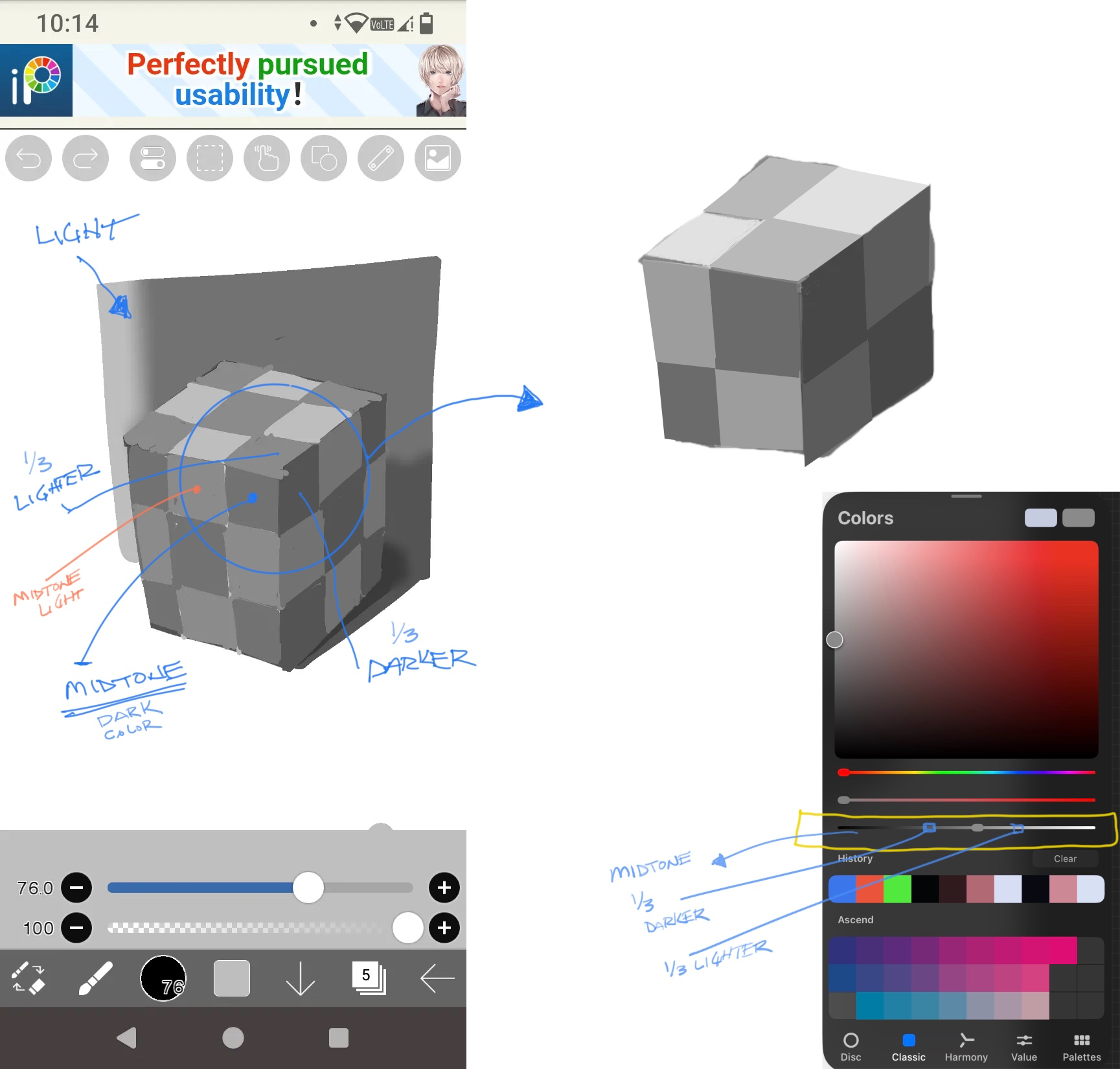


As a rule of thumb here I usually will pick a midtone grey(this case you’d need a midtone dark square, and midtone light square) the midtone is where the light is not direct and not in shadow. I then use the darkness and lightness slider to choose an approx. 1/3 lighter color from that midtone to choose the direct light color and again the 1/3 darker from midtone for the shadow color. This is just something I use to start with and usually wil eyeball from there. This should get you in the ballpark at least for good value changes. Play around with this and see what you get, the idea is to make sure you have enough contrast between the 3 values(light, midtone, and shadow. Hope this helps.
Pinturas (1)
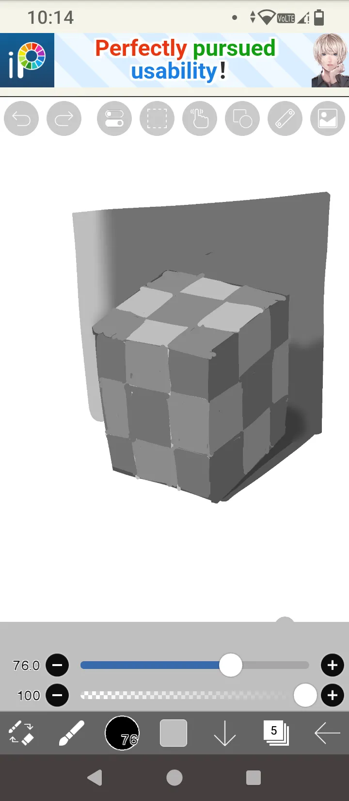
Studying value organization with that one checkered optical Illusion.
Notas de autor:
I find myself overthinking if the values are light or dark enough. God help me if i have to start coloring.