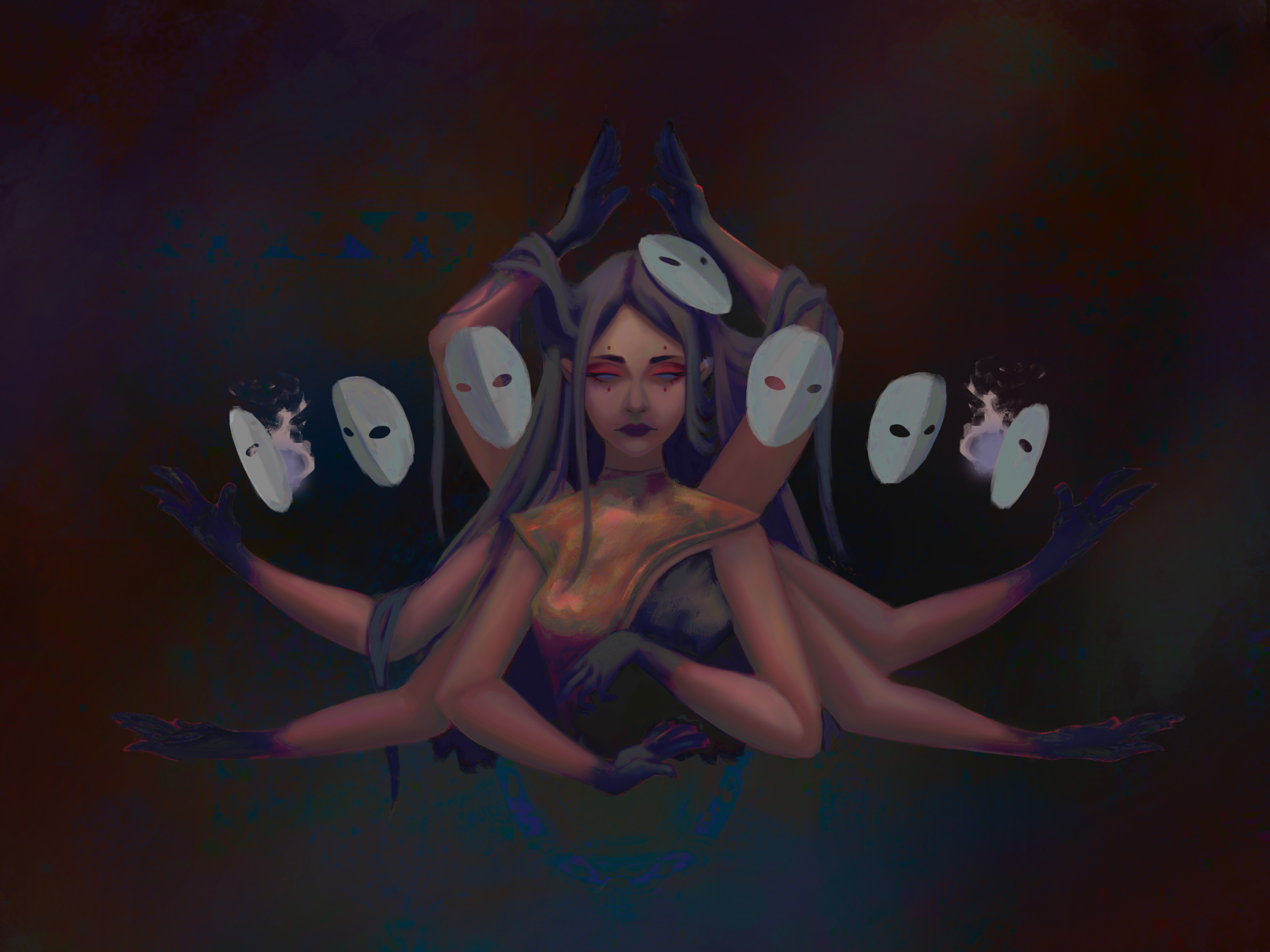
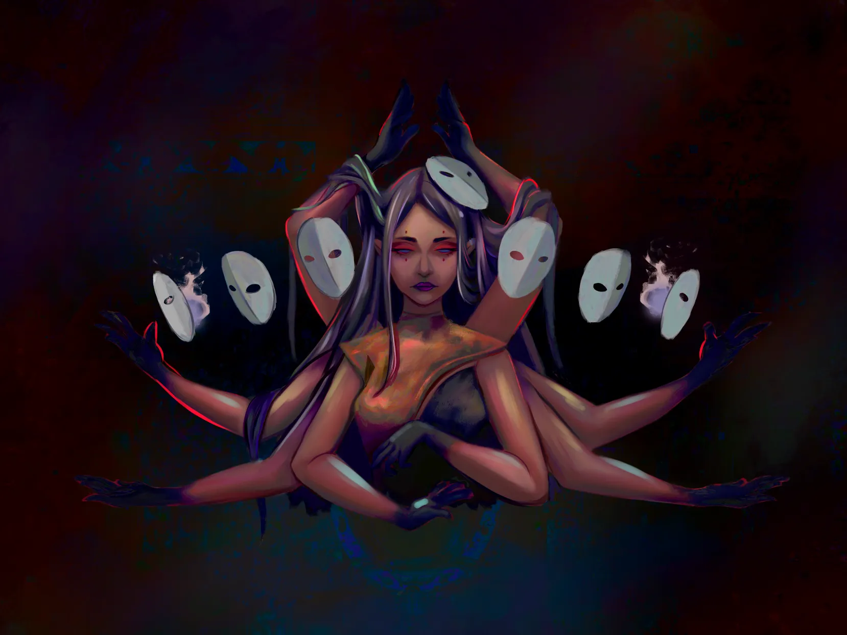

The issue I noticed wasn't necessarily the color pallette itself, but the lack of contrast. Don't be afraid to make the places that are deep in shadow super dark and the highlights brighter! I also played around with the brightness/contrast correction layer in my art program. To check contrast, I recommend putting a solid black layer over the whole piece and setting it to color to see which colors you need to darken and which ones to lighten. You got this!
Oh I see what you mean; that’s already more striking! Thank you so much, I’m going to implement this right away. :)