¿Quieres guardar tu opinión?
Regístrate para guardar todos tus comentarios en tu cuenta. Tu opinión será privada y no pública.
Pinturas
Notas Paintover
Elige una pintura
Elige un avatar de usuario para ver sus notas y comentarlas.
También lucha con renderización?
Mejora tu control de sombra y luz, leer 3 min
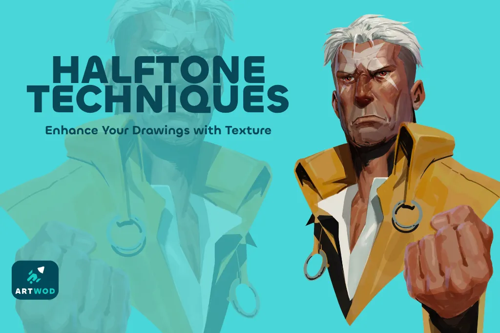
Halftone Techniques: Adding Texture and Depth to Your Artwork
Master halftones by establishing shapes, volumes, and shadows first, then practicing on beans, noses, portraits, and posters to add texture and depth to your artwork.
Rendering
¿Quieres ayudar a alguien que sigue esperando?
Portraits
Aún no responde
Face
Rate this
Hace 3 horas
Ver
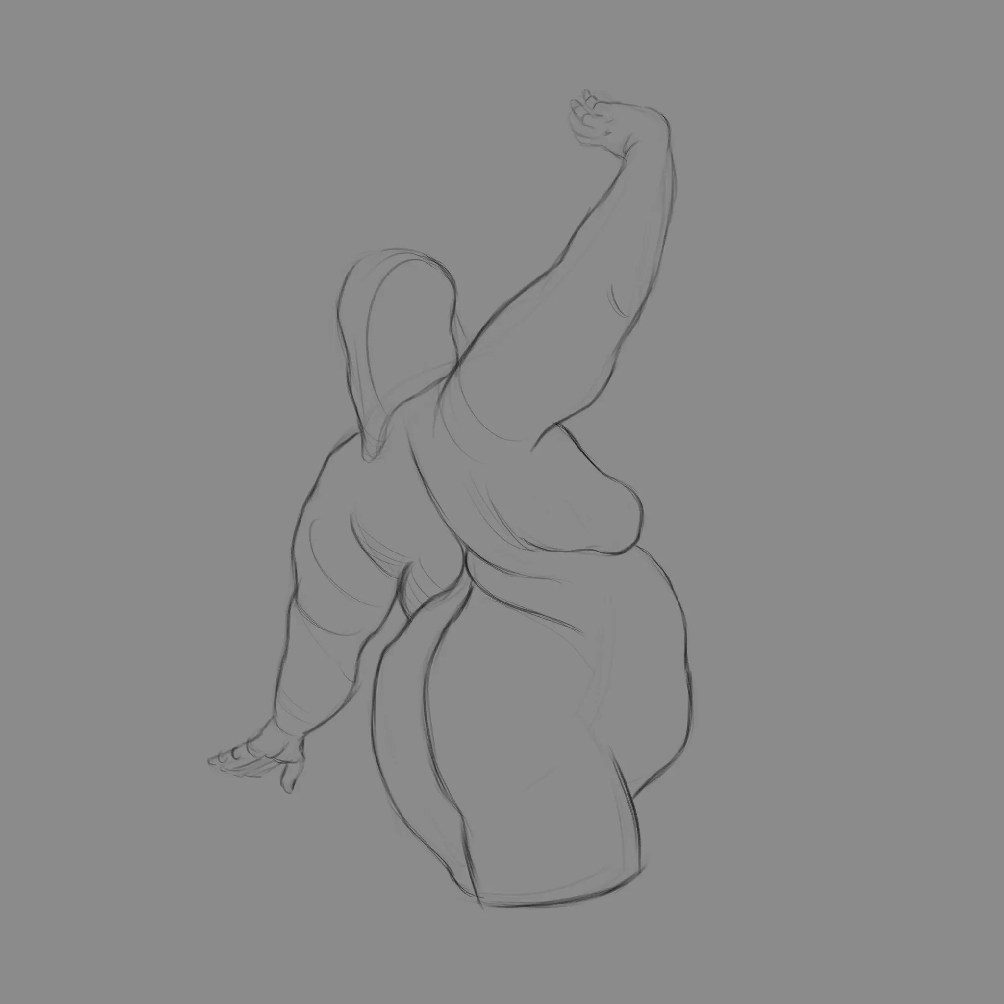
Figure
Aún no responde
Morpho reference
Lately I have been studying Morpho's Books. Zero panting knowledge here. How would do a rough hatching for lighting and shadow areas? Thank you
Hace 5 horas
Ver
Rendering
Aún no responde
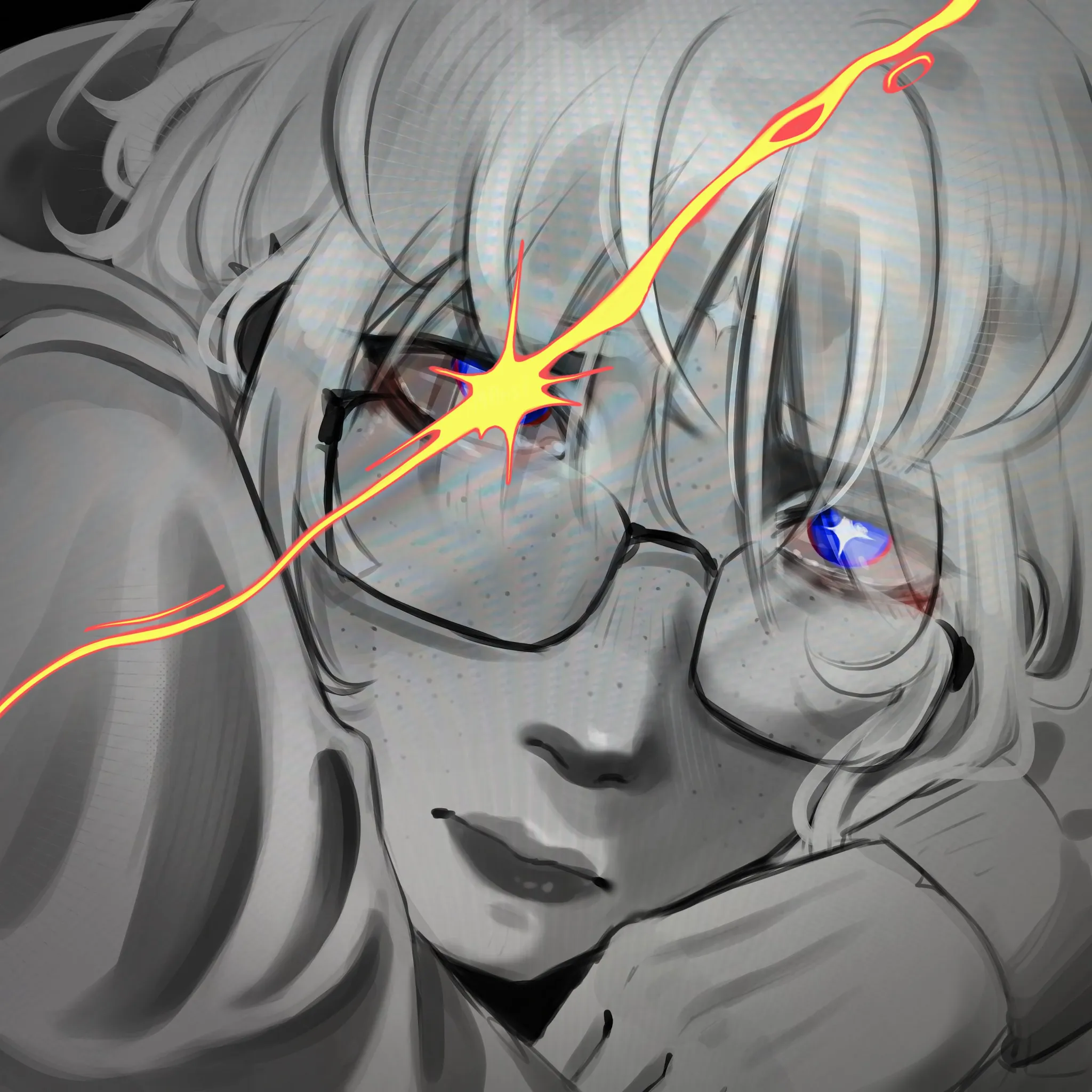
An avatar for a channel with my OС
I think there's a complete lack of contrast here. Everything just blends together. I'm really afraid of harsh, dark shadows :(
Hace 5 horas
Ver
Anatomy
Aún no responde
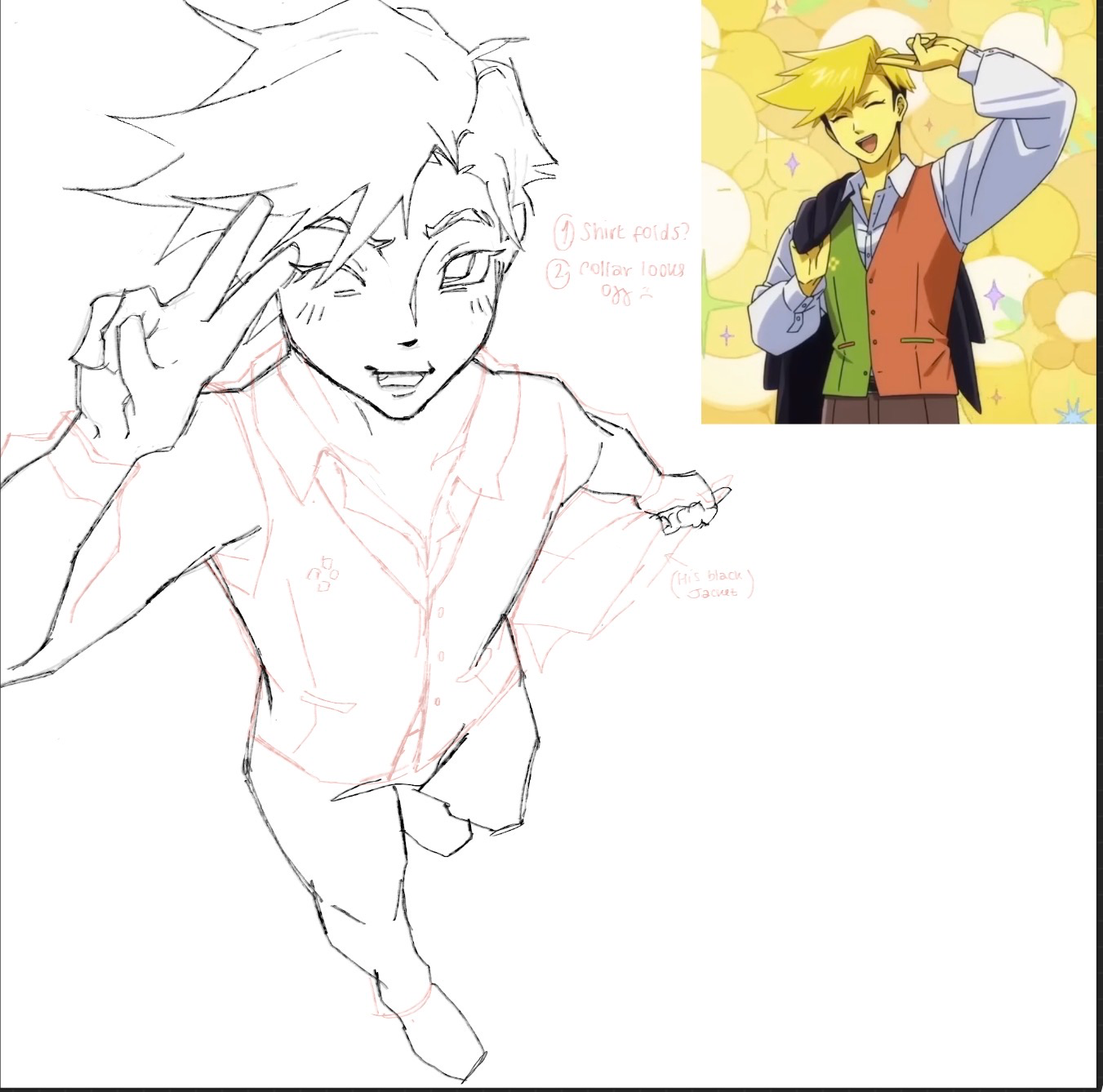
Flowery fanart
I can’t for the life of me figure out how to draw his clothes, folds and everything with the right perspective, (The red line art is where I tried but it still looks off) I also need help with the overall anatomy Pls
Hace 5 horas
Ver
Anatomy
Aún no responde
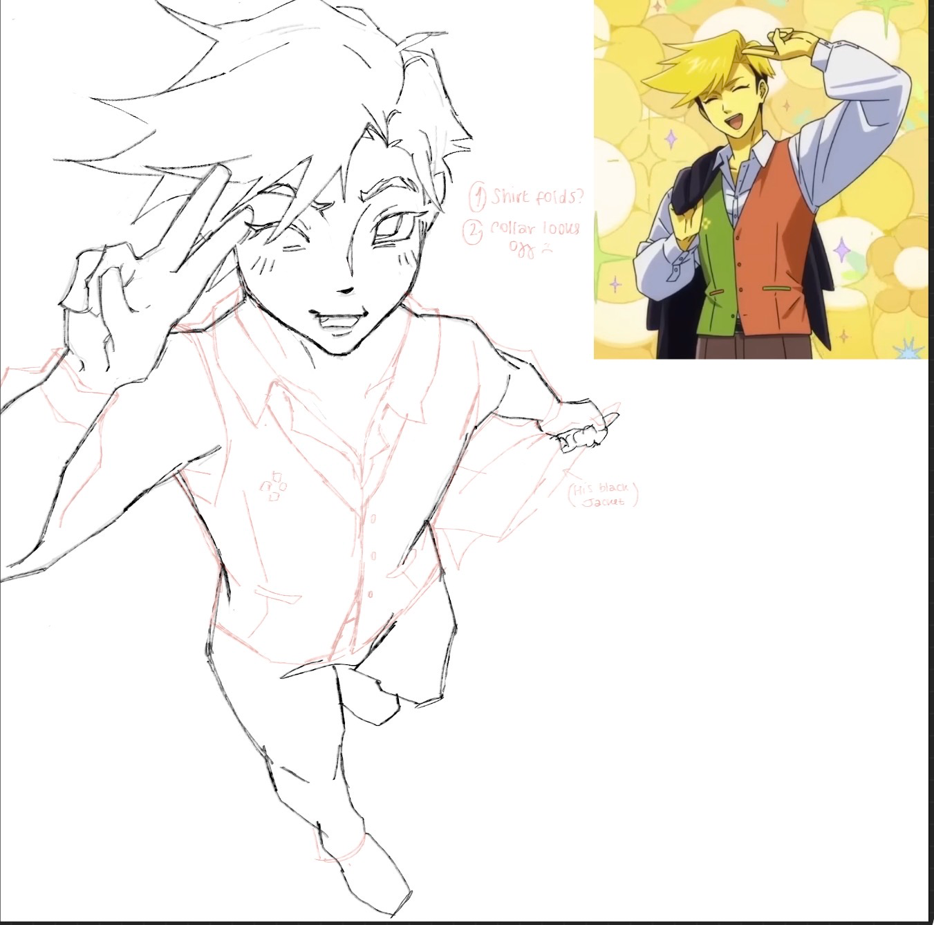
Flowery fanart
I can’t for the life of me figure out how to draw his clothes, folds and everything with the right perspective, (The red line art is where I tried but it still looks off) I also need help with the overall anatomy Pls
Hace 5 horas
Ver
Environment
Aún no responde
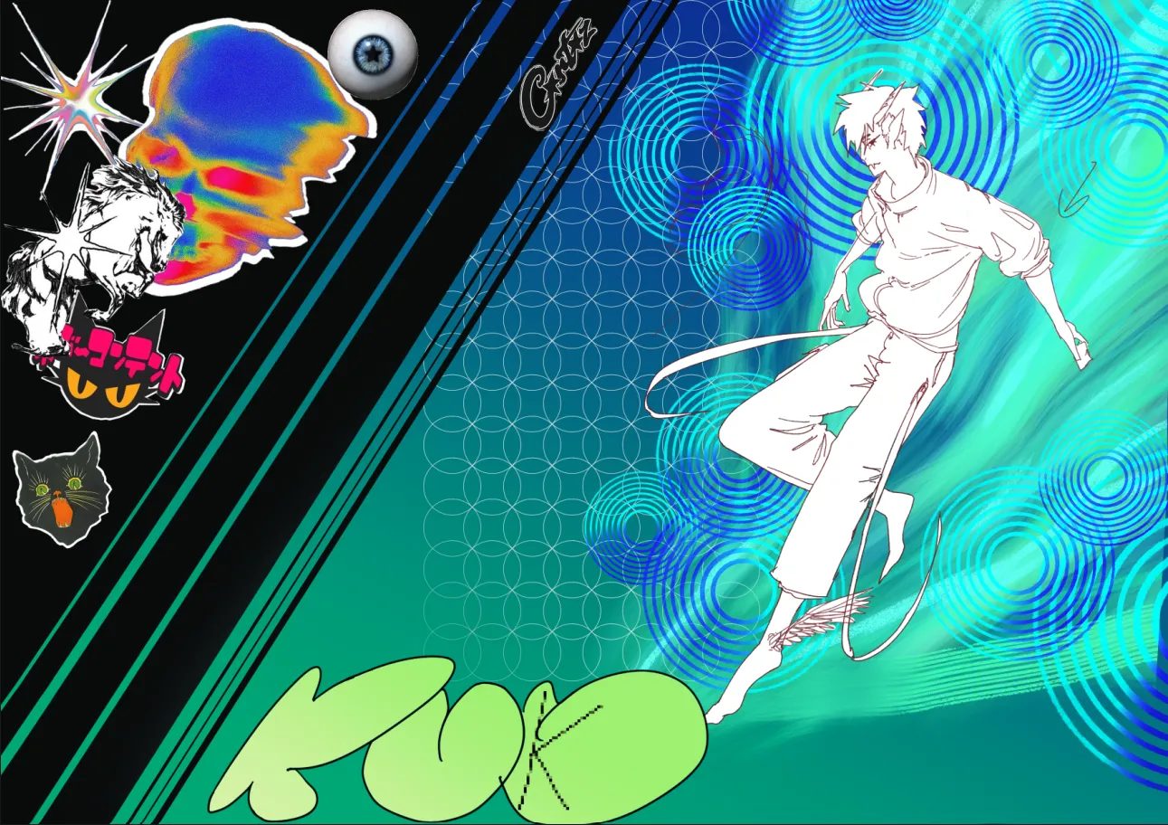
WIP composition
I'm working on a character illustration and i cant help but feel that the composition and hierarchy is all over the place, if someone can correct me or refer me to some sources wich i could look up to better my art i would be really thankful
Hace 6 horas
Ver
Perspective and Form
Aún no responde
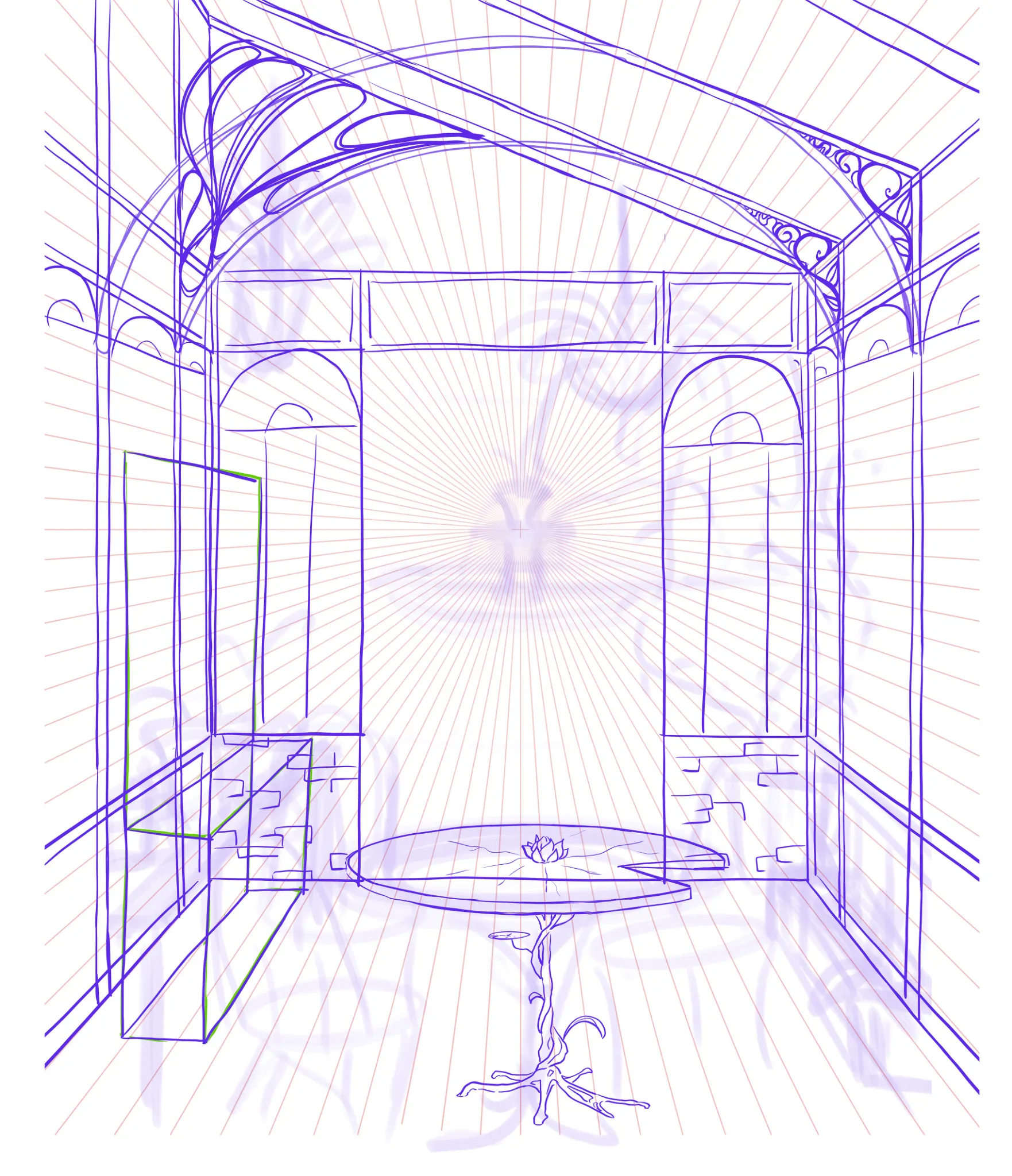
Green house
Hi, I'm working on a green house project but i have a hard time figuring out the perspective. Should i put a second (or even third) vanishing point? And Where should i put it so that it make sens? You can kinda see what kind of perspective i'm aiming at (i put the sketch of the crooked furnitur as a reference) Any help is appreciated
Hace 6 horas
Ver
Figure
Aún no responde
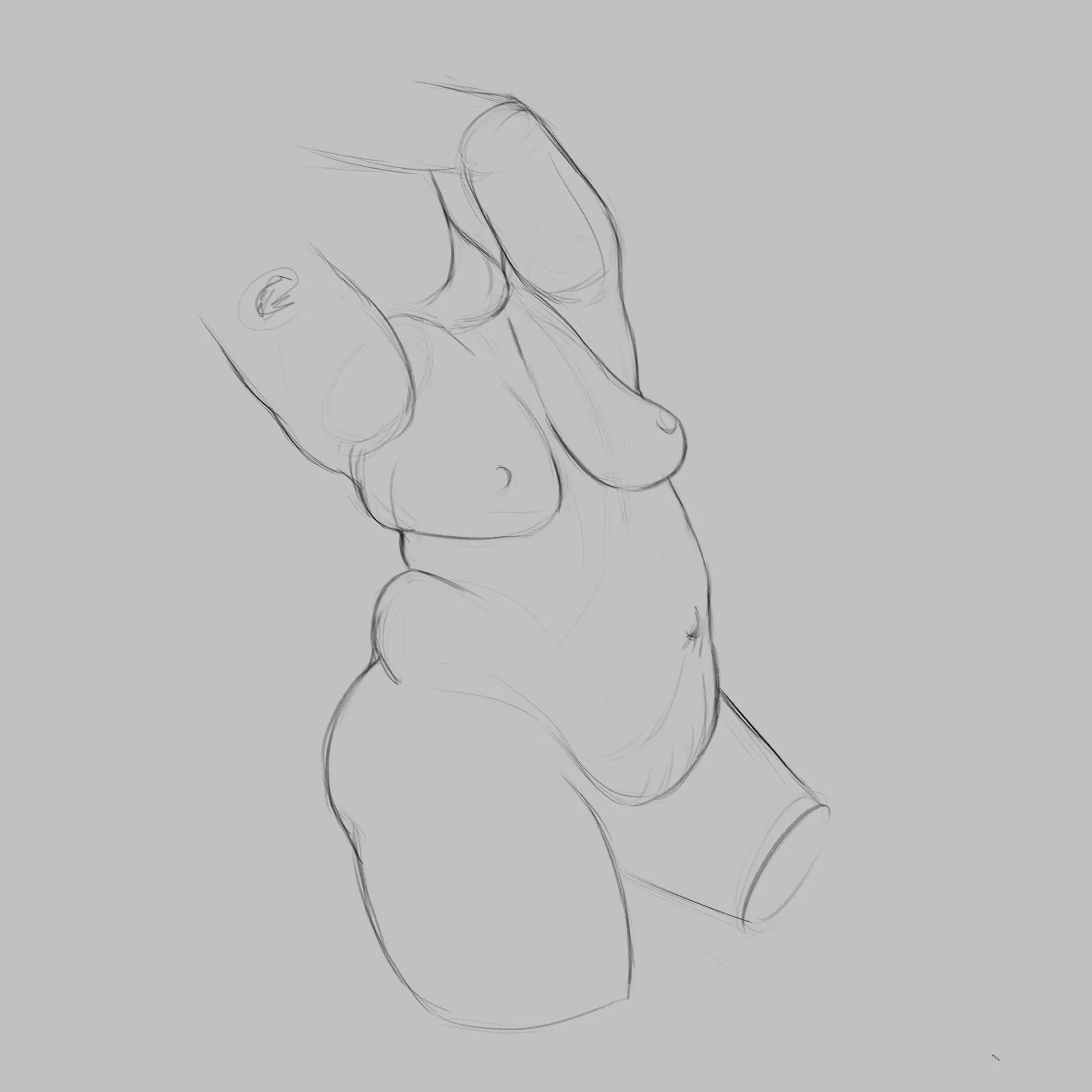
Figure
Hello community, Any feedback on how to make this figure look more 3D. I feel a bit stuck on the mannequization process, so I ended up going straight to the forms, which consequently (obviously) feels a bit flat to me. Maybe more wireframing indication? Thank you
Hace 7 horas
Ver
Perspective and Form
Aún no responde
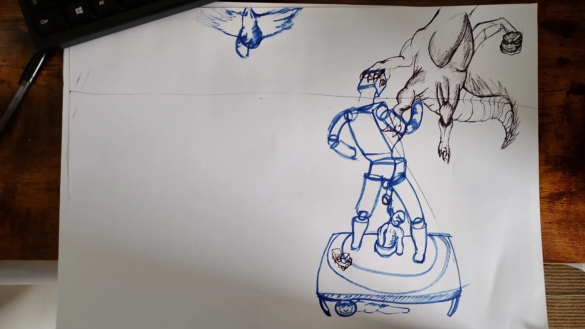
stevie
struggling to fit multiple characters in 1 scene and get the proportions right
Hace 9 horas
Ver