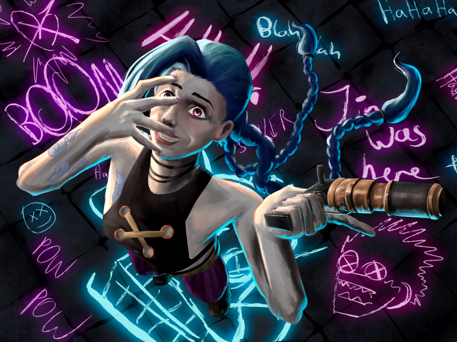
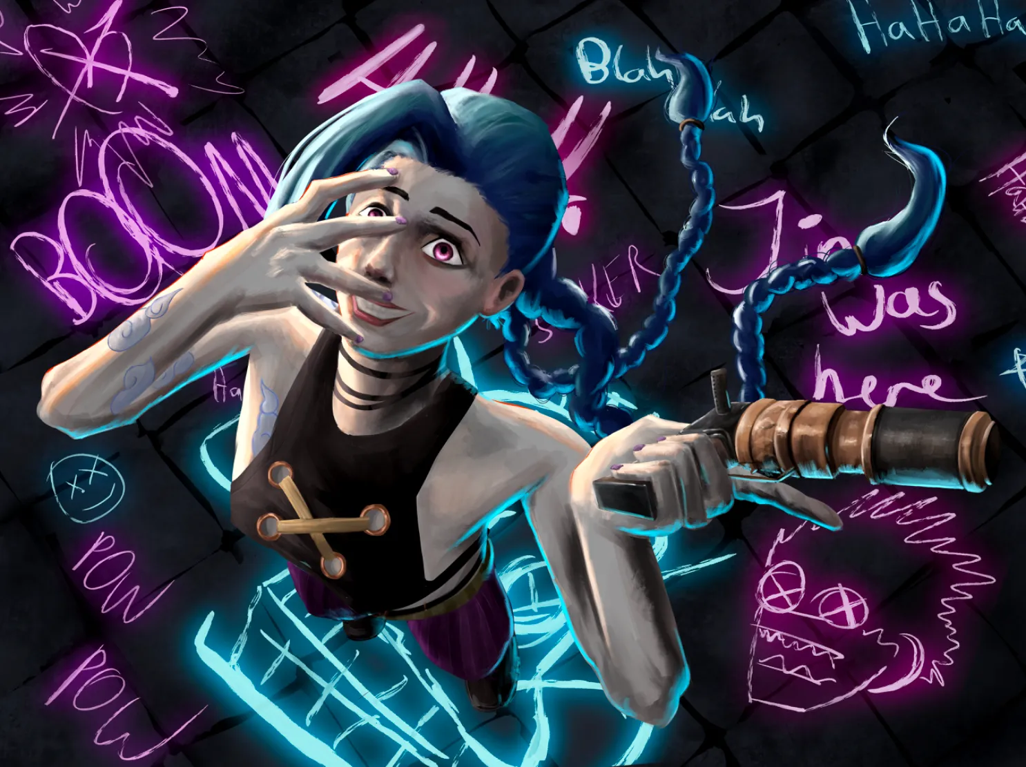
I really like the concept of this piece and I can tell you definitely put a lot of effort into it. I tried to do some overpainting. Just some stuff I did and suggest: - Increased overall saturation of the painting because it looked a bit washed out to me. - Tried to adjust the anatomy but I recommend playing around with a 3D model as reference for the pose and experiment with some camera angles and lens settings, since this is a very challenging perspective. - Reduced the intensity of the lighting on her face and increased the brightness of the blue light under her instead. - Gave it a bit of a vignette effect so the focus would be more on her, also darken her braids to push it back into the background more. - Added a layer of purple tint over her so the colours feels more cohesive. - The angle of the tiles are off for this perspective but you can fix that easily if you also use a 3D model reference for this specific angle and perspective. Overall this is a very ambitious piece so lots of references will definitely be beneficial.
Pinturas (0)
Jinx (Arcane)
Notas de autor:
Honestly. Just tell me anything, that would be good to improve the image. I do think it’s a bit cluttered, but that fits with her emotions. Any rendering, composition, lighting or any other critique is welcome.
Comenta 2
WaitAMinuteHace 1 mes
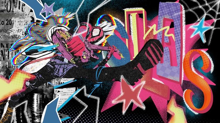
I really love the idea for this! I love Arcane, and I'm very inspired by their rendering and character design. I would recommend having the light from the floor drawing be a bit stronger and maybe treating the floor as a main light source. Having that blue light be a bit stronger to illuminate the underside of the character could really add a sense of drama. I would also recommend finding a reference for the eyes and mouth, wether its a Jinx one or a photograph that goes with your idea.
Thanks, making the floor the main light, could add a lot of drama. And I prob should have worked closer with references