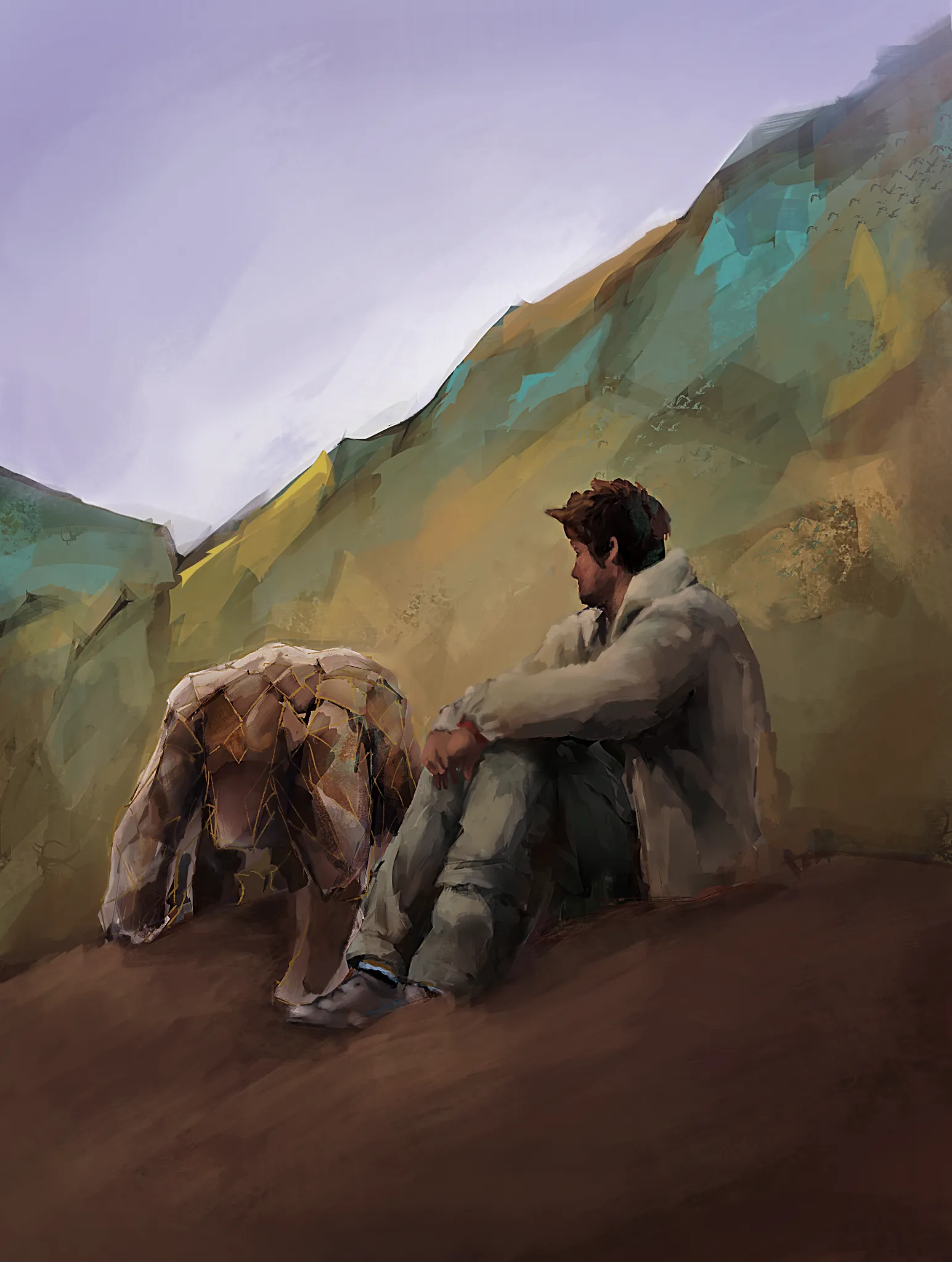
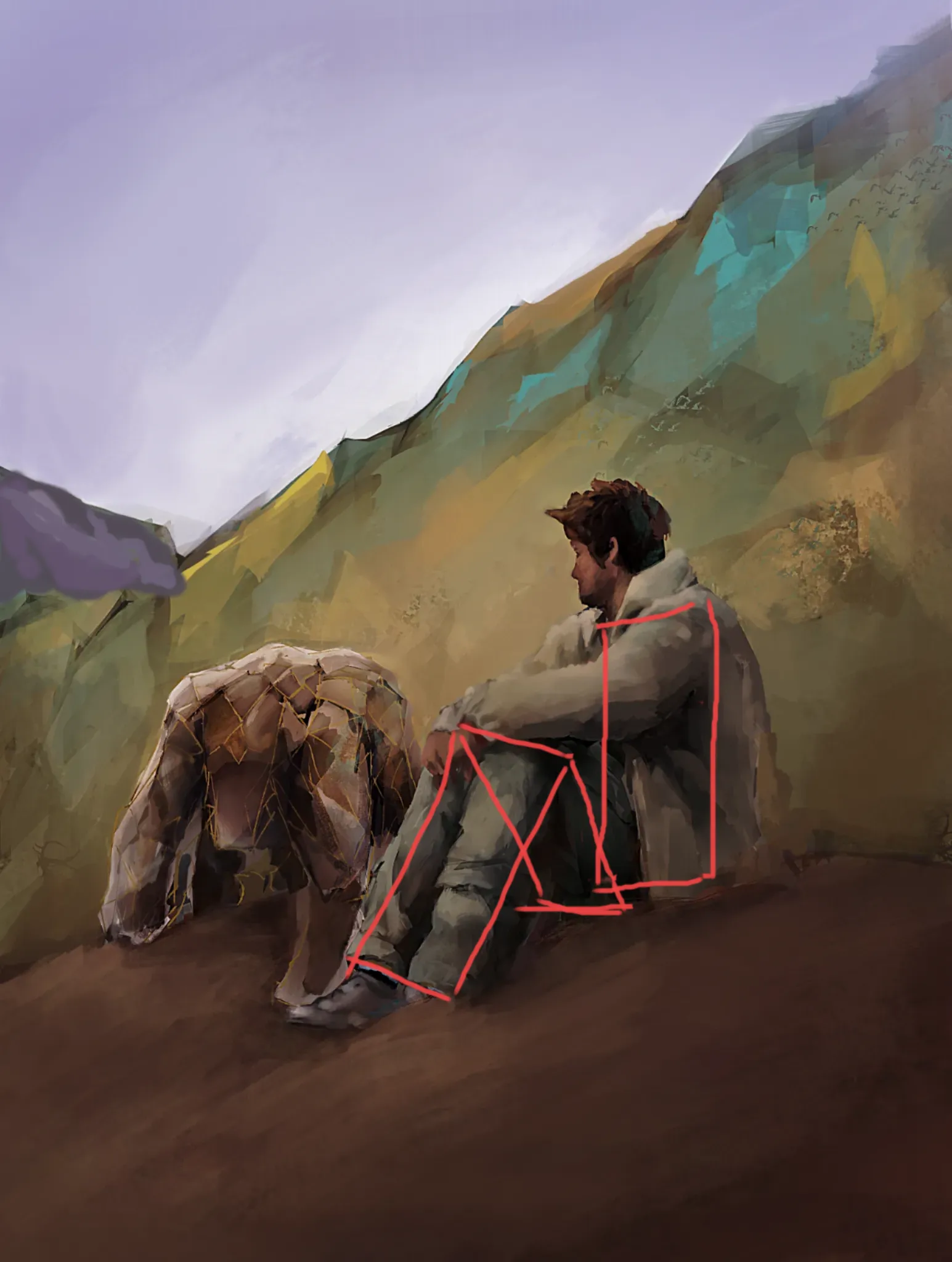

HI. I can only use a mouse so I apologize for the graphical quality. Colours: the palette is very pleasant to my eye, I think only the contrasts are in the wrong place. The mountains are brighter than the sitting figure and they have touches of bright yellow and turquoise. the figure on the other hand is very muted. The bright colours bring the attention to the mountains instead of the figure. You can make the mountains interesting by creating more forms, like adding interesting peaks, ravines and light/shadow breaks on them. The mountain range in the distance is the same color intensity as the forward one. We can understand that it is further because is is obscured by the mountains in front of it but I would also make it calm blue-purple. Your sky is already purple so it would complement it nicely. Make the person more lively by using warm color accents, like maybe a reddish spot on the cheekbone and brighter skin tone on the hands. You can also change the color of the clothing. That would make your figure more dominant and the viewer's eye would automatically go there. Biggest issue that is bothering me when I look at the picture is the anatomy. The pivot of the torso does not seem to align with the legs-pelvis structure. It see the torso sitting on one plane and the legs/pelvis on another' almost beside it. The far leg (viewer's left) seems too be also too long compared to the other leg. The knees are obscured so It is hard to judge the real size. I dont understand the bulky mass to the left - is it a leather jacket on a rock? It attracts quite a lot of attention but it is unclear to me what it is and what is its purpose. If it is a jacket, I would lay it on the ground, beside and parallel to the figure. Right now it is almost equal in importance as the figure. One more interesting feature you got here is the gaze. It is very intriguing what he is looking at. You could leave it like it is now, letting us wonder or you can add some landscape feature or brighter highlight on the far mountain that would connect with the gaze direction and complete the story of what he is looking at. Good job all in all!
Thank you so so much i will definately try to implement these when i get the time. The rocky like structure is actually another figure and the other figure was supposed to be looking down at it but the angle was off and also now that i can see the issue with the legs/pelvis i cant unsee it, the legs were supposed to be facing slightly towards the rocky figure but i think i accidently changed it during rendering. I think my issue about the muddy colours were less muddy colours and more what you were saying about the constrasts between the figures and the mountains, so thank you for pointing that out. As soon as i get a free time slots ill be adding these improvements but i just wanna say again, Thank you!