¿Quieres guardar tu opinión?
Regístrate para guardar todos tus comentarios en tu cuenta. Tu opinión será privada y no pública.
Pinturas
Notas Paintover
Elige una pintura
Elige un avatar de usuario para ver sus notas y comentarlas.
Necesito ayuda con renderización?
Mejore sus valores y su mezcla, leer 3 min
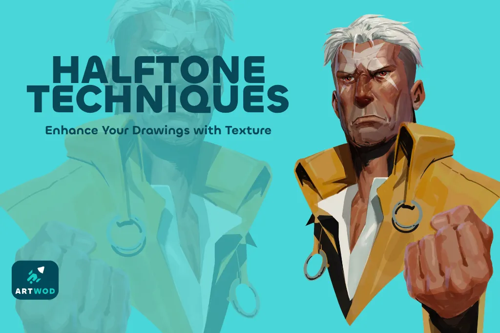
Halftone Techniques: Adding Texture and Depth to Your Artwork
Master halftones by establishing shapes, volumes, and shadows first, then practicing on beans, noses, portraits, and posters to add texture and depth to your artwork.
Rendering
¿Quieres ayudar a alguien que sigue esperando?
June 30 Sketchbook Pages Challenge
Aún no responde
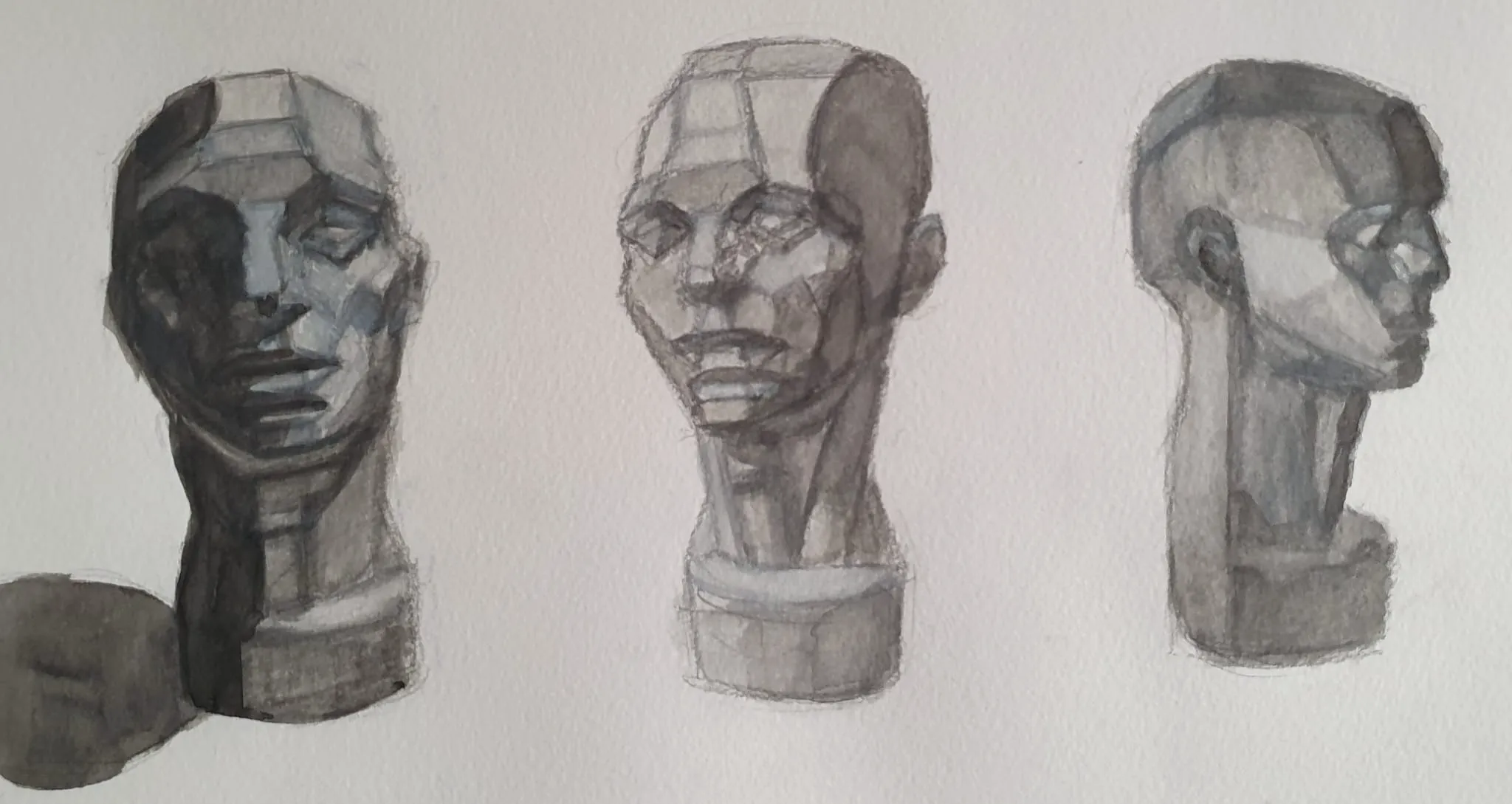
Asaro head study in watercolor and white gouache
Making an study of the asaro head was on my to do list and thought why not do it now with this challenge.
Hace 23 minutos
Ver
Environment
Aún no responde
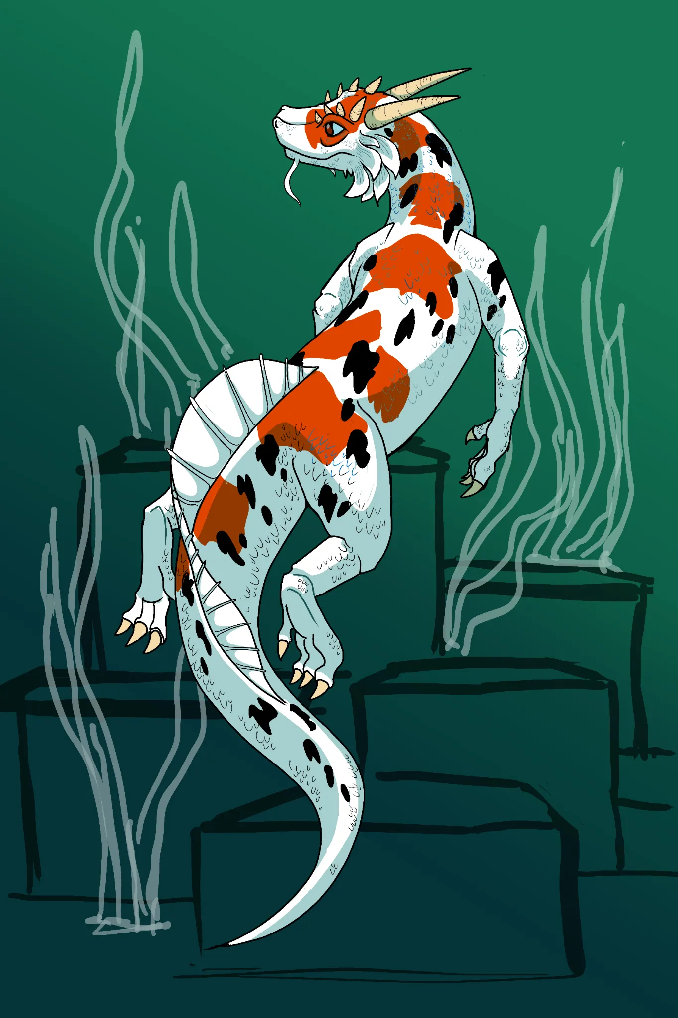
Sulawesi Sanke wip 2
Starting to rough out a simple background for this one, what are some things I could work on to frame him better and give him more of a floating appearance?
Hace 44 minutos
Ver
Figure
Aún no responde
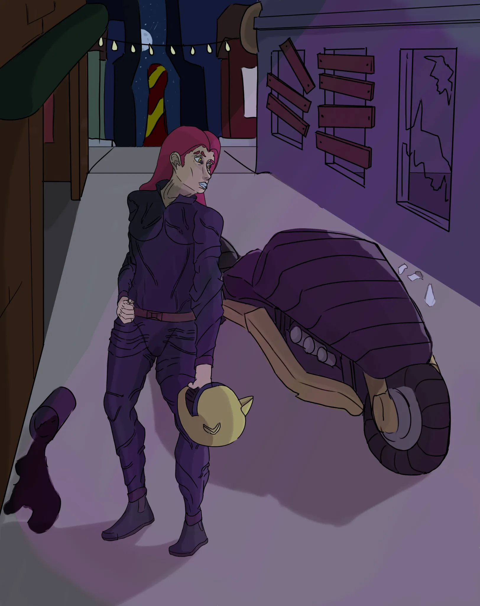
ciberpunk biker i guess
pretty much same this but now with some colour and a little light, still doesnt feel right on the light department aswell as the fabric of the suit feels bad xd
Hace 1 hora
Ver
Figure
Aún no responde
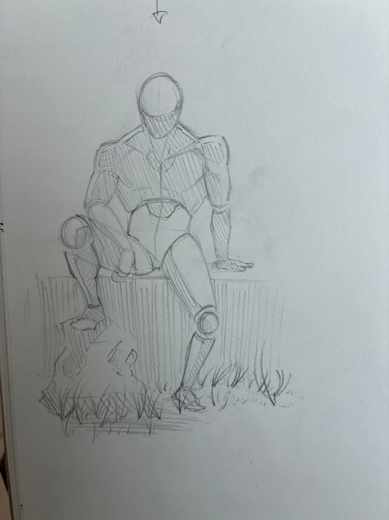
Fogure and shading
I want to know if the proportions are right or at least believable. If they are, i want to know if the shading is right. I did this from memory(if that helps to show what level im at). And one small thing, at this level i wanted to know what i should be thinking about next. All advice accepted😁
Hace 1 hora
Ver
Rendering
Aún no responde
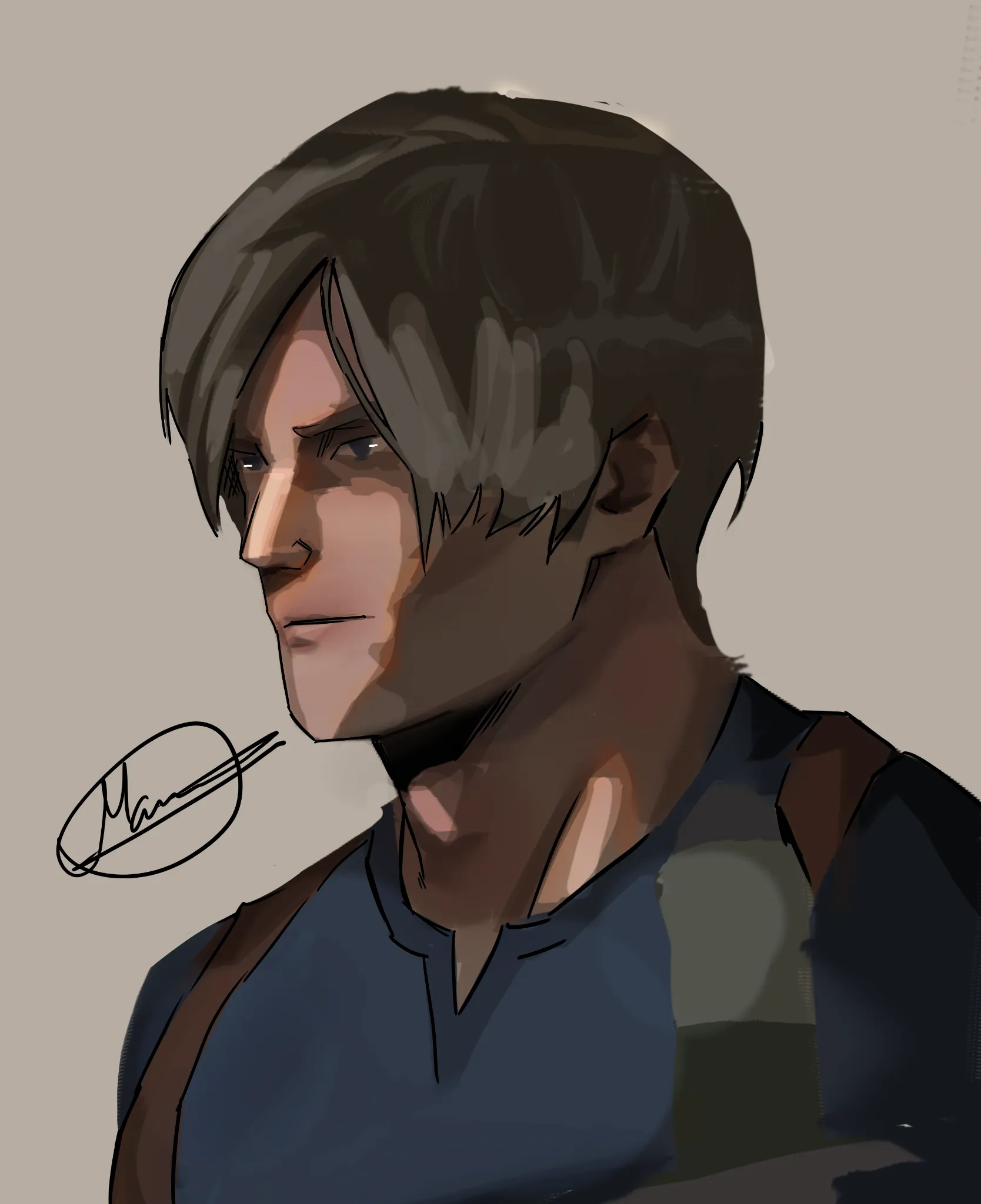
Leon semi realism practice
i made the jaw third too big i know, i know. other than the jaw what can i improve pls tell me, i wanna improve at drawing semi realism. i'd appreciate a feedback ( i am too lazy to fix the jaw :D )
Hace 2 horas
Ver
Rendering
Aún no responde
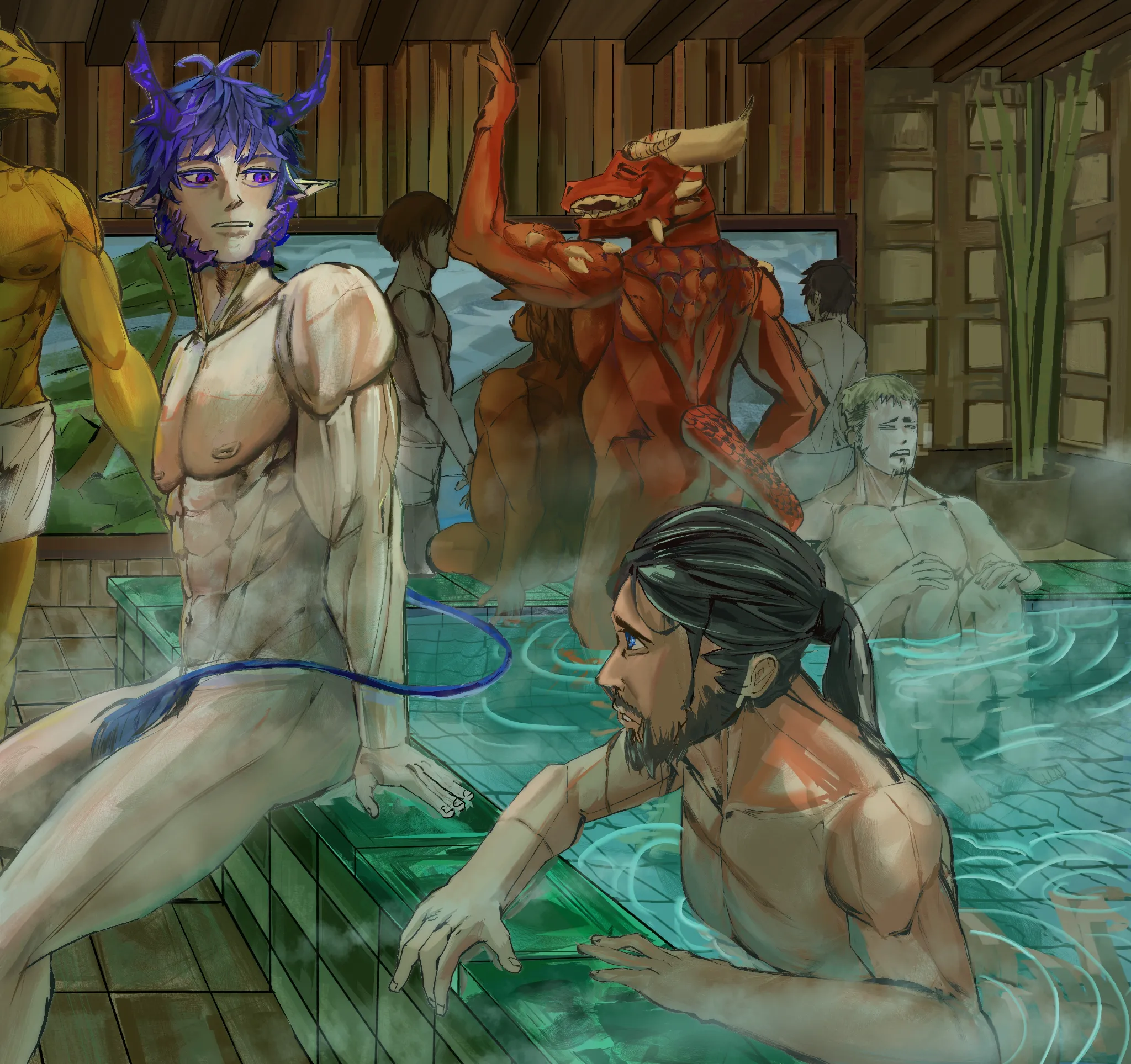
bath house
Hello! Thank you, everyone, for the valuable feedback. It helped me a lot. The setting they're in is a bathhouse. they're relaxing and chilling I want to focus on the blue-haired guy and his friends. For some reason, I don't really like the atmosphere, and the environment doesn't look very appealing. While I know I have some anatomy issues to work on, I want to focus primarily on the vibe, color, lighting, and atmosphere of the setting they are in. Thank you!
Hace 2 horas
Ver
June 30 Sketchbook Pages Challenge
Aún no responde
Day 27
Concept art
Hace 2 horas
Ver
June 30 Sketchbook Pages Challenge
Aún no responde
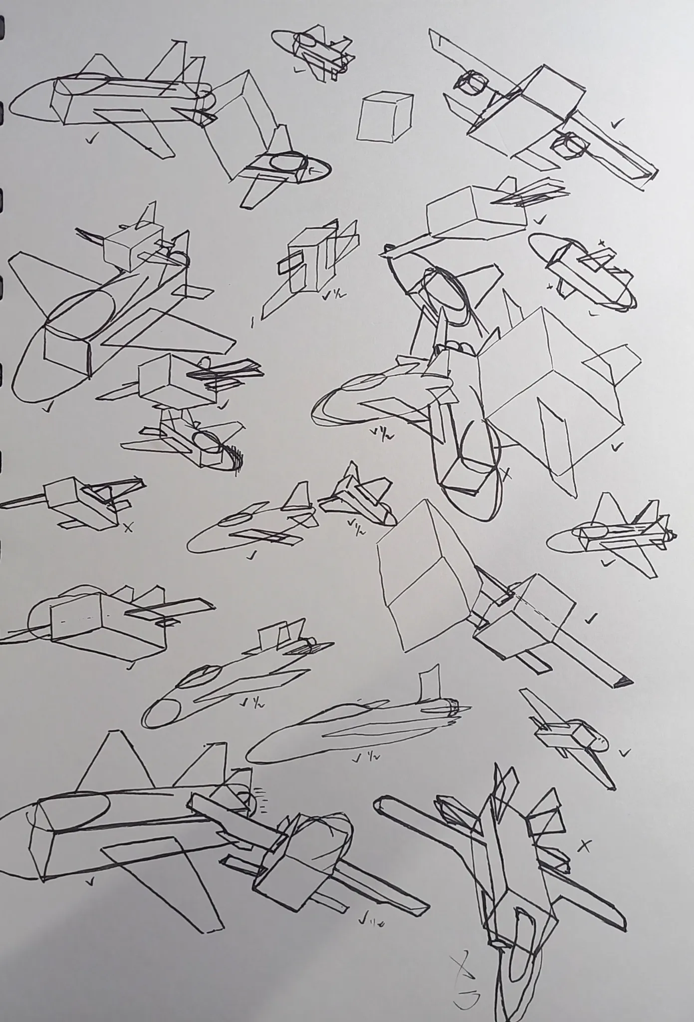
June Sketch Day 27
I decided to explore more into jet shape, from simple shapes. I still don't understand some of the perspective from below. When i draw from below, it feels like the wing sorta want to flap wings like bird. But drawing from side and top, i already comfortable. Well at least i don't get confused unlike when i draw from below. Any advices and feedback are really appreciated!
Hace 3 horas
Ver
June 30 Sketchbook Pages Challenge
Aún no responde
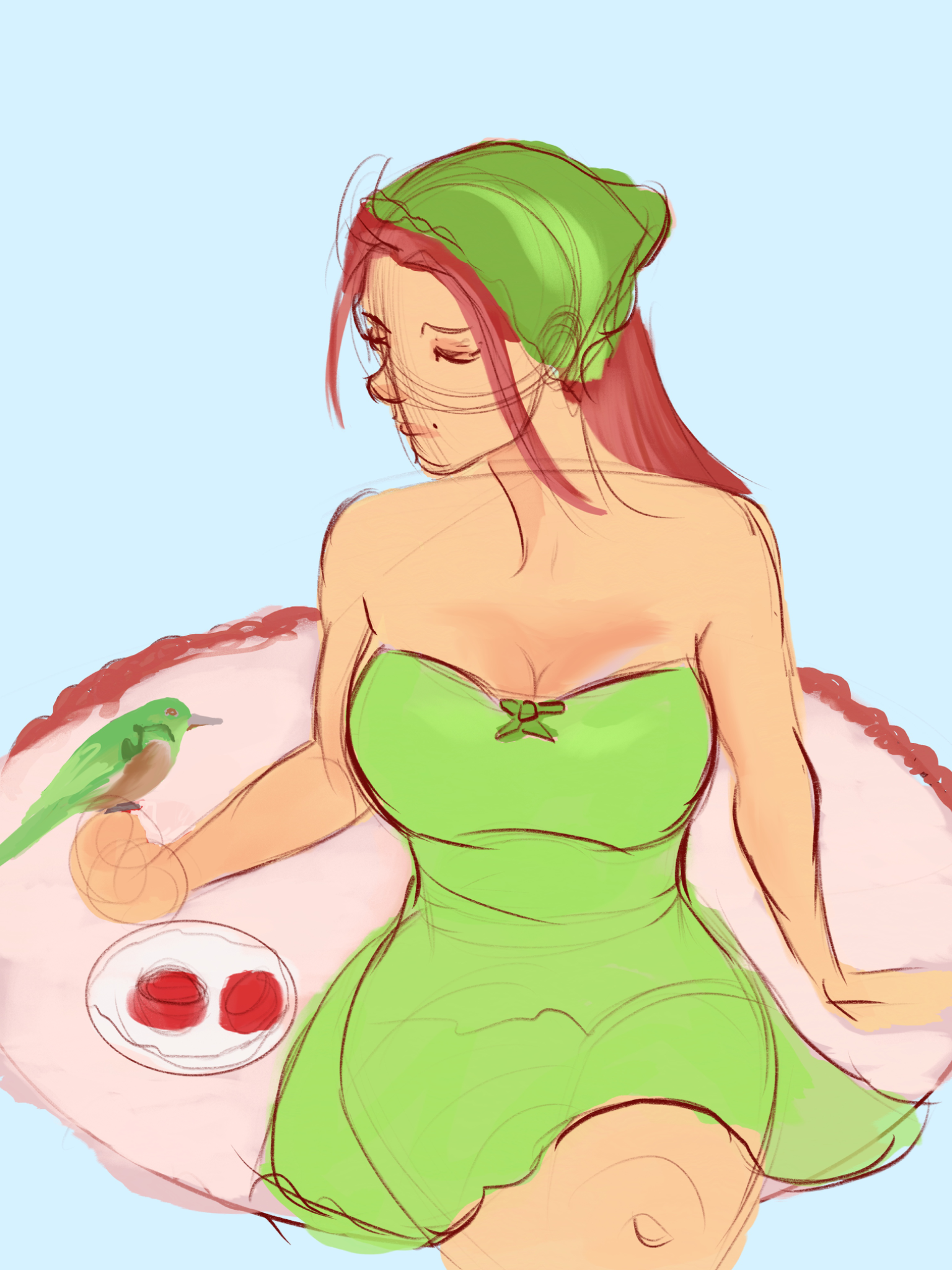
Green & Red
I can't seem to get past this stage with any of my drawings. I am not sure what's wrong with the perspective as well as the anatomy, among other things that I can't put my finger on.
Hace 6 horas
Ver