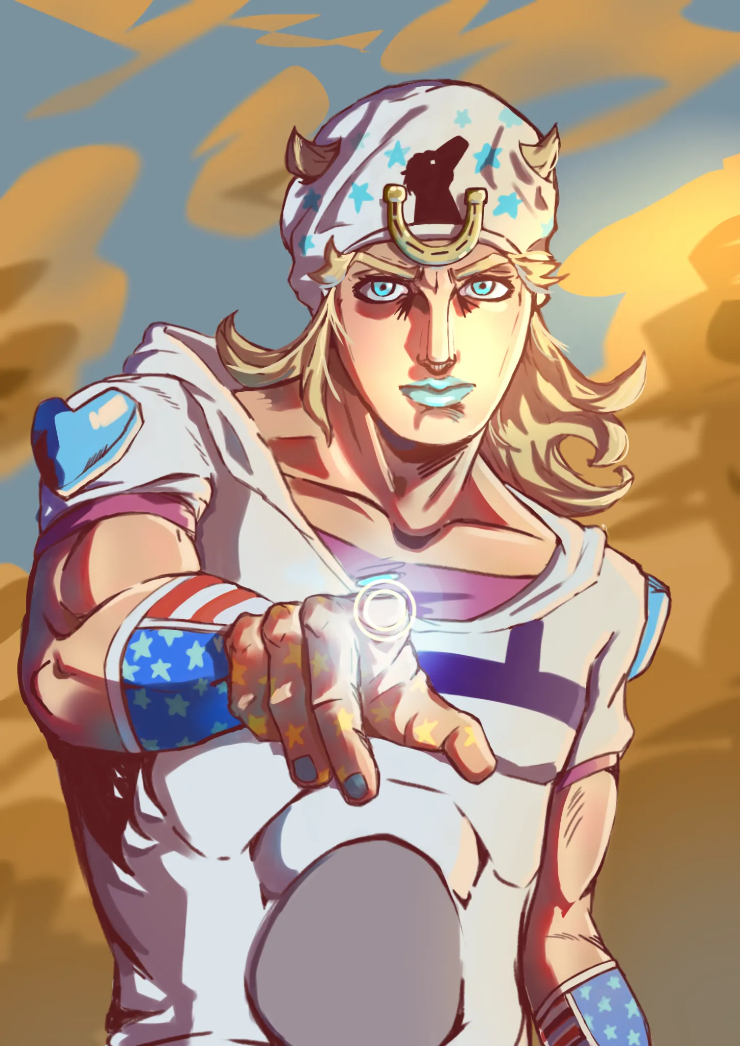
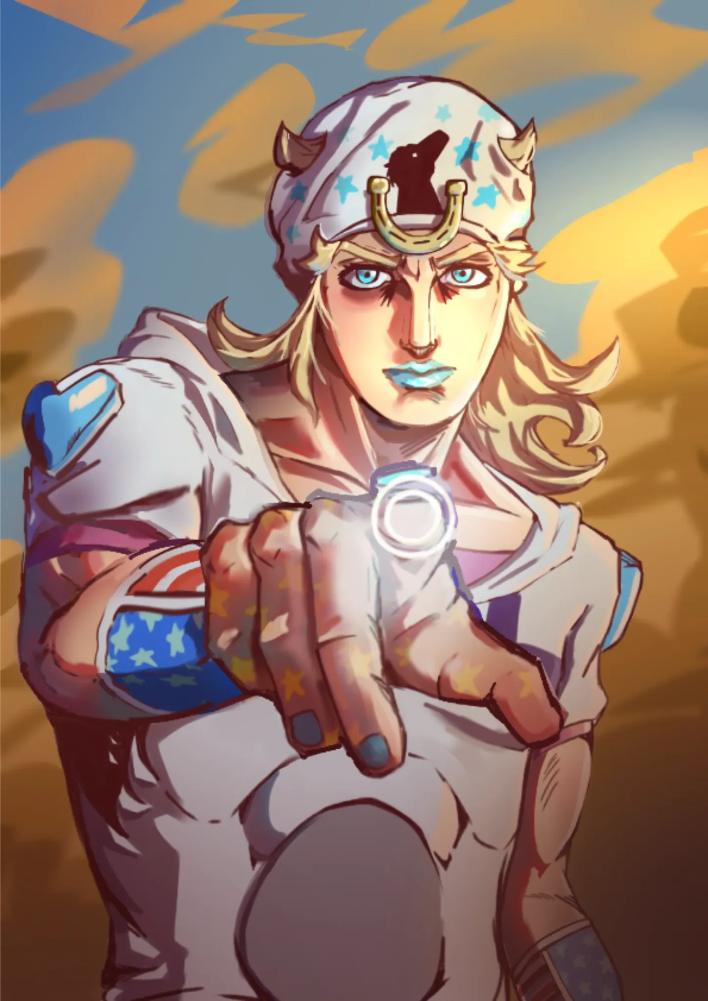

Hello! (This is my first time using this website, haha) The things that stuck out to me first were the foreshortening and harsh shadows, and some lack of finish. 1) Foreshortening means that things get bigger at they get closer to the camera. By making his hand a lot larger than you normally would, it gives everything a lot more depth and actually looks more natural (but it's really annoying to do, lol). I also increased the line thickness around his hand to further emphasize the depth. I also changed his forearm a bit to match the hand -- one thing I noticed was that his arm.. thing (??) seemed kind of flat, so keep in mind that it "wraps around" if that makes sense. Also his sleeve was shorter on that side so I made it longer to match the other one. 2) I felt like the harshness in some areas was kind of distracting, especially where there were a lot of soft edges like the face, so I added in some midtones. 3) I love this piece, but I felt like it was lacking some finish. While drawing over, I was thinking about how to emphasize the focus points (his face and hand) more. I really liked your lineart, especially the big block of dark shadow under his right arm, so I tried to add some dark shadow around his face and hand to increase the contrast in those areas. In the same vein, I made the corners and bottom of the artwork a little darker, to put more focus on the high-contrast areas (AKA the center). This makes it feel a lot more dramatic and cool, yay! Lastly, I added some small details to his face, to increase the information(?) there, since it's a focus point. Sorry, I hope this makes sense. Your art is super cool!!
Pinturas (0)
Johnny Joestar
Notas de autor:
Can you give your opinion or help me figure out what is wrong with my artwork or what I can improve.