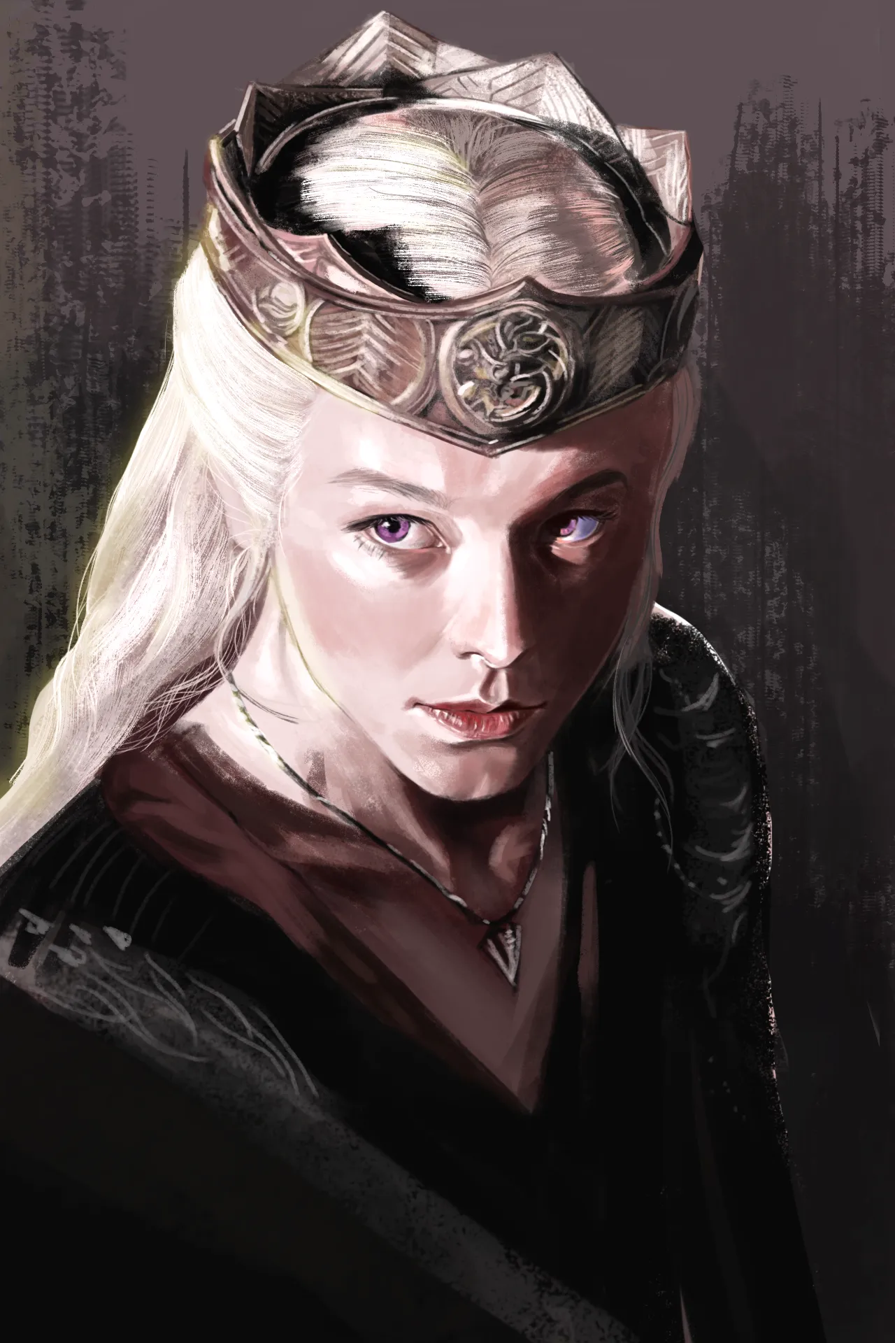
Hi, the values lacked cohesion in the lights so I reduced the brightest parts so it sticks better with the midtones and it feels less out of place.
Pinturas (2)
Comenta 3
Looks nice
Thank you!!

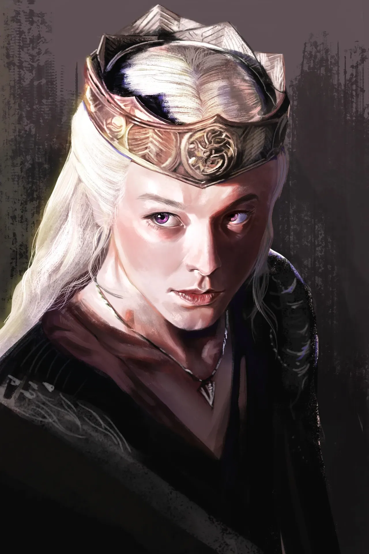
I think adding a warmer tone in the light and a cooler tone in the shadow helps make the painting feel more colourful. I added more saturation in between the shadow and light, using a more salmon pink tone to suggest the subsurface scattering effect. I also added a warm soft glow effect in the light area, added some occlusion shadow between the head and crown, make some parts of the shadow cooler with a purple blue tone, increase the contrast of the eye on the left. I think your piece is strong by itself. I hope you can at least get some idea on how to continue on it more if you think the paintover is helpful.
I really appreciate your tips! Thanks to you, I also remembered how to draw skin under light interactions. The warm tones you added made the piece feel much less cold. Seeing your paintover gave me so much motivation to keep refining it! Thank you so much for taking the time to give me feedback. Wishing you a wonderful day! ^^
Rhaenyra Targaryen
Notas de autor:
I would like to hear your feedback and advice on how to improve this painting—specifically regarding the lighting and shadows.
21