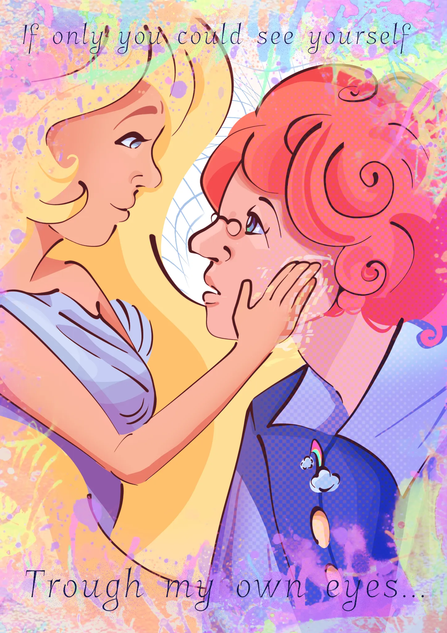
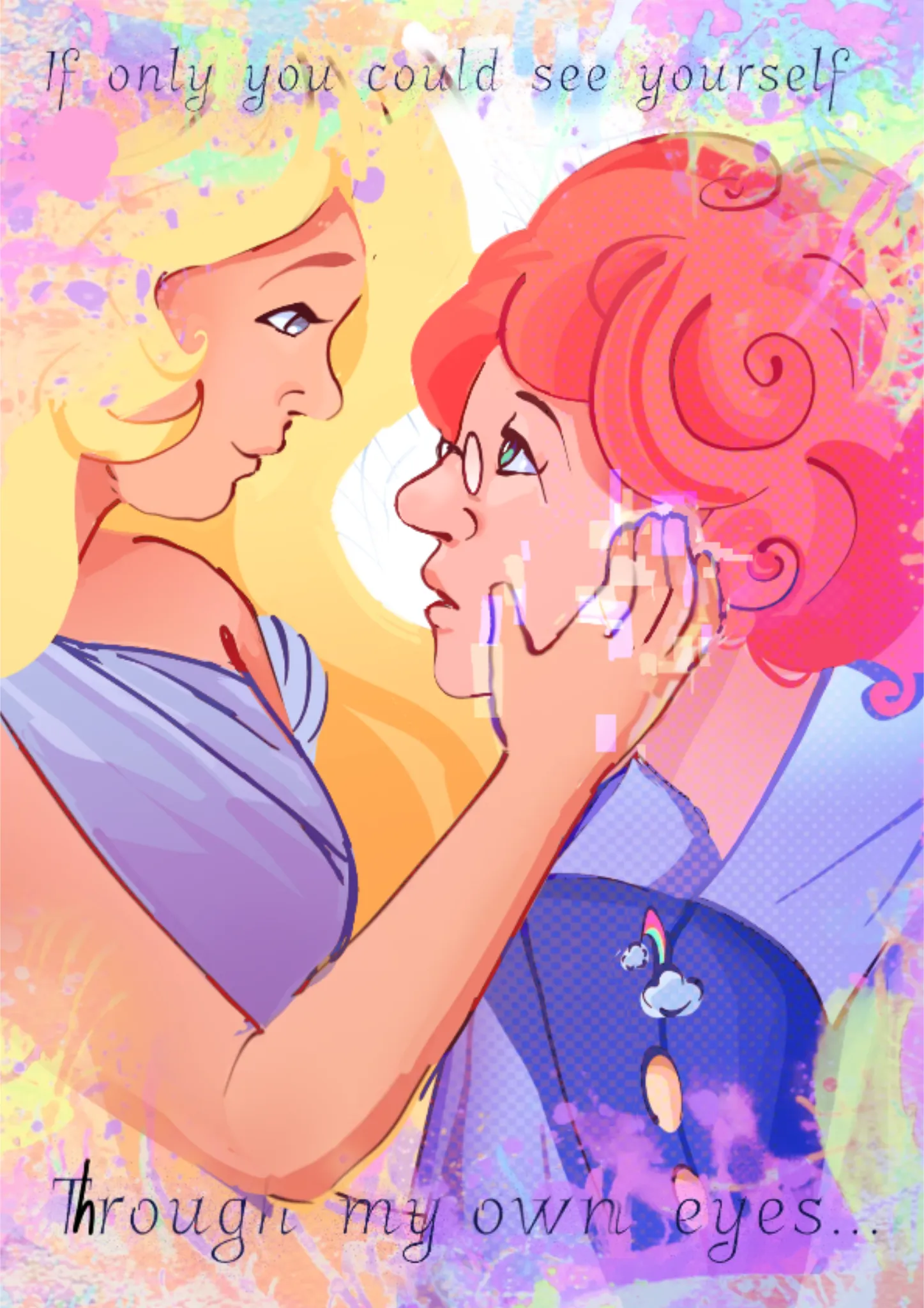

Hello! First of all, I thought the overall compostion you did was well-done, it really has that feeling of closeness and love that I think you were going for. As you said, the blonde character's hand and arm were too small -- while you're drawing, it helps to check body parts against each other. For example, when drawing the hand, see how big it is compared to your own face/head, and it should give you a good idea how much bigger or smaller it needs to be. For the arm, it helps if you remember that the elbow pretty much lines up to where your waist is. Of course, if you're having trouble with proportions, it really helps if you take your own reference photo as well. I also slightly changed the hand so that it looks a little more relaxed and natural. Another anatomy issue I noticed was around the blonde character's chest, as it seemed like it was being pushed up too much? I also rounded out both characters' shoulders a little. I have trouble with those areas too, so my drawover probably isn't perfect either, haha. Something I liked was how you drew their faces, they both look unique in a good way! I adjusted the blonde character's head and both of their eyes so that their gazes match, as it felt a little off before. For the red-headed character, I moved their eye closer to the front to make it more anatomically correct. I made their lineart thinner so that it matched the other character's face better. I also adjusted both characters' mouths and chins so that their jaws weren't sticking out too much -- not for beauty reasons, but because it kind of looked like they had underbites. I liked the way that you shaded the blonde character's face, it felt really simple but well done. Because of that, I wanted to try and apply it to other parts of the artwork. I thought that adding some larger gradients around parts that felt like they needed some more shadow (her neck and shoulders, arm, and hair) would keep your flat, graphic artstyle while adding some depth and finish. I really loved the color palette you chose; it feels very unified and pleasing to look at, while being vibrant and lively. One part of your artwork I especially liked was the area to the right of the piece, around the red-headed character's neck. I saw that you used colored lineart and a lineless style there, and I thought that it suited your artstyle very well. I felt like the black lineart was harsh and distracted me from the beautiful colors and shapes you used. Because of this, I applied it to the other parts of the artwork, and I think it softened it and really brought out the colors. I kept it darker around their faces to maintain the contrast in that area. I slightly changed the blonde character's hair shape to make it flow better and improve the overall composition. I liked the hair at the bottom, but because her arm got so much bigger, it disappeared. :( I saw that this piece was titled "Virtual lover" -- I thought that it was really cool to give the red-headed character the dotted pattern to show that they're virtual (but if I'm wrong about this, I'm sorry!!) I guessed that the effect on the blonde character's hand was supposed to be like a glitchy, digital-feeling effect, so I tried to make it more clear. If this isn't what you were going for, please ignore me! Lastly, I very slightly increased the contrast around their faces to make them stand out more. I felt like there was a lot going on, so I made the background pattern much lighter. Be careful about adding too many patterns and such to the artwork, as they can start competing for attention. (Also, you forgot an h in "through"!) Sorry I wrote so much!! I hope this makes sense and was helpful!
Pinturas (0)
"Virtual lover"
Notas de autor:
First time applying here! I'm struggling with anatomy knowledge from time to time (I already see that her hand is too small in relation to her head) and I really want to elevate my rendering, while still keeping my cartoon-esk artstyle in mind. Also, I want to hear not only critique, but also some things you already like about my artwork. And please, don't be too harsh, I'm a bit sensitive 🤭