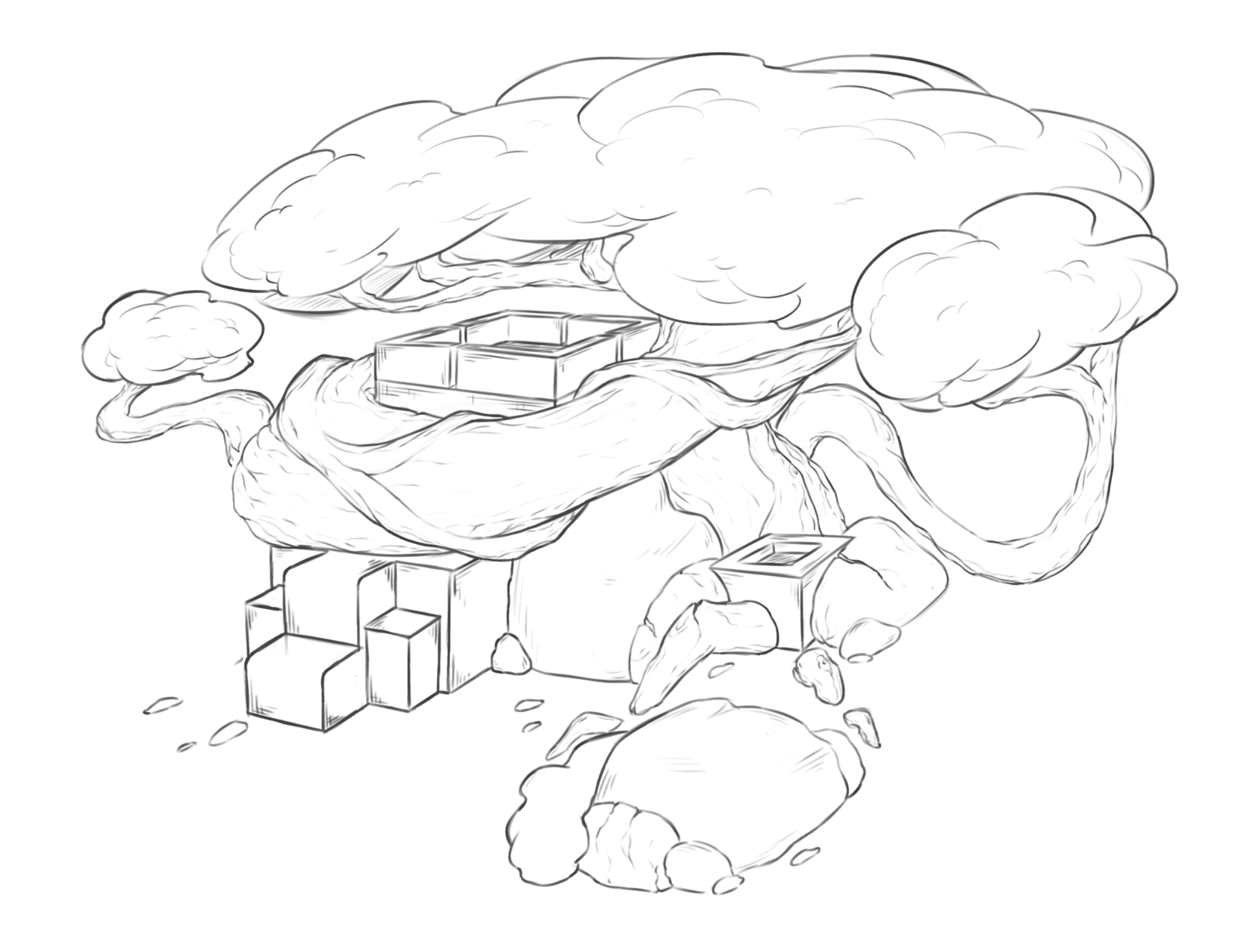
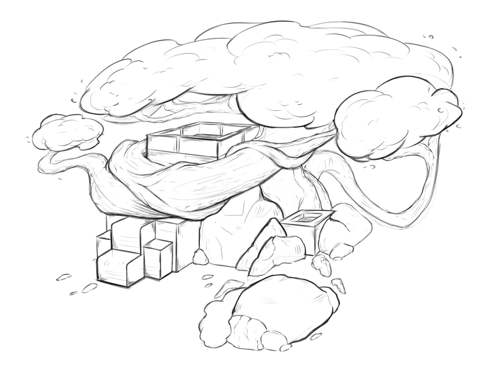
Hey there! I like how it looks! What I would suggest here is focusing a little more on improving your line quality, especially to indicate depth more effectively. Remember to use thicker lines for areas that are closer to the camera and lighter, thinner lines for areas that are farther away. This helps create a better sense of depth and prevents the drawing from looking a bit flat. For example, the tree trunk covering the ruins could have a slightly thicker line, particularly along the bottom, to show that it's in front of the foliage and even the trunks on either side of the ruins. You could also use a slightly thicker line for the treetop on the right side to indicate that it's in front of the larger tree's canopy. The idea is to identify which areas are closer to the camera so you can emphasize them more, while using lighter, thinner lines for areas that are farther away and have less visual importance. You can also use thicker lines where forms overlap. I'd like to provide an example of line quality, but I have to admit that my heavy hand doesn't help much at the moment, hehe. But I hope this helps!
Pinturas (1)
Intermediate Road Map
Notas de autor:
I would just like some feedback on the final project if possible?Any tips and tricks or things i can improve/work on.