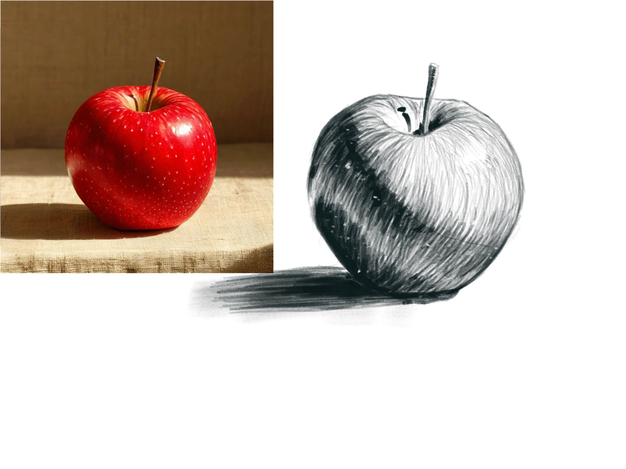
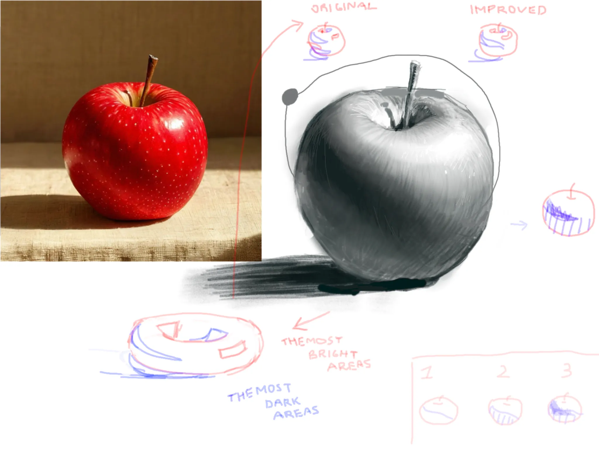


I like that you put highlight and shadows on the exact places! I see that reflection of the cloth on the left side is really bright on the reference and I understand, why you did the same on your art, but because of that the apple doesn't look three-dimensional and shadows just breaks up the figure. Usually, the area where an object meets its shadow on surface, the shadow on the surface is darker than the shadow on the object. About the reflection of the cloth, I muted it a bit, leaving a bright spot only on the side, but the tone itself is darker then on reference. If the spot were brighter and bigger, it would become flat and lose its 3D feel. While you drawing, I suggest to draw the boundary of where the shadow falls on the object, then lightly shading the entire area below that line, and finally applying the darkest area along the line (example on the lower right corner). I see that you’ve added texture to your work (small dots like on reference) and I really like it!! II recommend to not overdo it and apply a texture mostly on light areas, because otherwise the sense of 3D might be lost again. I also suggest making the hatching finer and lines should be closer to each other (you can even sharpen (cut at an angle) an eraser and use it to hatch the light areas). You did a great job, I hope, I helped you even a little bit!
Thanks, that looks much better!