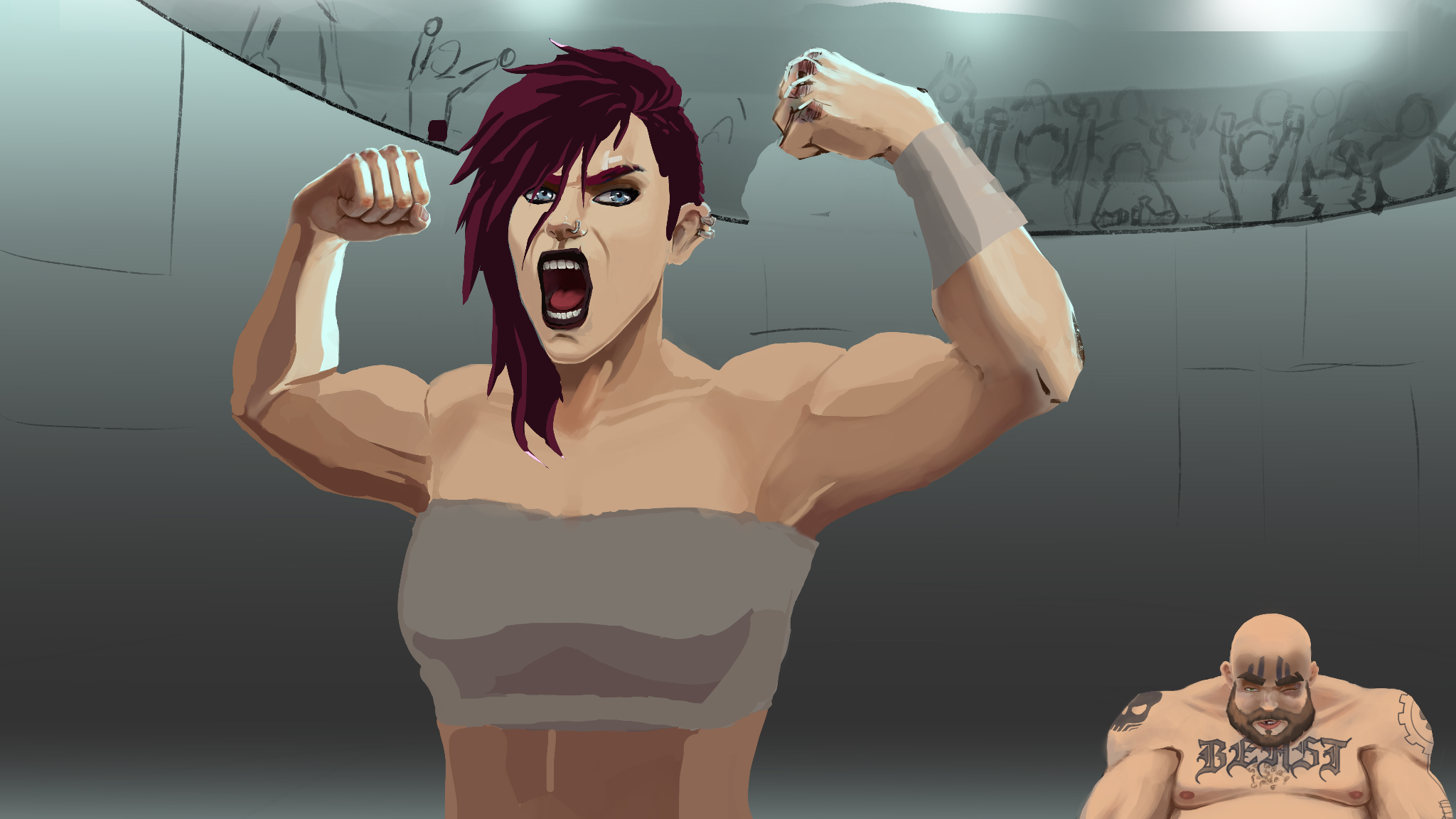
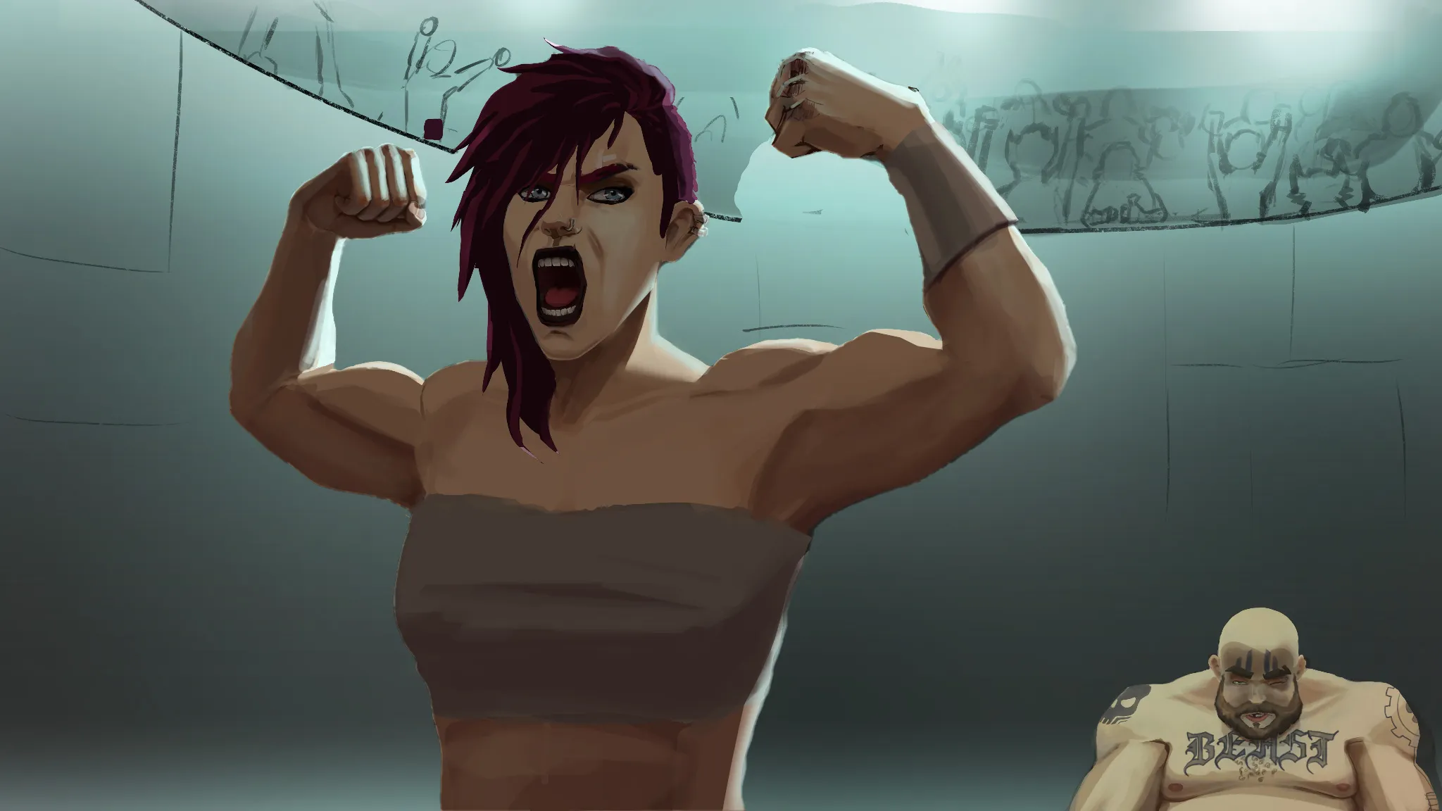

my suggestion is to think about the position and flow of the whole arm and hand before committing to rendering them, the lipstick missed highlights that defined the form, and dont forget that clothes should wrap around the shape than just across it
Pinturas (0)
K.O
Notas de autor:
There’s something about this drawing I despise and I don’t know if it’s the composition or her proportions or both
Comenta 2

Hey! Nice work here! :D One thing I'd suggest is making the lighting read more clearly. The rim light you've painted on Vi's forearm and hand suggests that the main light source is behind her. If that's the case, then most of her body should remain in shadow, with only parts of her silhouette and edges catching the light. In my opinion, that creates a much more dramatic effect. It also reinforces the dark-against-light contrast, which helps the character stand out. Whenever you're painting, try to look for those light-against-dark and dark-against-light relationships. Avoid placing light values against other light values whenever possible, as they don't create the same visual impact. You'll also notice that I adjusted the characters' skin tones so they better match the color of the main light source. Hope this helps! :)