
...
Pinturas (0)
Desert Inn
Notas de autor:
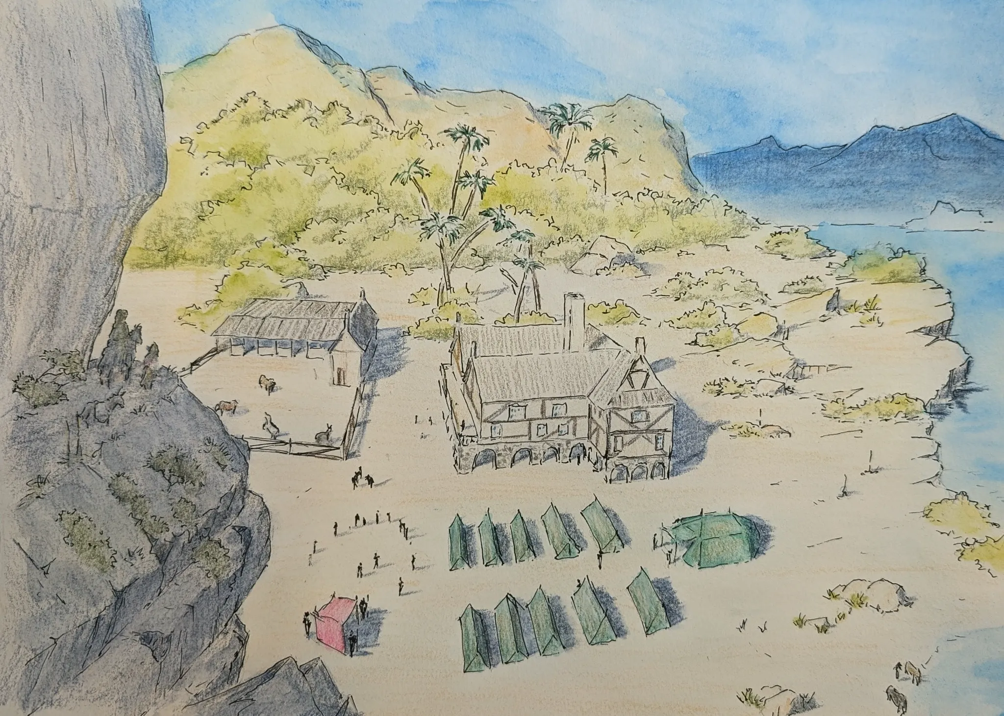
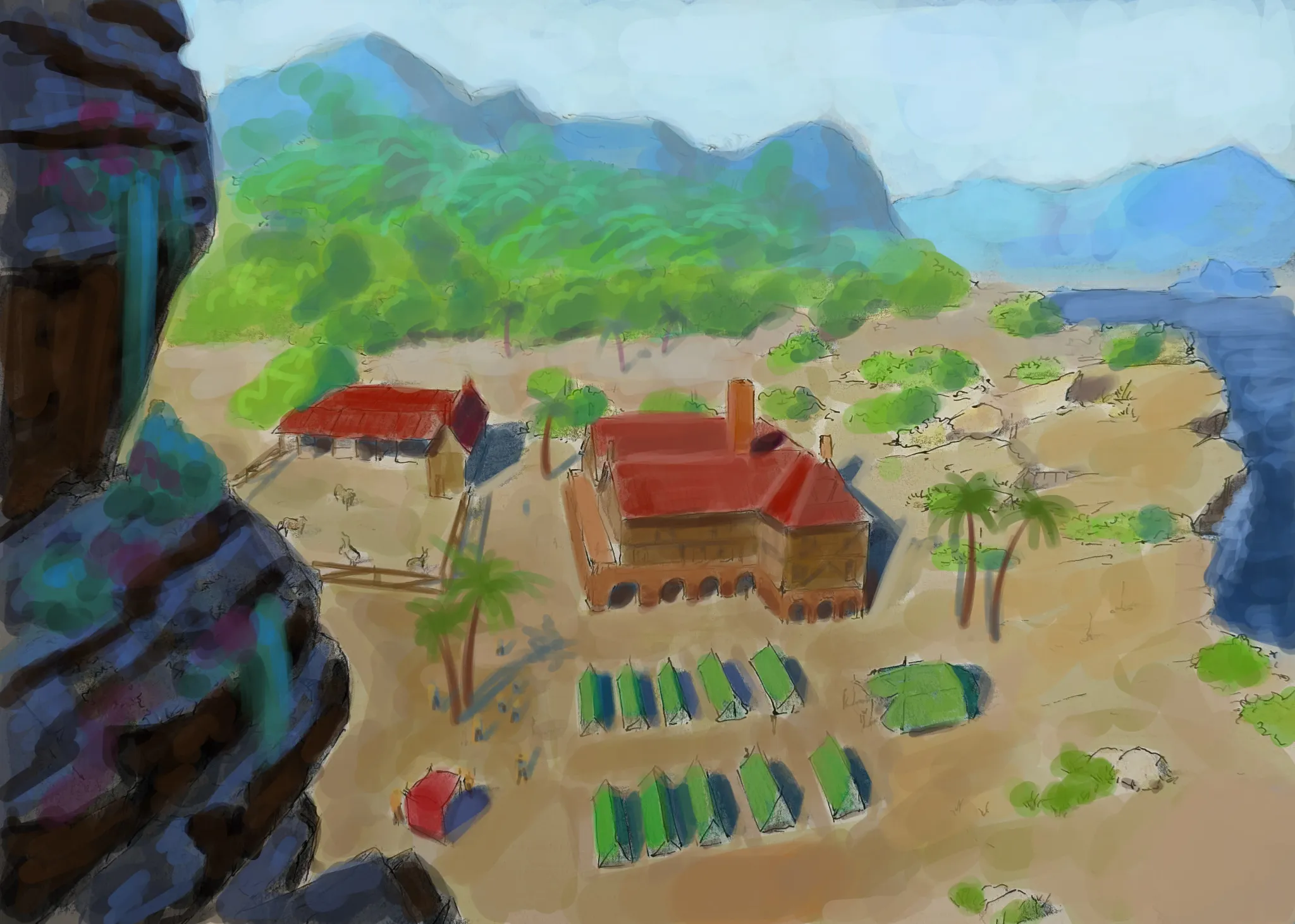
What do you think about composition. I wonder if perspective is working. Do you think distant mountains are to dark?
Comenta 3
The first thing I noticed about the perspective is that, while correct, it's messing with the composition. The way they converge is creating a few invisible "arrows" pointing somewhere with no visual interest. This could be fixed by moving the vanishing point off the page. The second thing, about the mountains in the distance. The haziness and the lack of detail really sells the effect of atmospheric perspective, but notice how much easier they blend with the sky when I remove the dark outlines! The outlines created a harsh separation between the two, making the contrast feel much stronger than it actually is.
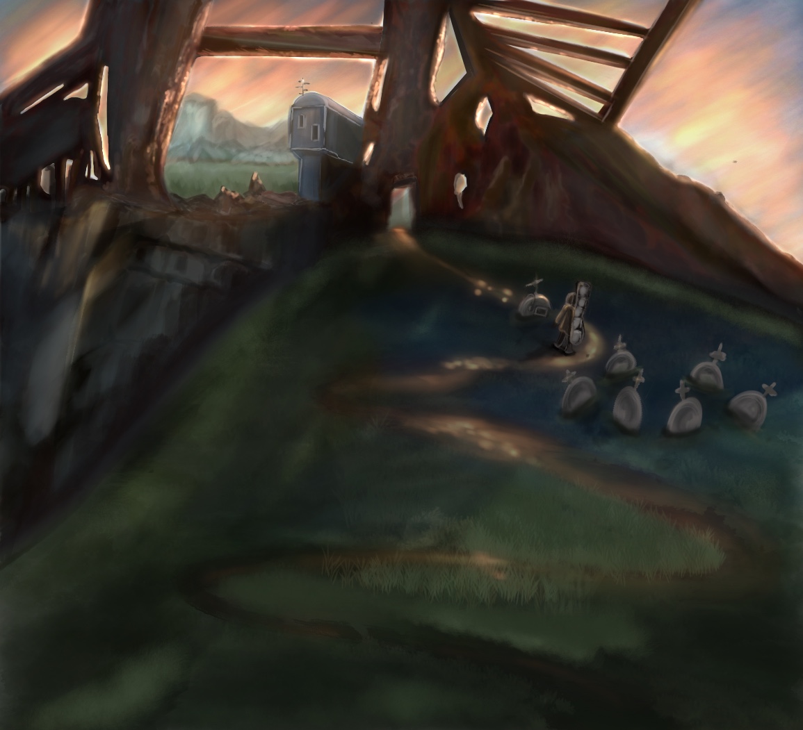
Hello, distant mountains should be lighter, and kinda in cyan blue range 3-point looks good, relative scale looks good as well Cast shadow says light source seems to be on the left..maybe emphasize more on darker shadows inside those openings under the main building, ranch, and under the rocks... The cliff in the foreground on the left better be in the dark as well as it is away from the light source