
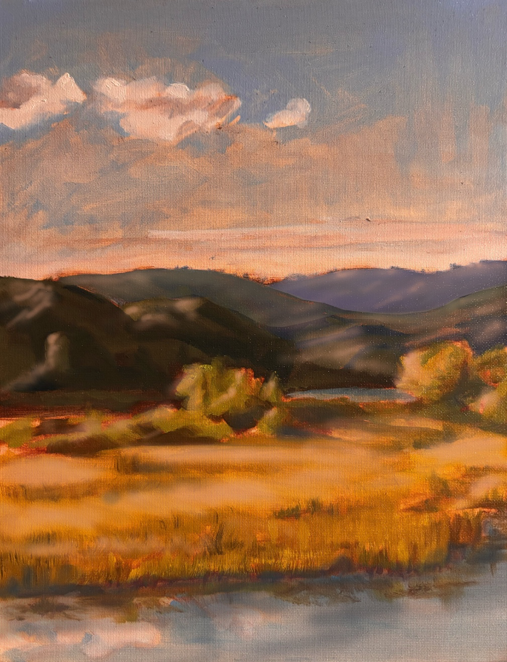


You have a really great start here and the colors are vibrant. I think what is needed is some depth. The hills in the distance need to be closer in value to the sky in order for them to feel far away.then gradually darken as you come forward. With all of the orange in the piece, i feel like the shadows need a bit more blue and the water should be just darker than the sky in value. Also added some darker shadows near the shore where the light might not be hitting. All in all it’s a nice piece . Just try to expand your values from back to front. More subdued and grey(less saturated) colors in the background and saturated as you come forward. Then add some light highlights to make it pop. Hope this helps.
Pinturas (1)
Tree by the River
Notas de autor:
This painting feels as though it’s missing something for one and two I’m looking for general things I can improve!