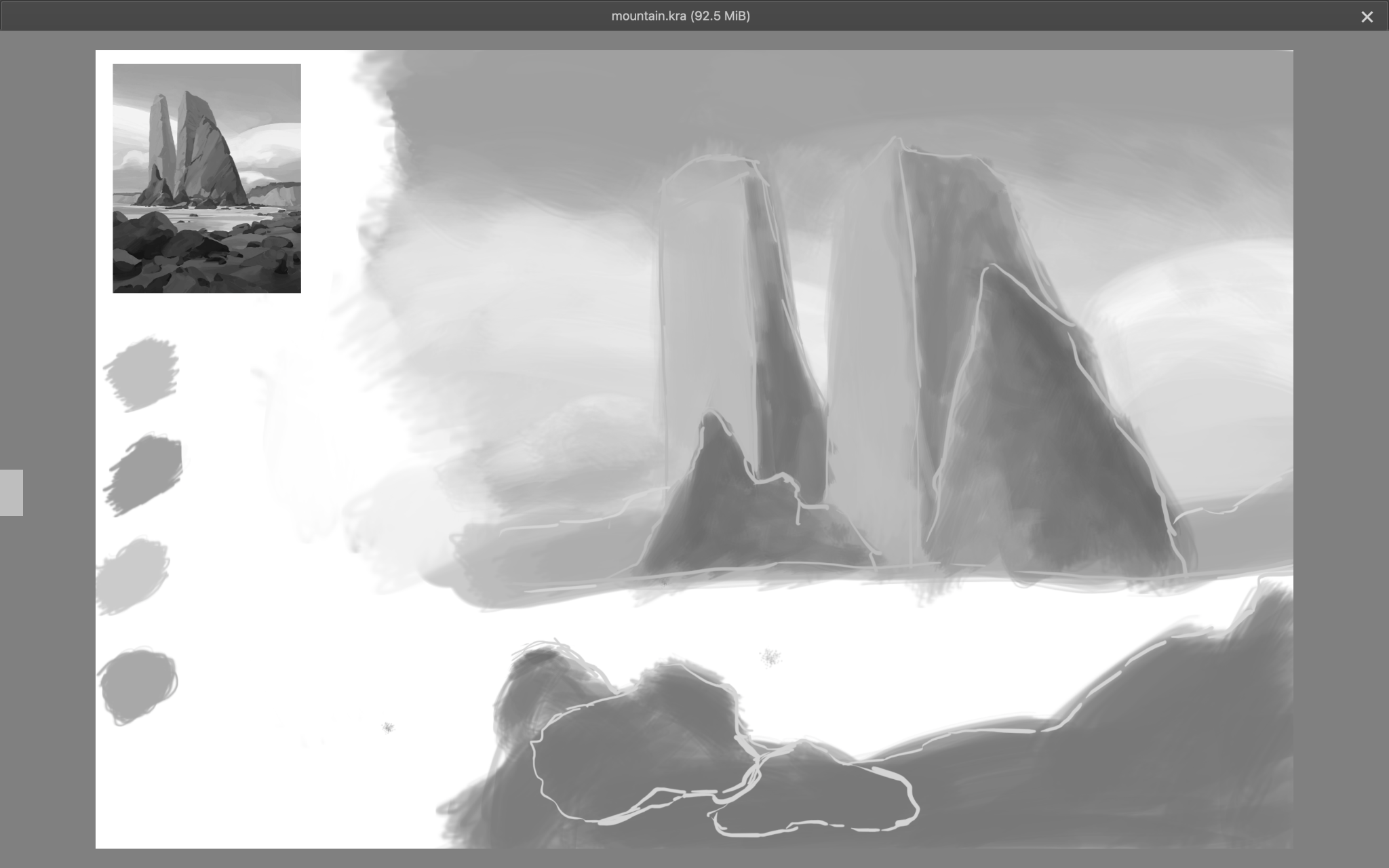
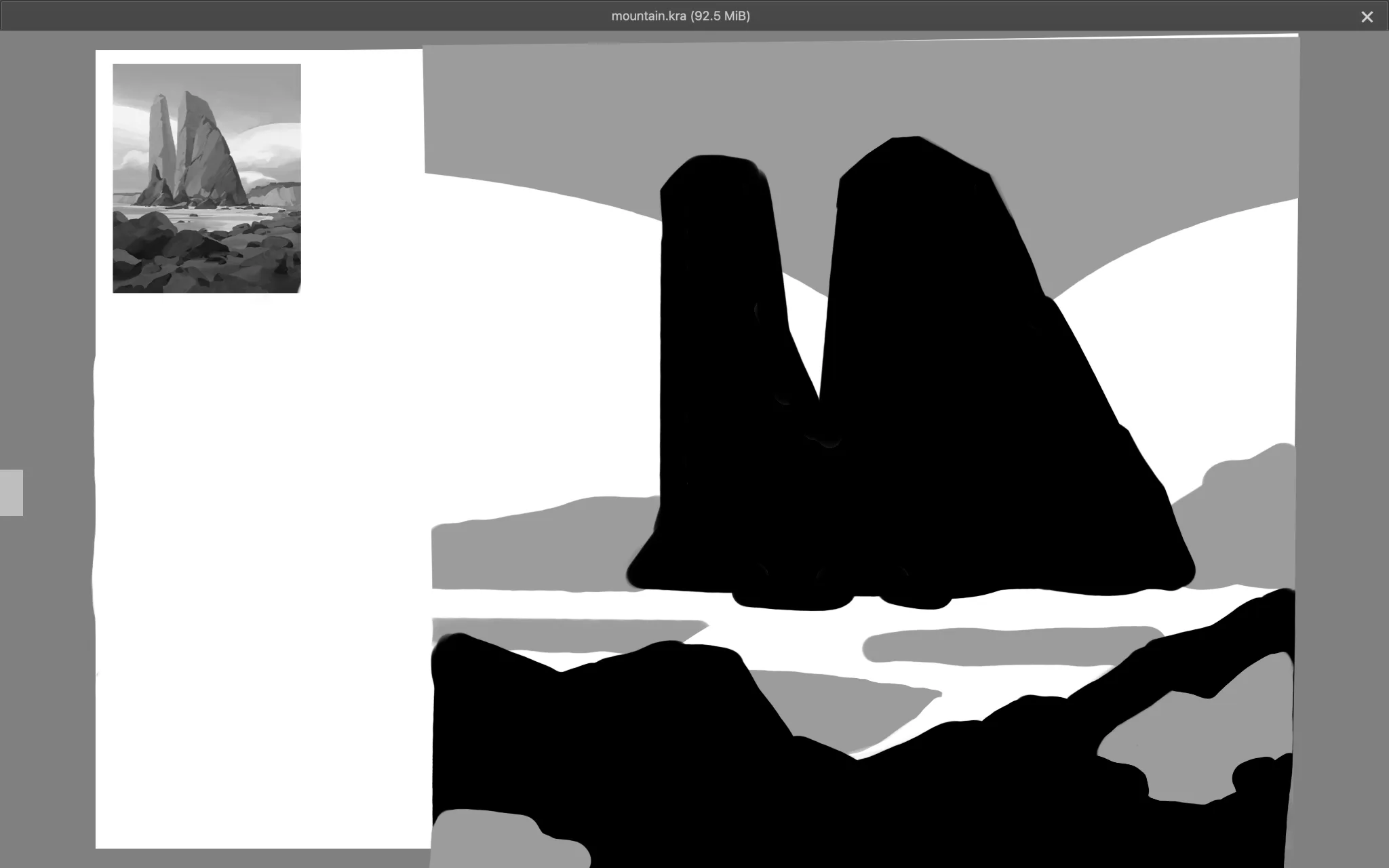


Hey, as was said already, when working only with values, commit to definitive value shapes. Simplify them as much as possible if you're struggling. Group them generously. It's also usually a good idea to start with as few values as possible. Try to represent your image with just 2 values first. Maybe add a third and see how it works. Try to do this gradually, working with one value at a time and not constantly jumping in between. Squinting when looking at your reference can help a lot to find the values. Otherwise, in digital, feel free to use tools to make identifying values easier while you're struggling. You can add a soft blur over the entire image to get rid of details that might confuse your brain in seeing the most important value groups. Or you can even use digital tools to reduce the total amount of values present in the reference if need be. Good luck!
Thank you very much really helped a lot.