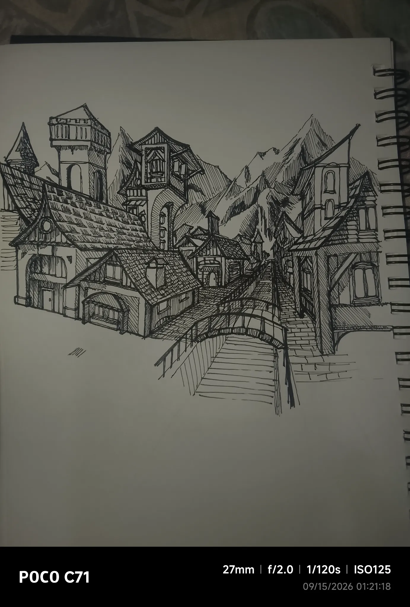
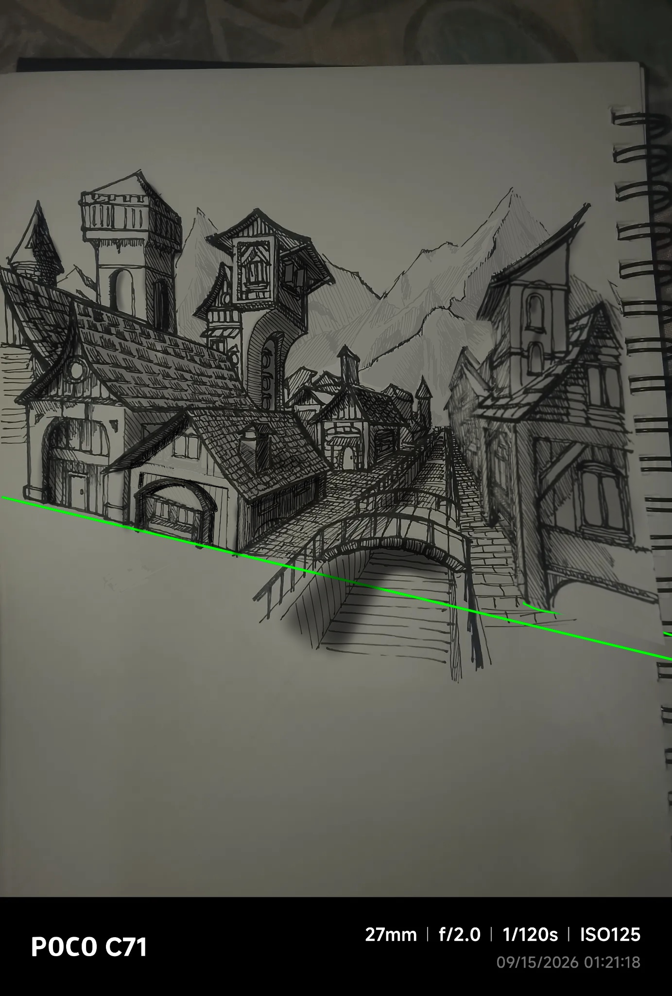

I think you have a good base here and the composition is good. What I am seeing is an over hatching or over detailing overall. Think of the light source, here coming from the left. With that in mind anything that is facing that light should have limited texture/hatching. The areas with overhanging roofs would cast a crisp consistent shadow but not over the entire face that is in light. Everything that is on the right side away from the light would be in a consistent darker value and again not a tone of detail in the shadow side. Even in this shadow side, there will be darker areas in the recess and overhang areas. The right side of the canal, the left side of the buildings are facing the light so treat them like the front of the buildings on the left side of canal. The canal it self will have a shadow side and will cast a shadow on the water as wil the bridge. In the distance you will have even less detail and the ines ought to be thinner. The mountains can have just thin subtle hatching in areas so that it isn’t competing with the buildings for value. I tried to show this with tones as redrawing the entire thing manually wouldn’t be feasible. I will try to do a building with traditional fineliner to give you a better idea of what I am trying to describe here. Hopefully this helps, I think that if you hold off your hatching until you are completely finished with your piece and then spend time on your line quality when hatching you will see great improvement. Take your hatching as seriously as your entire sketch and try to make it consistent.
Pinturas (1)
Medival town
Notas de autor:
I am struggling with lines and also detailing, I'm struggling with valuing the building and stuff