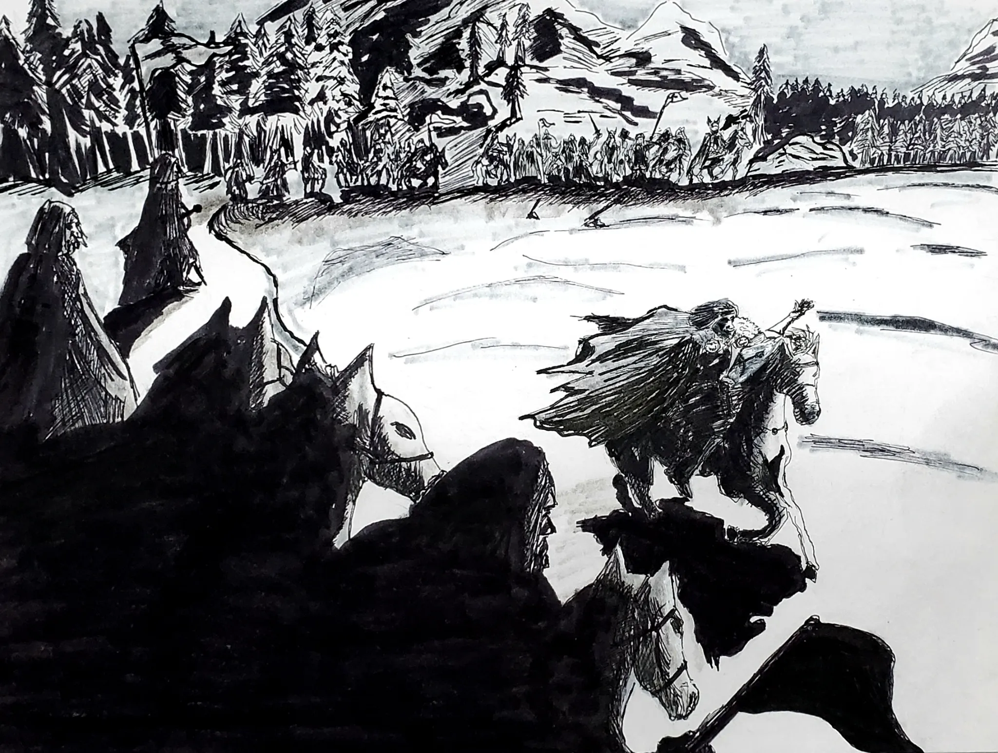
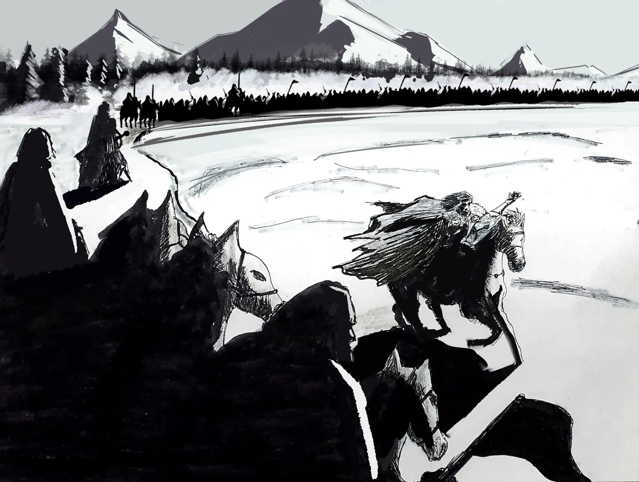

Hey there! Andrew already gave you some great feedback regarding the lighting and how to paint more accurate shadows based on the direction of the light. As for the background, I'd recommend simplifying it. Your attention to detail should primarily go toward the foreground and the focal point, so try to keep the background mostly as silhouettes and avoid adding details such as individual pine needles or rocks on the mountains. Keeping things simple will help prevent the image from becoming visually overwhelming. On another note, consider reducing the size of the elements in your background to create more space between the FG, MG, and BG. Making the mountains smaller will immediately improve the sense of scale and space throughout the illustration. The same applies to the army in the midground; by reducing its size, you'll have more room to increase the number of figures while also creating more distance between the rider in the foreground and the soldiers. Having smaller soldiers also reinforces the idea that they're farther away. Likewise, you can keep most of them as silhouettes and, if you'd like, add a few light shapes here and there to suggest a bit of visual interest. I'd also recommend studying movie frames that depict similar scenes and analyzing how they solve the problem of depth and scale. Doing so will help you apply those solutions to your own work.
Heya, Antonio! Thank you for the feedback and for showing me your version. Learned a lot!