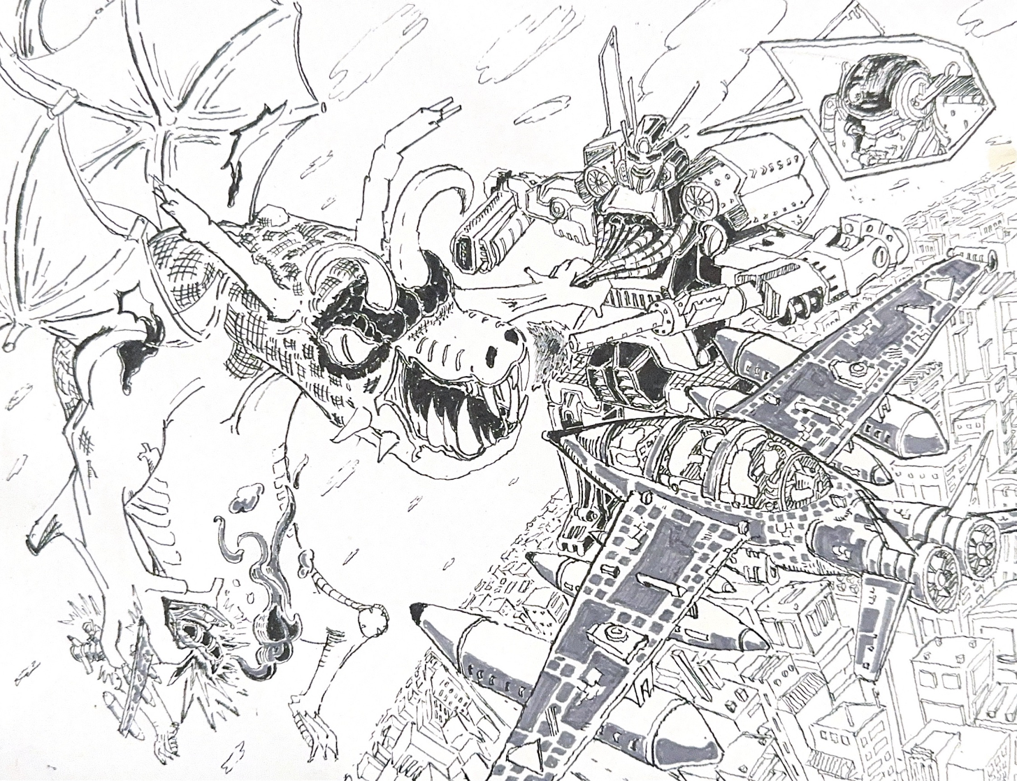
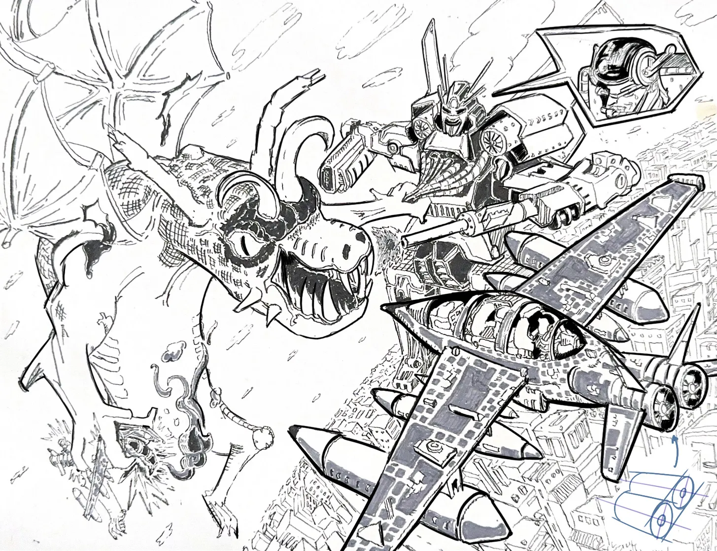

Hello! This is a very cool scene, quite dynamic! The biggest issue I see here is the line quality. There isn't a clear sense of contrast because the line weight remains the same throughout the entire illustration. As a result, it's a bit difficult to distinguish certain elements, such as the mech in the background and the airplane in the foreground. The creature reads more clearly because the background behind it is cleaner. In comparison, the airplane sits against the buildings, which makes its silhouette harder to distinguish. My recommendation would be the following: use thicker lines to emphasize the silhouettes of your primary subjects and create better contrast and separation between the different elements. Also, use heavier line weight where forms overlap. For example, having a thicker outline on the airplane compared to the mech immediately tells us that the airplane is in front of it. The same principle applies to the arm that's holding the robot. Notice how, with this small change, the important elements of the scene stand out much more, making the illustration easier to read overall.
Pinturas (0)
Aerial Fight (Pen and Ink)
Notas de autor:
I struggle greatly with readability, gesture, and scale with the simple and complex forms on the page and composition. Elements are crowded (both within and between the forms), and I’m uncertain on how to make the eye flow through the page (though I tried to implement it to the best of my current knowledge). I would love some feedback on one or two main things to keep in mind that I can consistently practice, especially when it comes to scale and readability, regarding the forms.