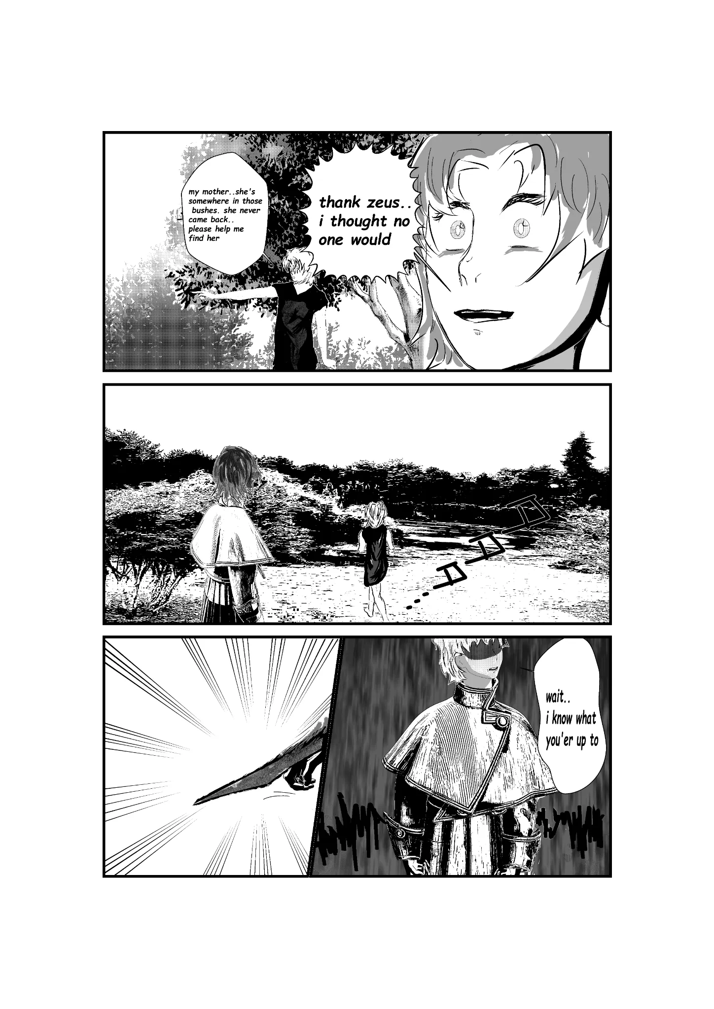
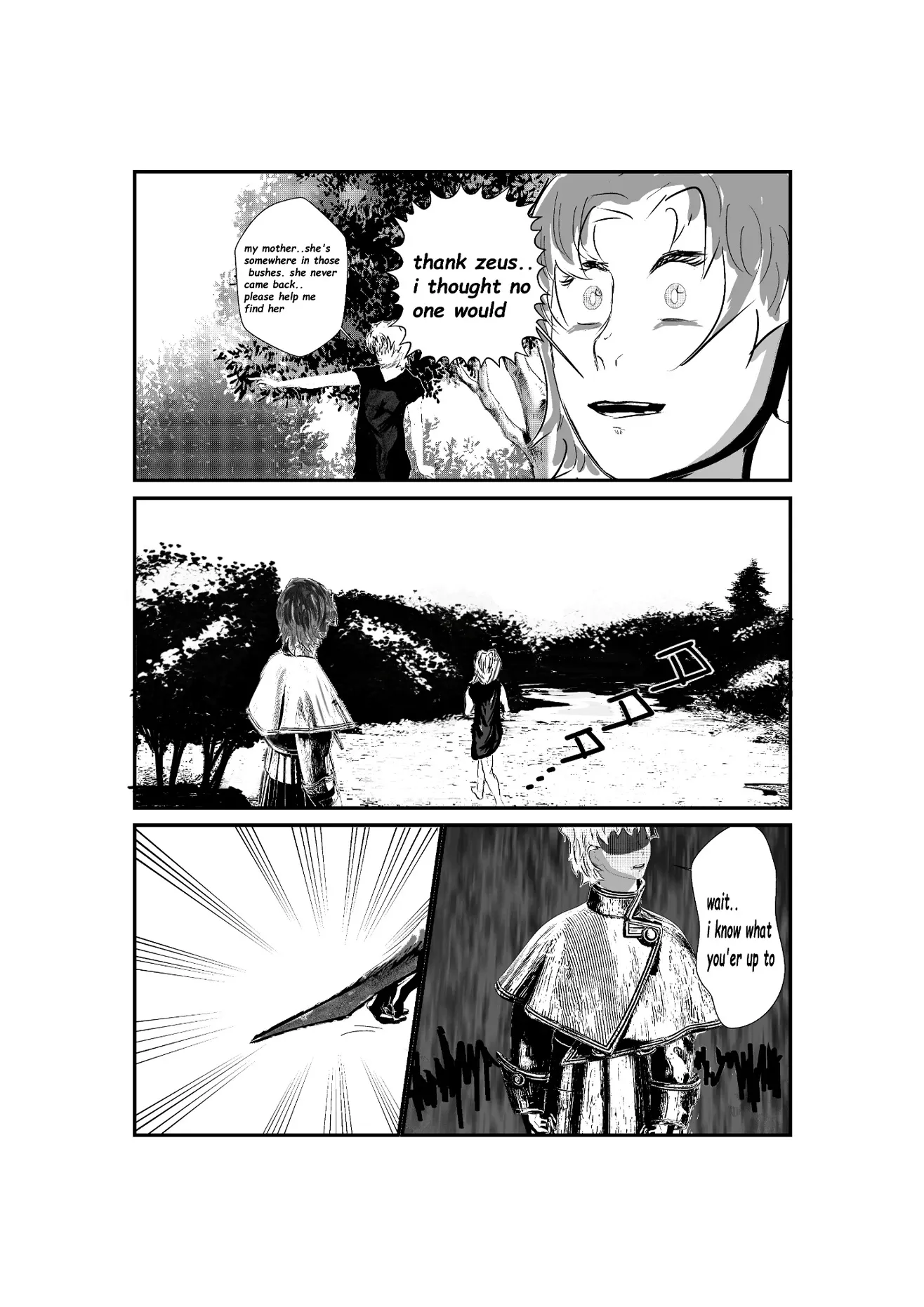


Hello! Overall, you have a solid foundation. However, always keep in mind that you should be looking for contrast between your backgrounds and your characters. In manga, black backgrounds are often used specifically to make the character stand out. In this case, the second panel has a lot of detail in the trees and bushes. Converting them to monochrome is a good first step for establishing the background, but even after that, you still need to balance the amount of texture to get a better contrast with the character. One thing you can do is simply simplify everything. Notice that I painted the entire silhouette black and only added a few spots of foliage to suggest some texture. I did the same with the ground; I reduced the amount of texture to simplify the image and make the panel easier to read. Always think in terms of contrast, whether it's light against dark or dark against light. Also, try to avoid having too much visual noise or excessive texture around the character, as this will help keep the character's silhouette clear and readable.
Pinturas (0)
my oneshot page jst wanted to know ( abt flow or any art tips )
Notas de autor:
recently struggling with panels and drawing background so i use real image backgrounds and turn them into monochrome