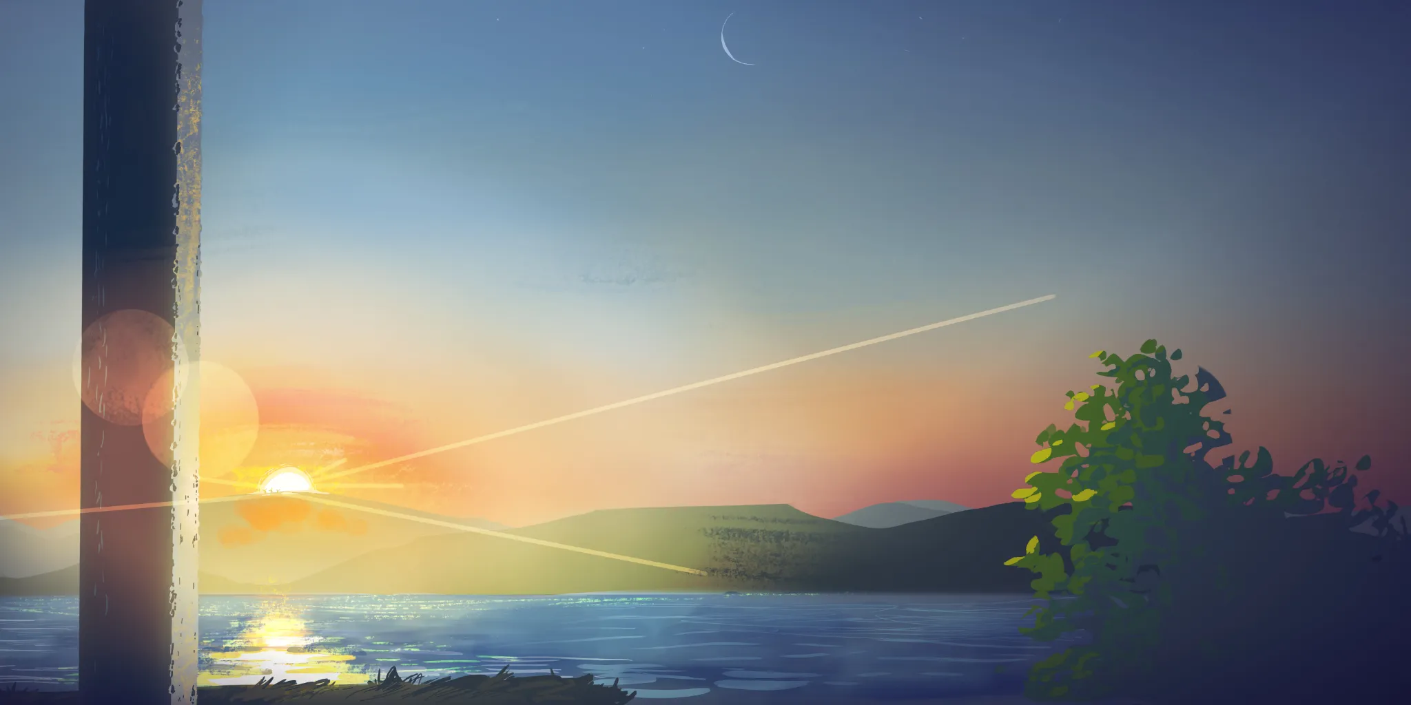
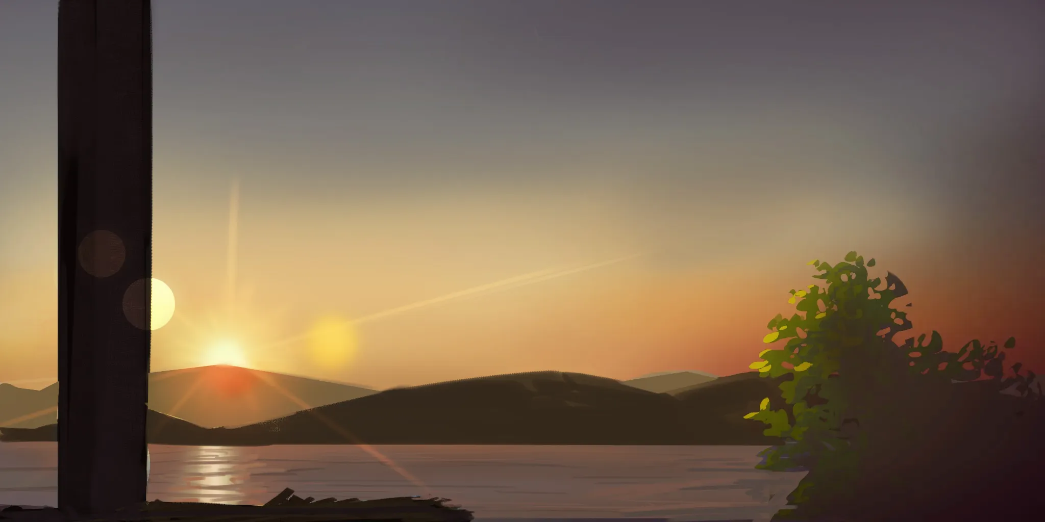

Hey there! Good work here! The only issue is that it doesn't quite feel like a sunrise yet because of the colors and overall mood of the scene. It's not necessarily wrong, but it isn't fully communicating that atmosphere. What you could do is make the scene warmer and use less saturated colors. A good example would be the water. It doesn't need to be entirely blue, since the sun hasn't reached its peak yet. If we're thinking of a warm sunrise, the colors in the water would shift more toward desaturated reds and oranges. As for atmospheric perspective, you can strengthen it by painting the mountains with lighter silhouettes and making the ones farther away slightly lighter in value. Placing the sun directly behind the mountains will naturally create this effect, since the light is being partially blocked by them. I'd primarily recommend studying values, as they are what will make an illustration feel solid. Study how value structures in movie screenshots or illustrations help convey mood and even lighting. On top of that, study lighting itself; pay attention to how light affects local colors depending on the time of day.
Pinturas (0)
Sunrise
Notas de autor:
I couldn't make the water watery enough. I really struggled with the sky and atmospheric perspective too. Which art fundamental should I focus on?