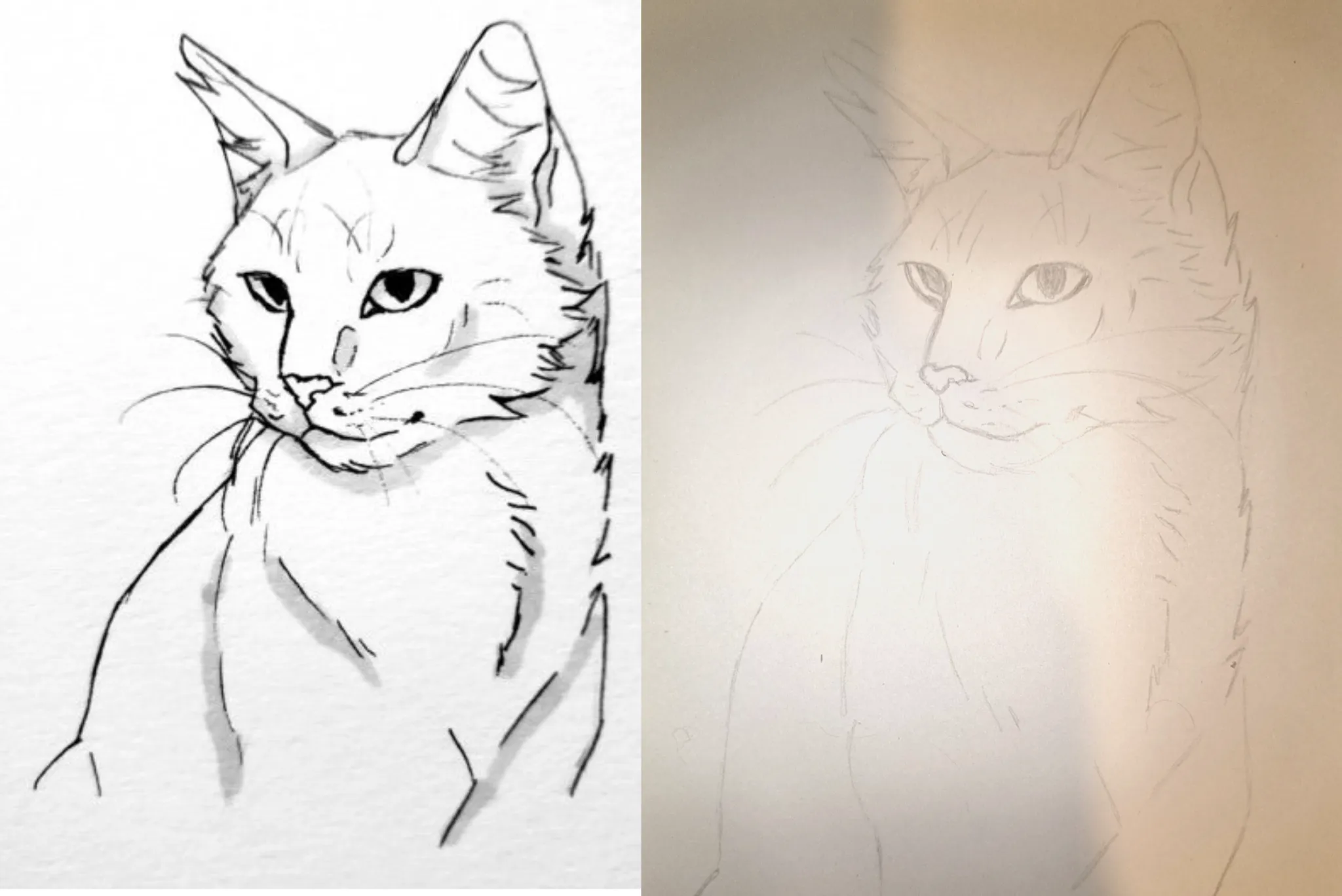
Honestly, your drawing is already really good! The differences I notice fall into three categories: 1- Your line work: You can darken the outlines even more, like in the example on the left, so the silhouette stands out better. 2- Shadows: You haven’t added any at all, and that’s what can make the drawing look flat. You’re good at tracing, so remember to trace the shaded areas too ;) 3- Proportions: You can make the outer corners of the eyes a little more slender—not by much; just extend the top line a few millimeters outward on both eyes. In your drawing, the bridge of the nose starts just a tiny bit higher than in the reference. If you look closely, it starts just below the level of her right eye (on the left from our perspective). I can’t wait to see the result with these small tweaks! And overall, keep up the good work and try adding more contrast with the outlines and shadows to take it to the next level :)
Comenta 1
Cat study reference

Notas de autor:
What should I improve in this drawing to make my copy more accurate, and what exercises do you recommend to work on those weaknesses?
01