Want to store your feedback?
Sign up to store all your feedback in one place on your account. Your feedback will be private instead of public.
Also struggling with your art?
Improve your skills, a 3 min read
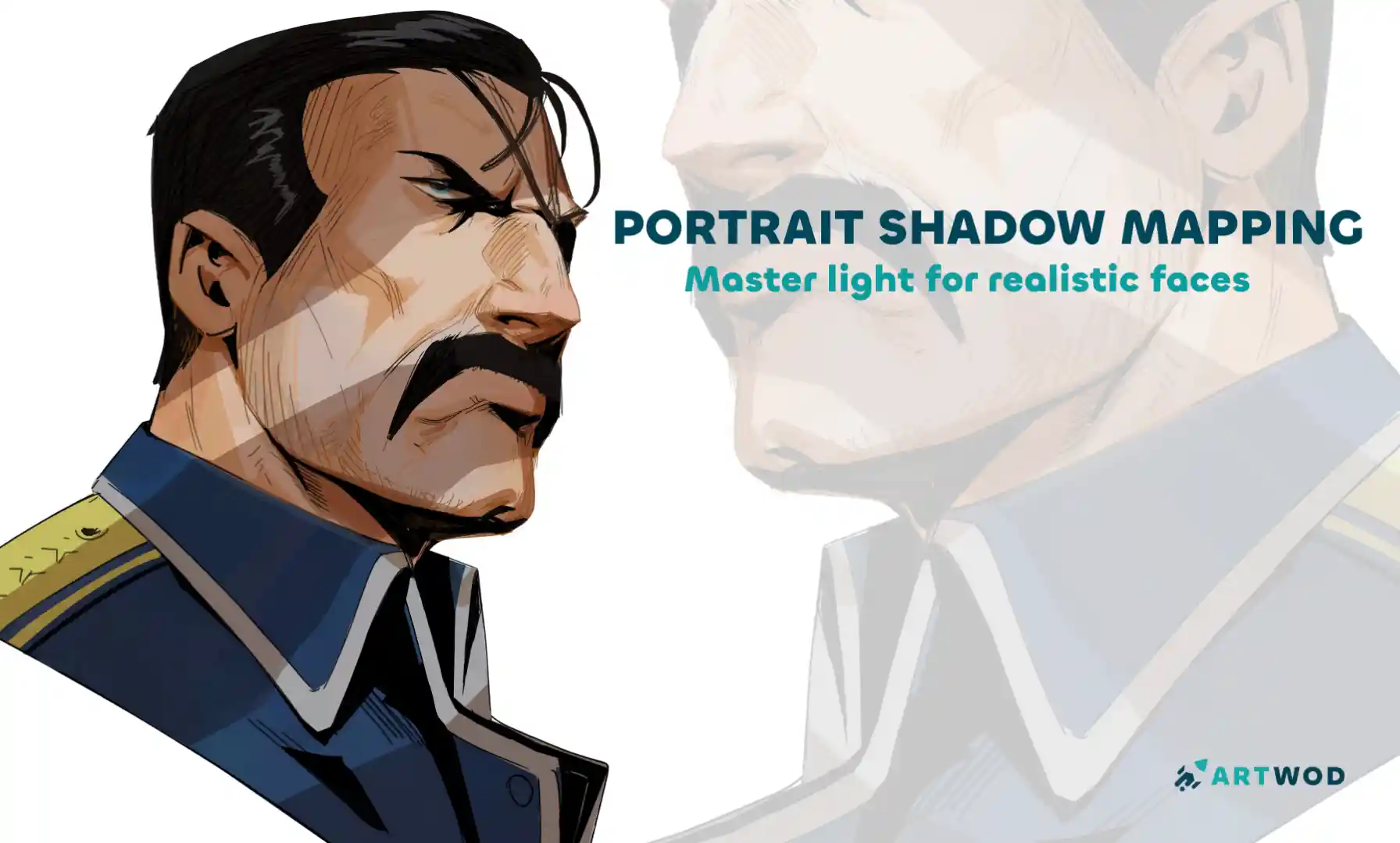
Portrait Shadow Mapping: Master Lighting and Shadows for Realistic Faces
Master shadow mapping through four progressive exercises—from simplified Loomis and Asaro heads to analyzing real paintings and experimenting with different light sources.
Challenge-of-the-month
Would you like to help someone who's still waiting?
Anime
No responses yet
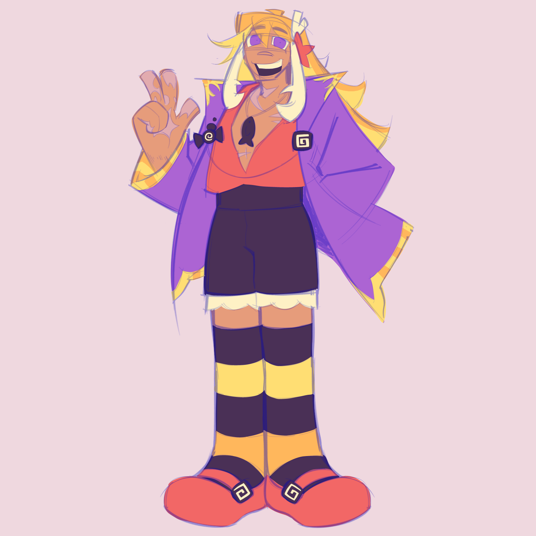
Tomomi Shimizu - Redesign
I am struggling so hard with this lad's design... he's a little crab themed, but I don't want to lean into that too much since it would be hard to mesh with his main theme, candy. I'd like for the oranges, pink-ish red, and purple to stay, but feel free to change up literally everything as long as he looks either cute or hot. Or both. His current deal is that he lived in an under-water isolationist society that's kind of japan inspired (though not very) which often uses a candy called 'karmel" as fuel for their magic. Tomomi here has the special power to conjure up karmel on a whim, so he's a sweet boy in a literal sense. He was basically kidnapped and tossed into a colosseum meat-grinder for farming EXP, hence the many scars... despite this he's usually a friendly face, being the chiller half of his comedy duo I can't elaborate on lest I make this explanation too long. He's insane, but he's insane in a fun way, y'know? Ignore the masochism. So, as you folks can tell, this whole backstory is REALLY hard to implement in tandem with his themes! I'm struggling!! I'm dying in here!!! Save me, more experienced artists!!!!
2 hours ago
View
Environment
No responses yet
Undecided
So, I was too deep in to go back to perspective Im just cheat and render it out. Sorry Fosco - When I start the next one im gonna really lean into the horizon line and vanish points. Try get some feedback on it early when its still sketch phase.
4 hours ago
View
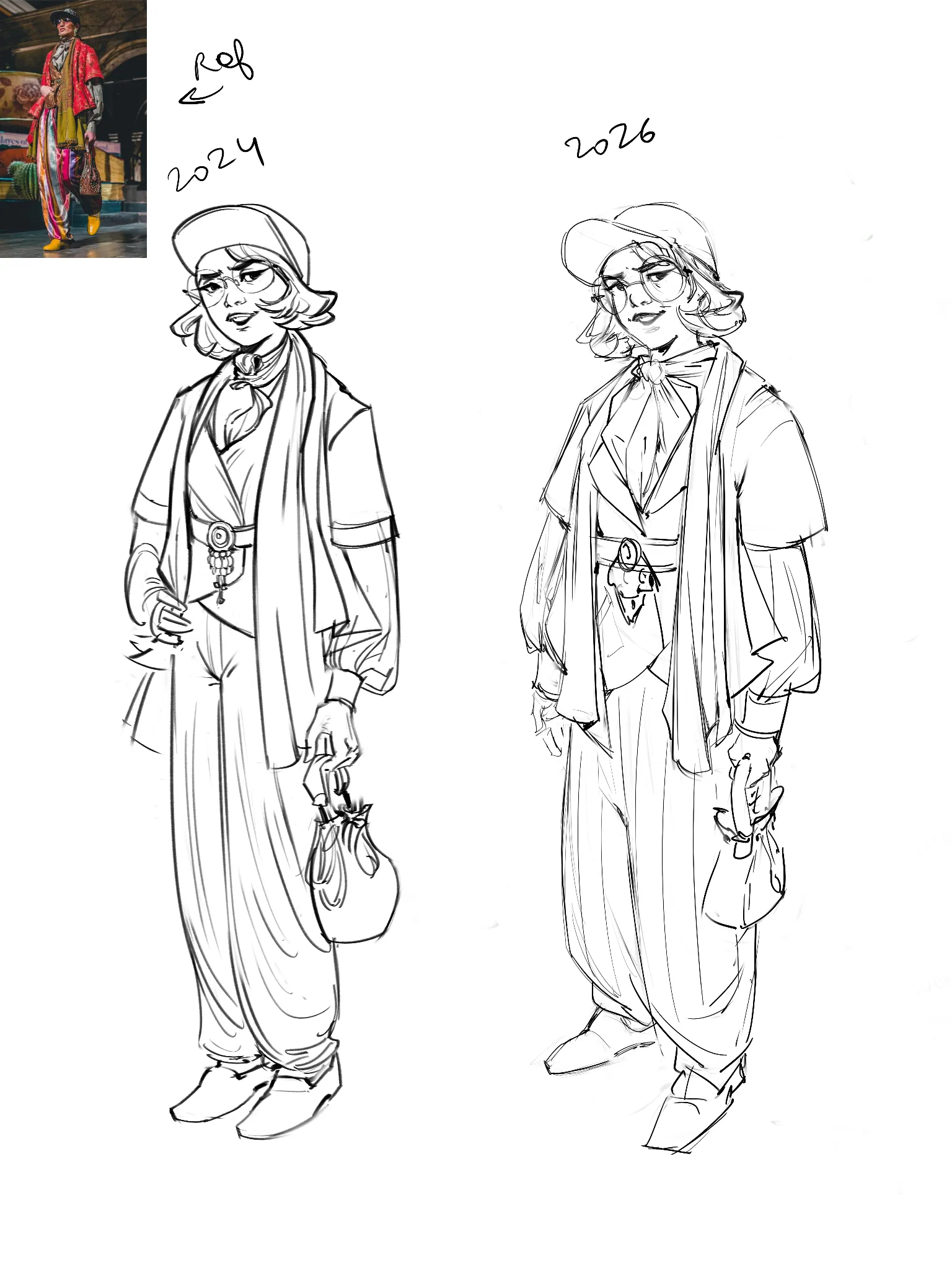
July Before & After Art Challenge
No responses yet
24-26
Still a looooong way to go but nice to see the distance covered so far :)
6 hours ago
View
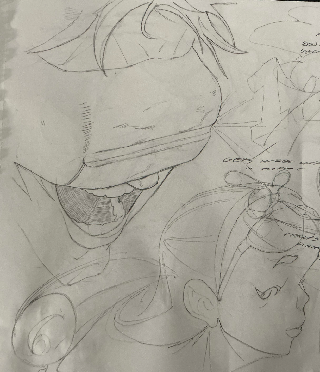
Portraits
No responses yet
OPTIC BLAST!
Cyclops from x-men! uuuhhh i started with the silhouette first (kind of a sloppy move on my part). Actually, this whole drawing is pretty much based on my intuition, so yeah, the proportions and everything under the visor are gonna be pretty inconsistent, especially considering the angle. Didn't do too bad on the hair and line variation, tho. Oh yea, and there's a face from imagination on the bottom right. Also, have y'all read the remastered x-men manga yet. Im enjoying it so far. Thanks for the feedback!
6 hours ago
View
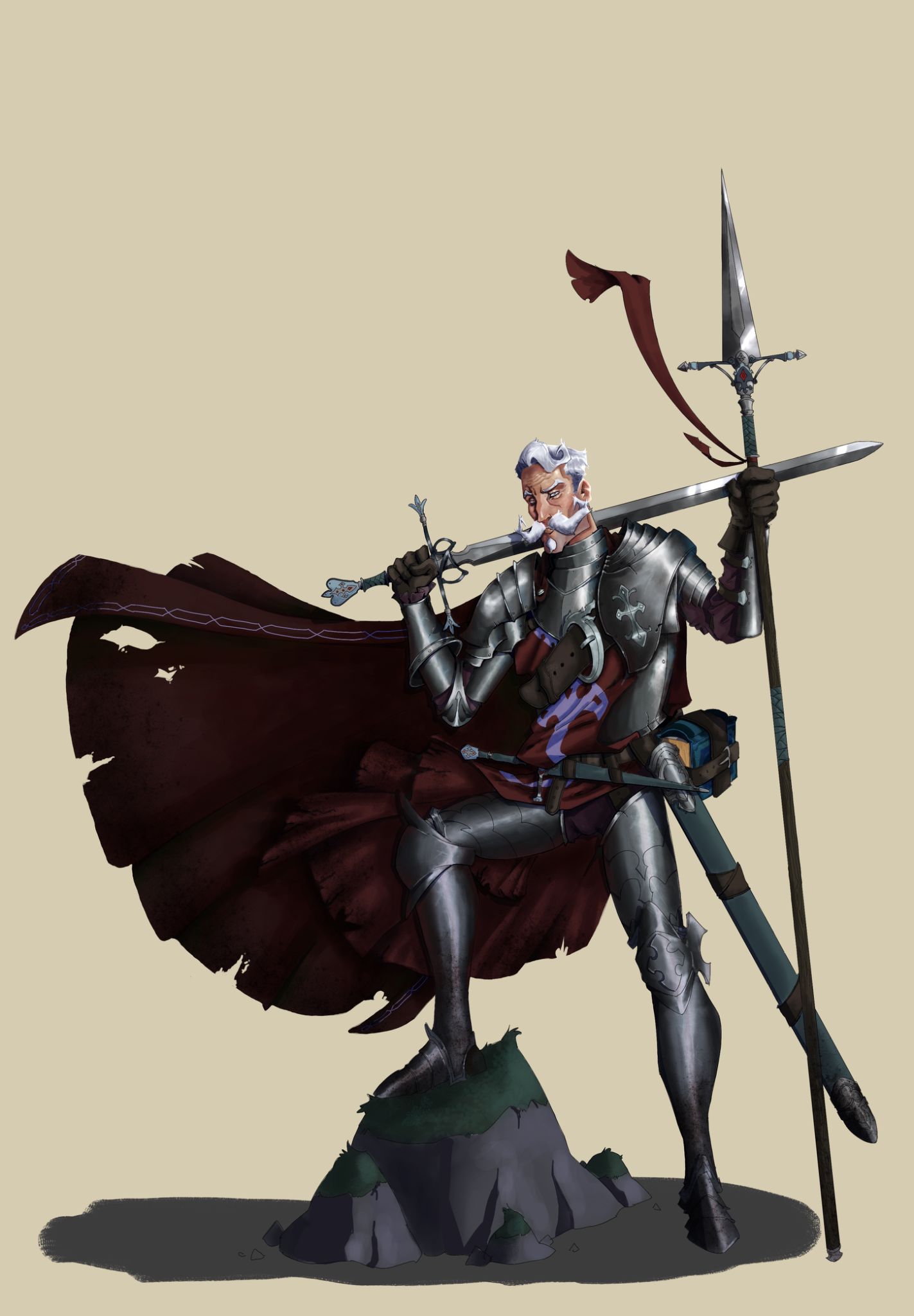
Rendering
No responses yet
Don quijote polish
I got some feedback in a Discord server, but it’s not here. Since im treating this website as a kind of journal, ill upload. I worked on the material separation, render of the face and tried to make the metal armor more beliavable. I think it’s a good improvement. Still, it could allways be better.
7 hours ago
View
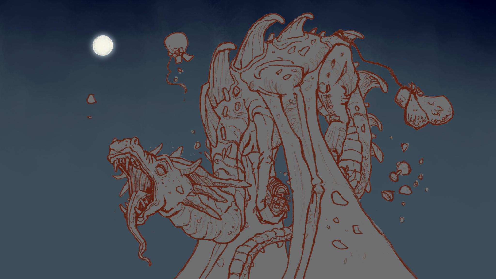
August Smaugust Challenge
No responses yet
Sleepy Hoarder
1. Definitely struggled with the back feet being hidden but still managing to draw convincible forms. 2. Even with the perspective grid I think I did a poor job of nailing that yawning snout - referred to yawning lions for reference. The other entries are fantastic!
8 hours ago
View
Anime
No responses yet
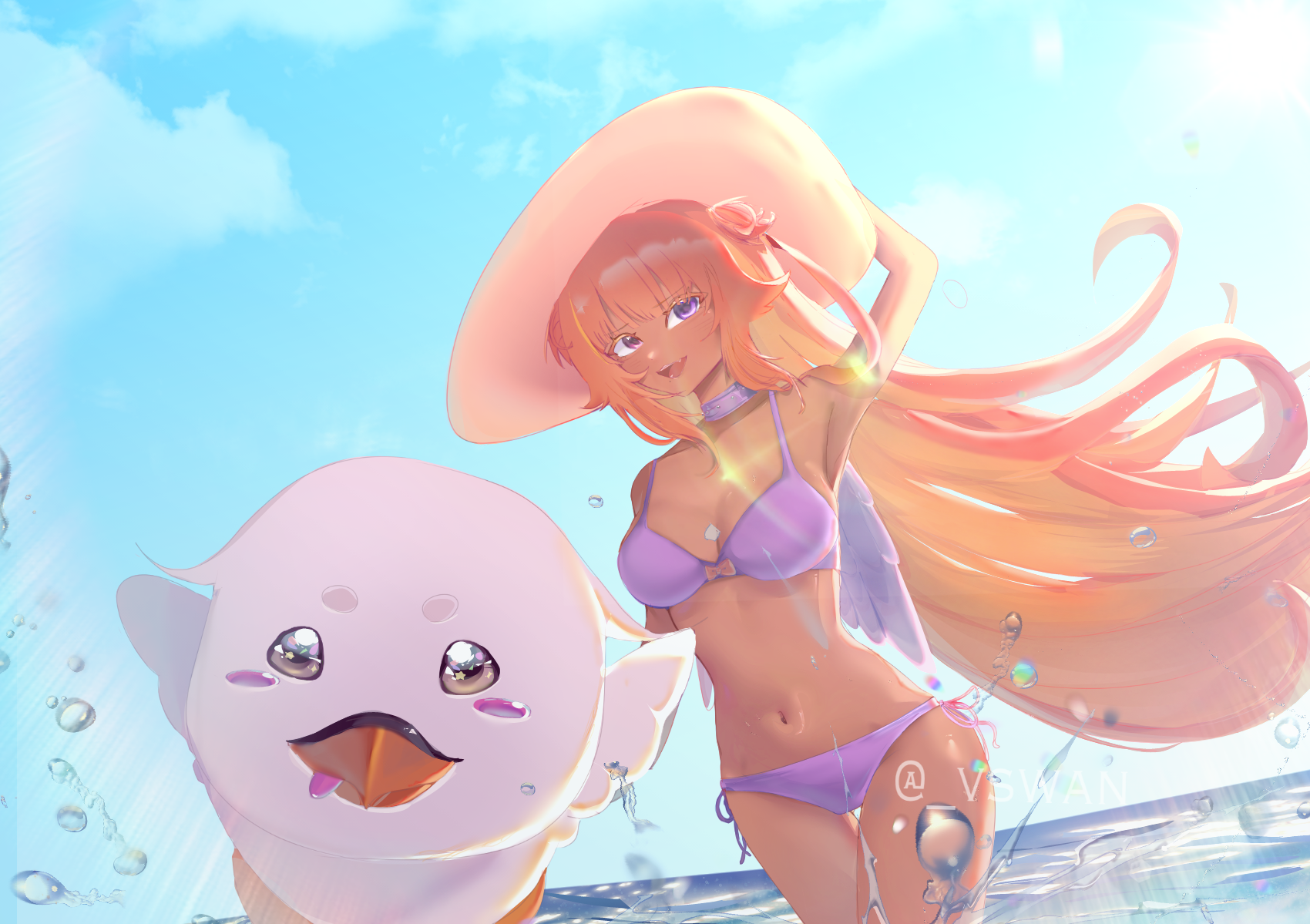
please show me what i can improve
im very open minded and really want some criticism on basically anything :)
12 hours ago
View
Anime
No responses yet
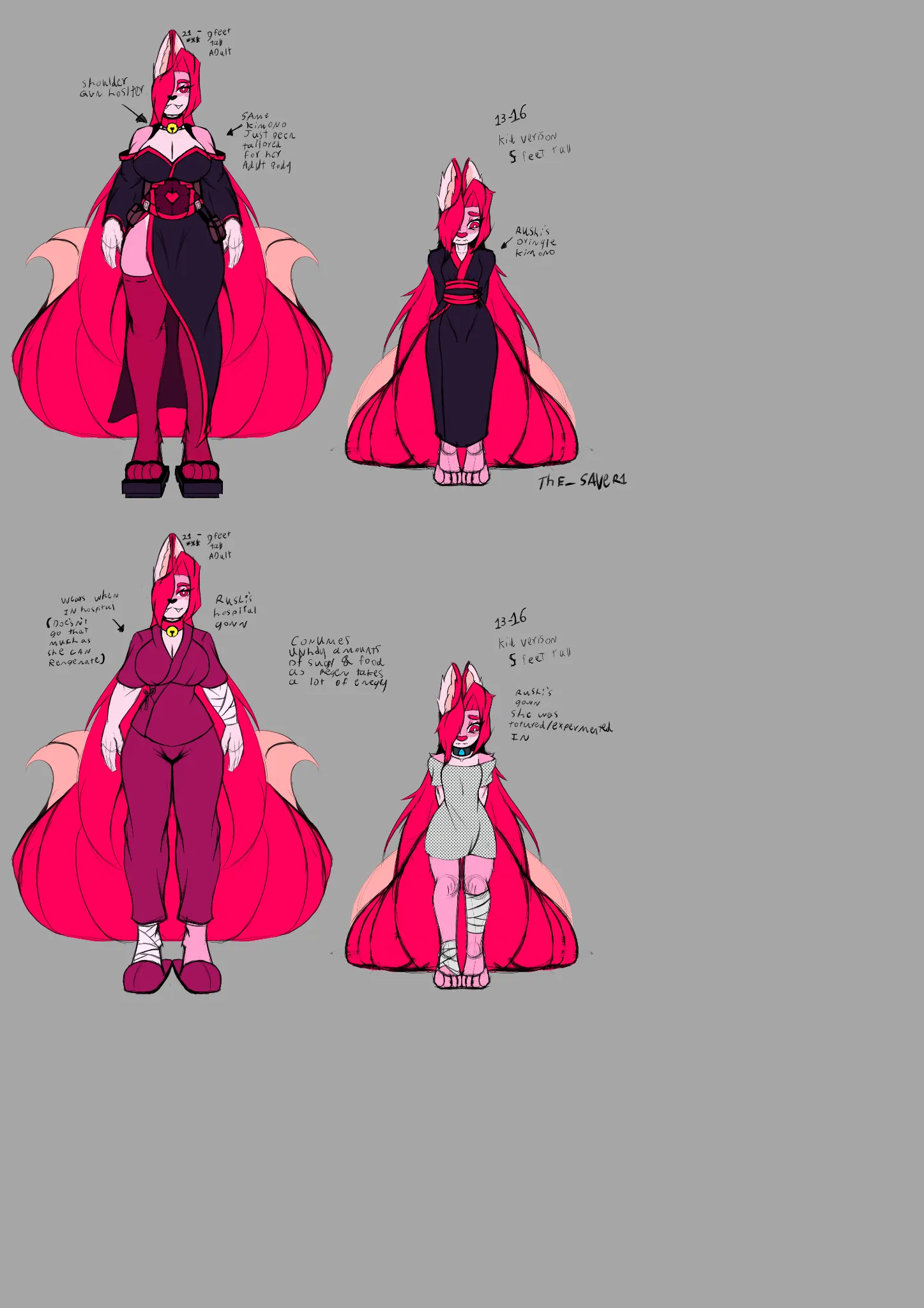
concept art For Rushinda
Struggling with the kimono for the adult version for her as I want it to be more combat but also be something you can wear to fancy events. Also want it fit her character more be something unique & memorable.
13 hours ago
View
Anime
No responses yet
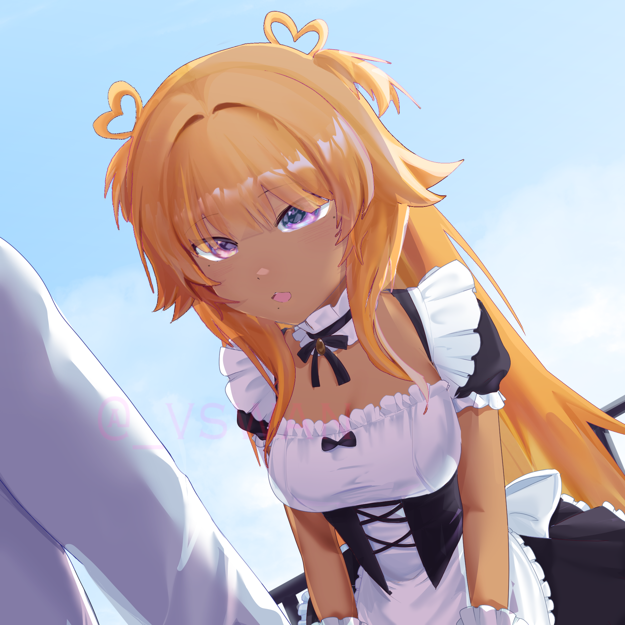
my first ych i opened, but it feels a little flat?
i feel like there’s not a lot of contrast, idkkk
13 hours ago
View