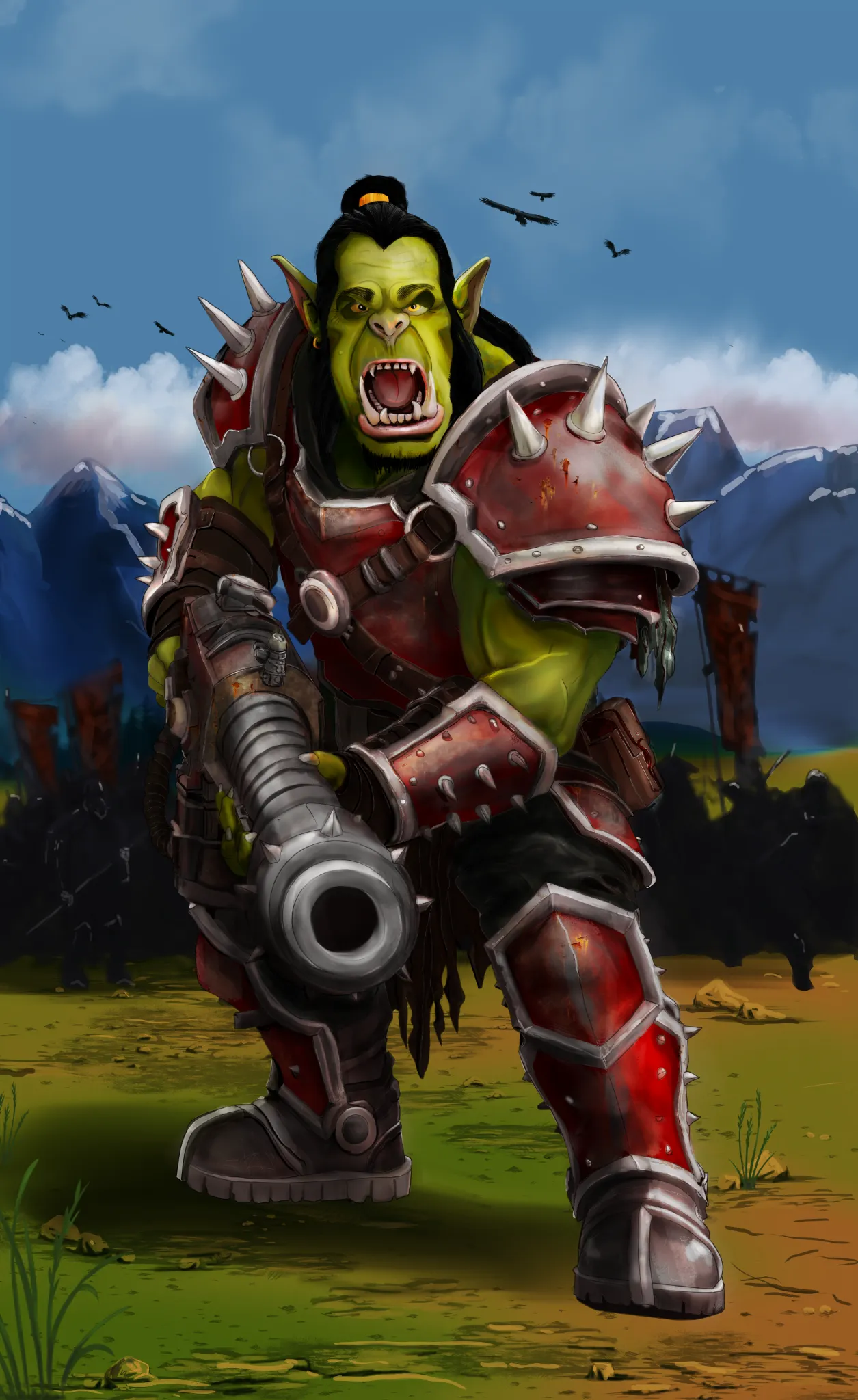
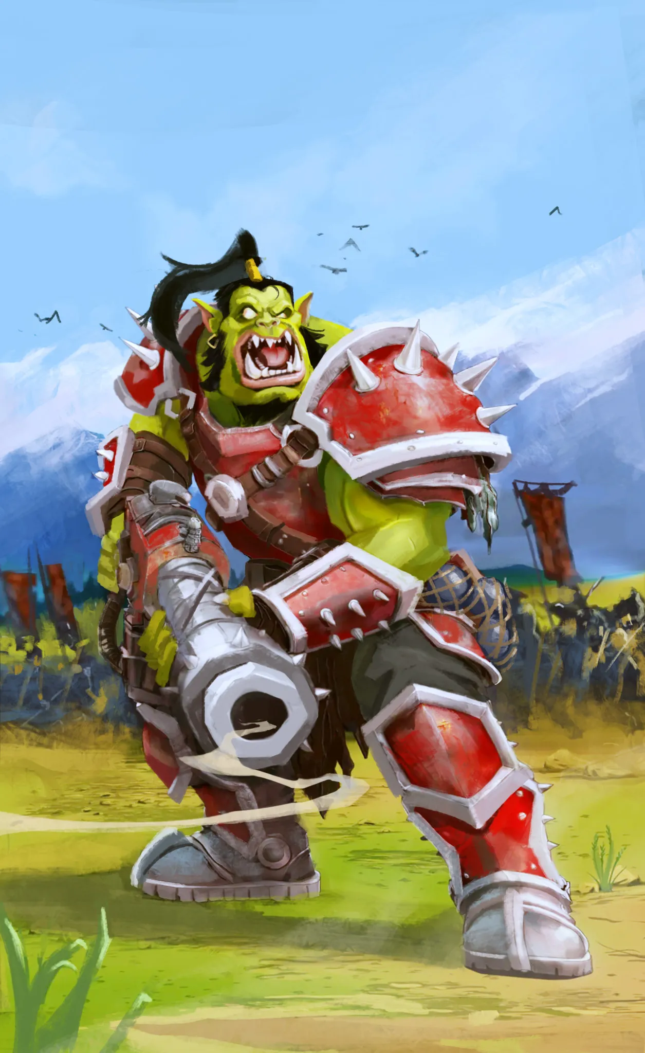

Hey, first off, huge props on the sheer amount of effort and detail you put into this painting! Rendering all those individual armor plates, metal textures, and spikes takes a ton of patience, and your dedication really shows. Your realistic rendering style definitely works on its own, but to address the "pop" and muddiness you mentioned, I did a paintover pushing it toward a more Warcraft-inspired stylized lighting and proportion look. Here is a breakdown of what I adjusted to help solve those contrast issues: Clearing Out Heavy Darks: High saturation can actually start to look muddy when dark, heavy shadows are scattered across every surface. It took quite a bit of effort to slowly paint out those deep black/dark values, but simplifying and lifting the shadows lets those bright, saturated midtones actually breathe and pop! Unified Sunlight & Sky Light: Pushing a clear, dominant key light catching the top planes (balanced with cool sky fills in the shadow areas) gives you that punchy, vibrant contrast without dirtying up your local colors. Chunky Proportions: Pushing exaggerated, heroic shapes, like blowing up the scale on the pauldrons and weapon, gives the character an instant graphic read. Balancing saturated colors with dark values is always a tricky puzzle, but the foundation and high-level polish you built here are super impressive. Hope seeing this stylized value exploration gives you a few fun ideas to play around with!

Hi Kyleyj, thank you for the paintover and feedback , as i`m still learning it`s always good to receive advice on how to improve. paintover are a great idea as you can see the changes that you suggested and how they have improved the origional Art peice. i will certainly try and put in practice your suggestions.