Want to store your feedback?
Sign up to store all your feedback in one place on your account. Your feedback will be private instead of public.
Paintovers
Paintover Notes
Choose a paintover
Pick a user avatar to see their paintover notes and discuss them.
Also struggling with environments?
Improve your composition and depth, a 3 min read
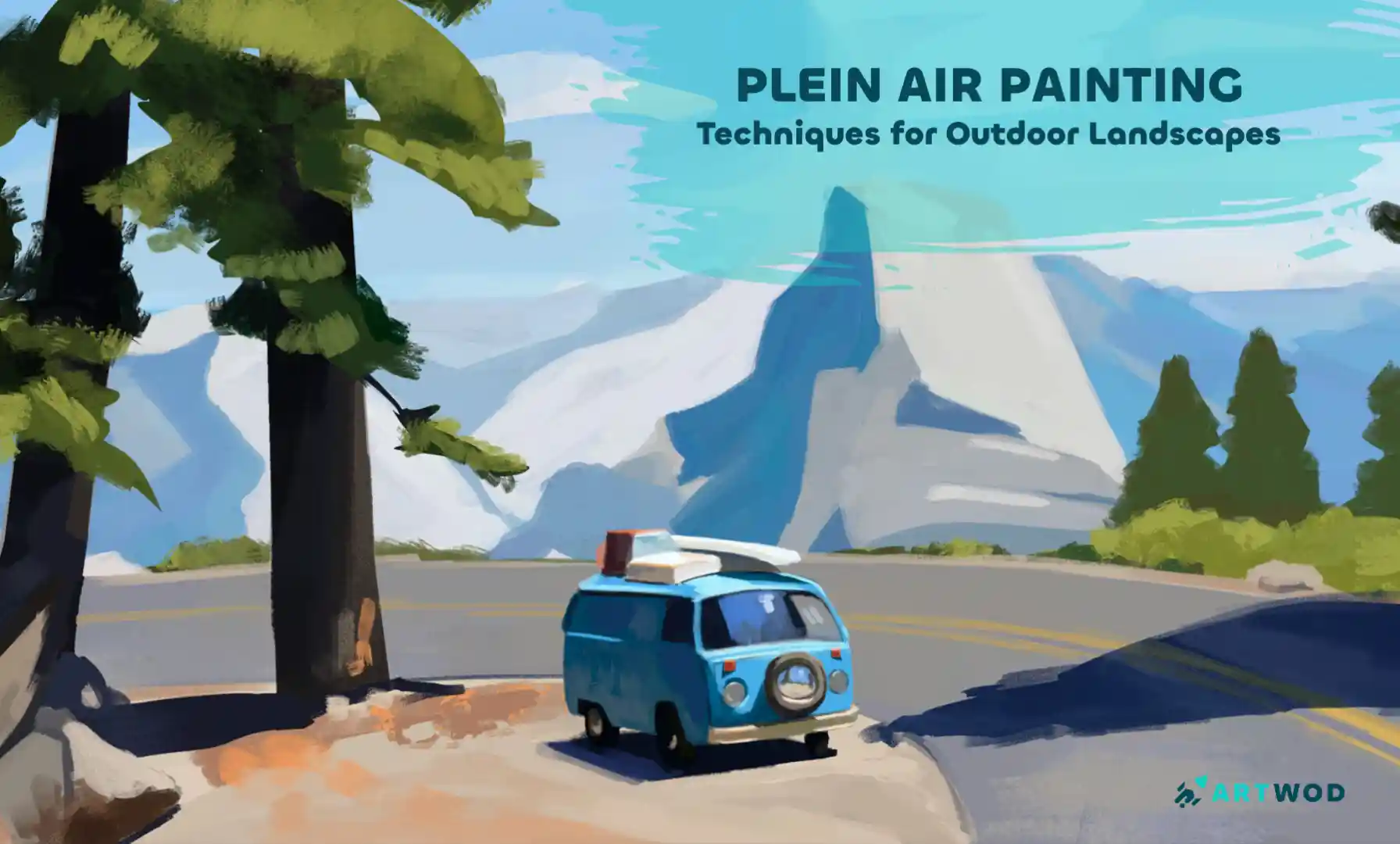
Plein Air Painting: Outdoor Techniques for Landscapes and Nature Scenes
Master plein air painting by analyzing compositions, sketching real environments, building value structures, and layering color to create immersive landscapes.
Environment
Would you like to help someone who's still waiting?
Perspective and Form
No responses yet
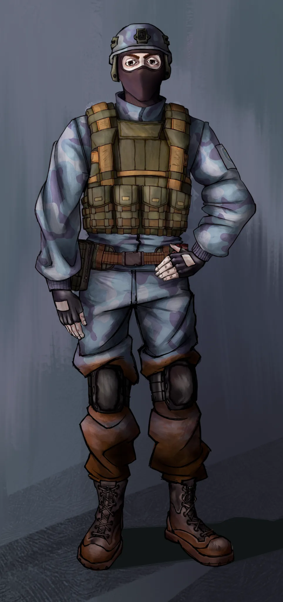
CragDyna
I want to get better at communicating shadows and perspective. That's something I've always struggled with. I'm sure there are some things I could've done better, but I need a seasoned eye to tell me what specifically.
1 hour ago
View
Rendering
No responses yet
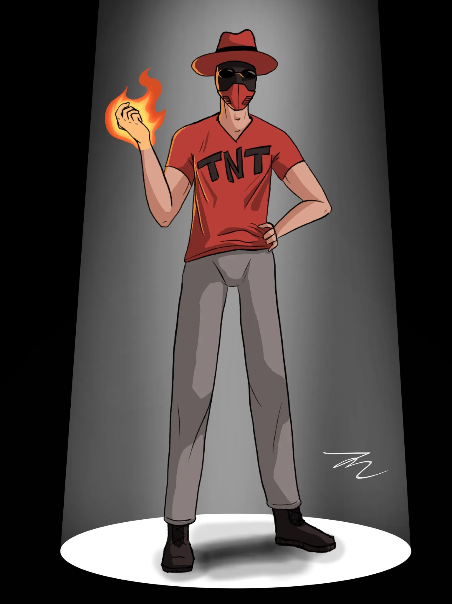
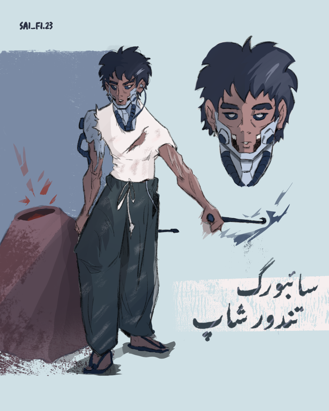
A character i drew, want to get some feedback
This is a commission i drew recently, and i think that aside from the boots, my texturing and render is kinda week.
2 hours ago
View
Figure
No responses yet
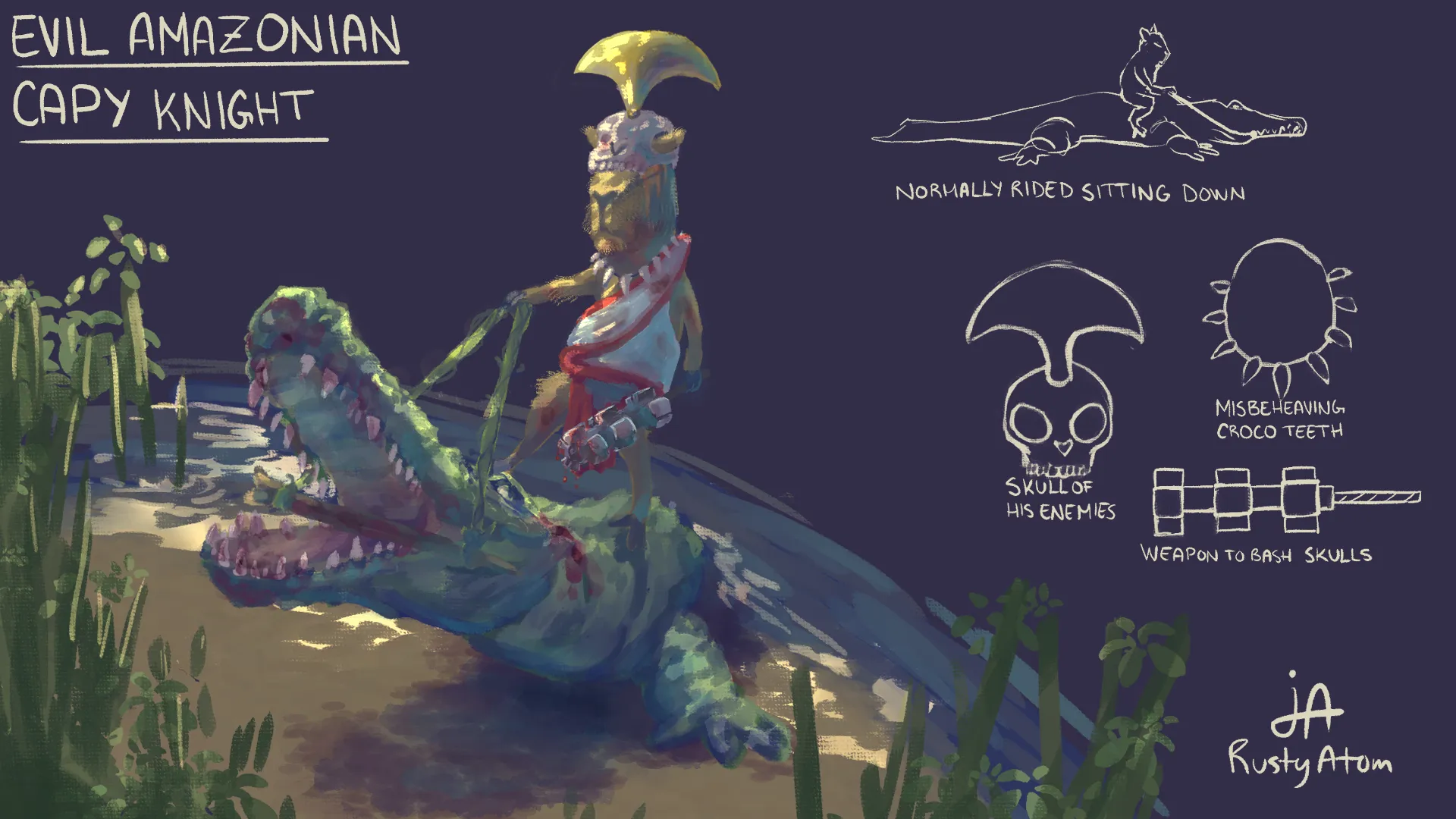
Bread maker Saleh
How can I improve the pose overall and make it feel more dynamic, I feel like the arm holding the rod can be executed better, other suggestions are appreciated as well.
2 hours ago
View
Perspective and Form
No responses yet
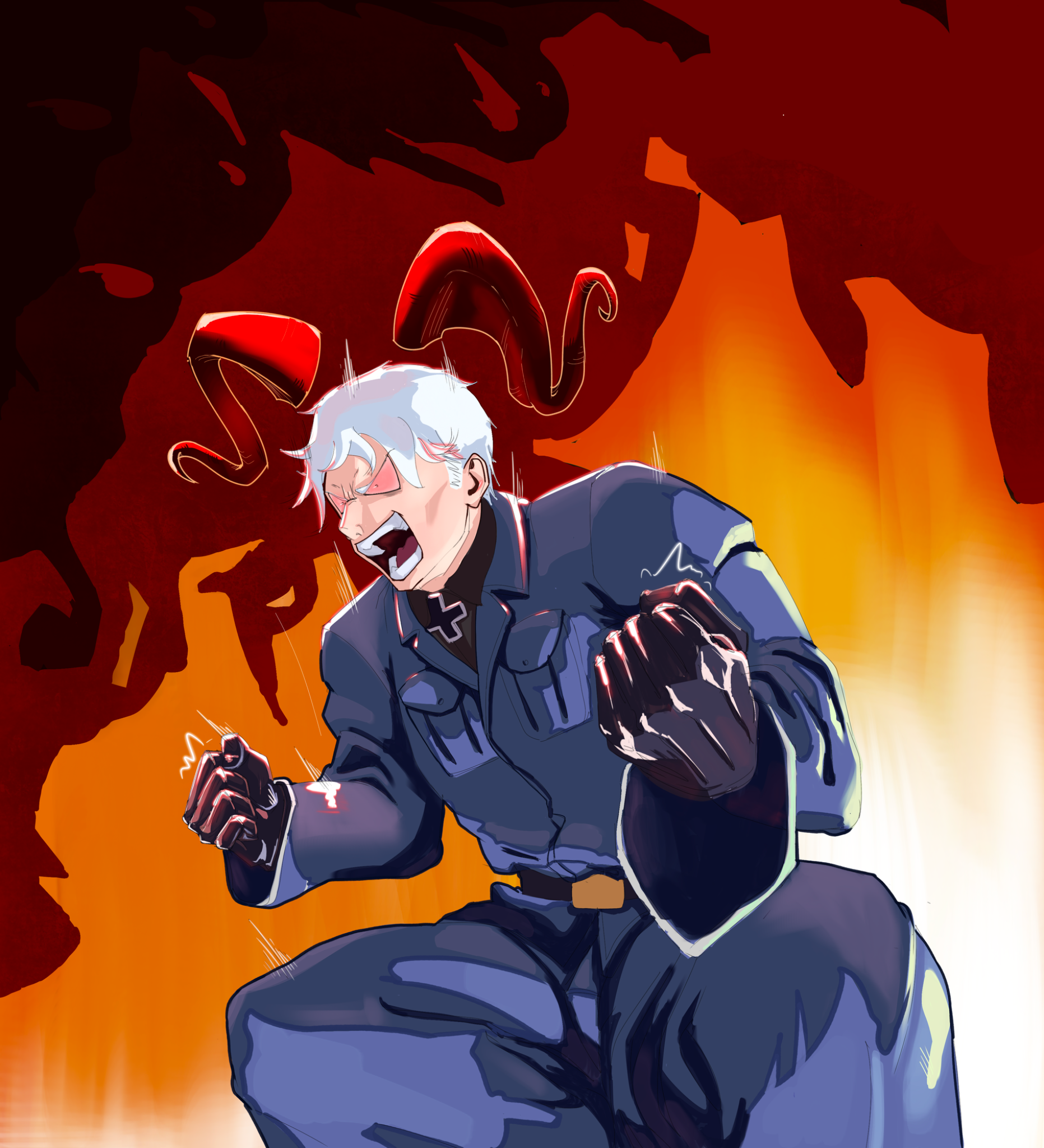
Evil capy knight
So, did this for this year's Chroma Corps assignment yesterday, and as proud as I am of this piece, I really did not receive the feedback I thought I would. I know my weak point is presentation, but I have also always struggled with both perspective and colors. I feel like the alligator and capy could've been in a more dynamic angle on more intense perspective, but I have no idea how to get it done.... Any help and ressources would be so much appreciated 👏
3 hours ago
View
Rendering
No responses yet
Lighting/Coloring Improvements
Anything I could do to improve this? Thanks!
4 hours ago
View
Rendering
No responses yet
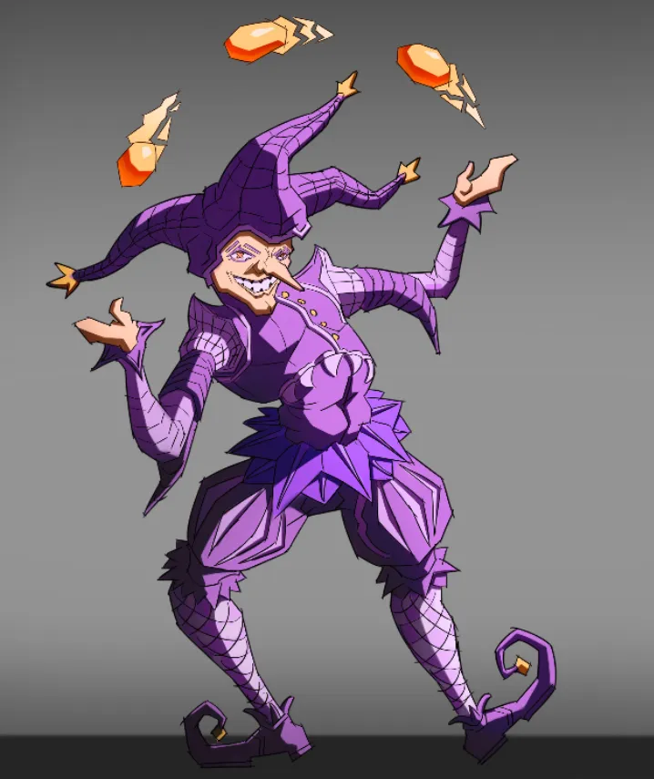
Character design, jester
This is practically my first piece of art without references. I drew it until I ran out of ideas on how to improve it. I would be glad to receive any advice.
4 hours ago
View
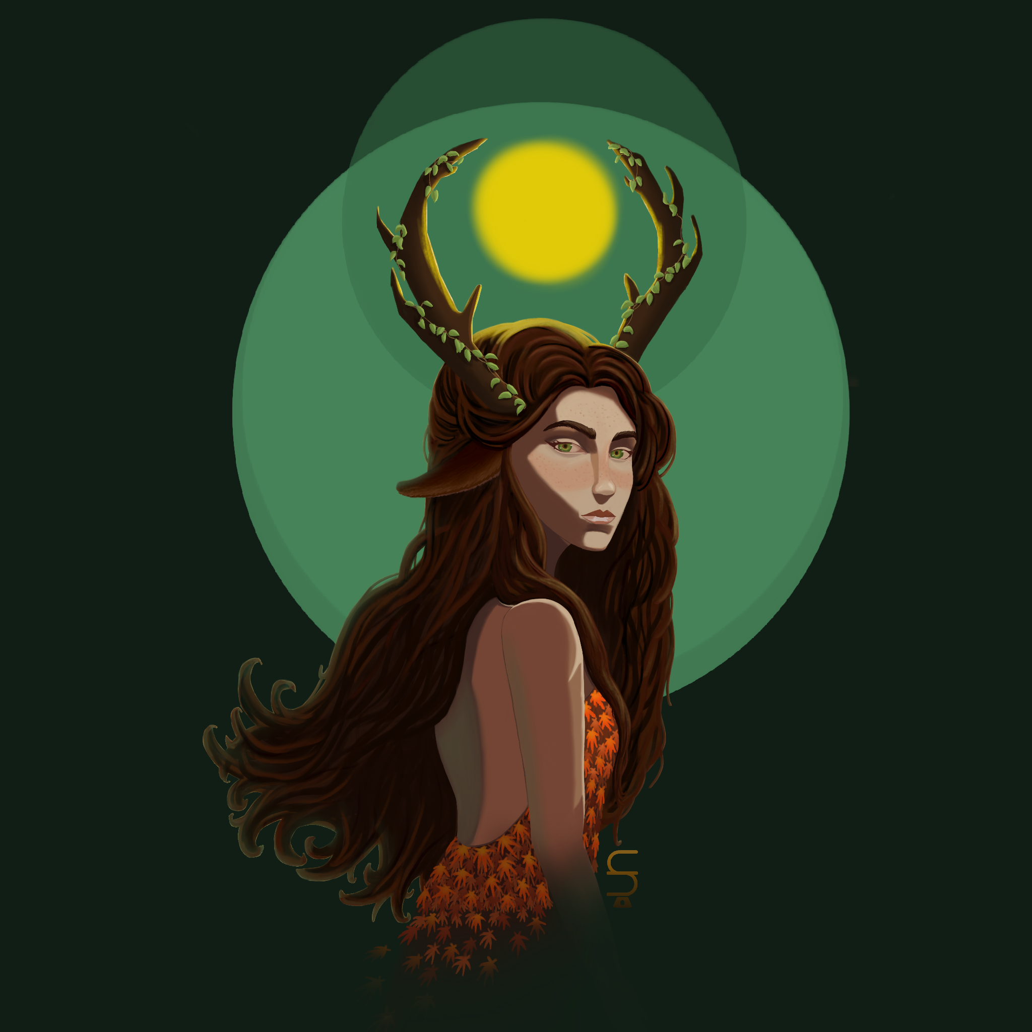
July Before & After Art Challenge
No responses yet
Profile illustration
Rework Thanks so much for your feedback, Fosco ! My drawing has really improved !
4 hours ago
View
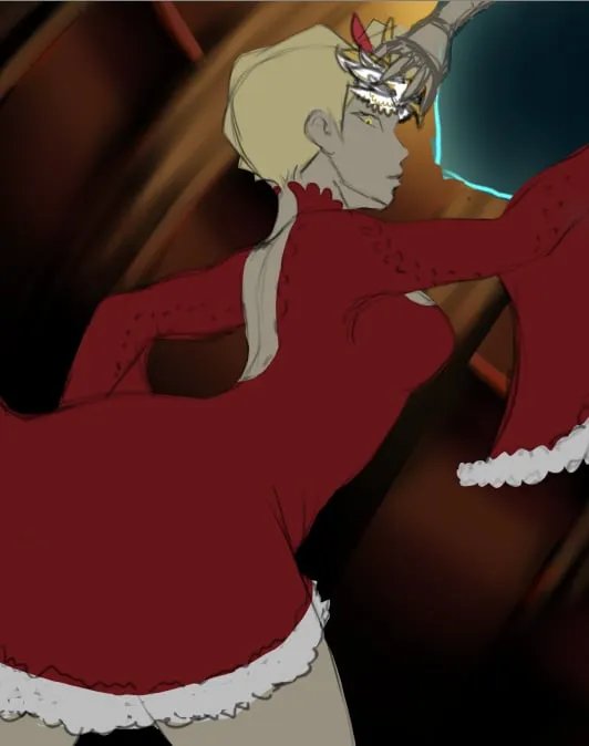
Environment
No responses yet
help me with the background
i really dont like the background it was supposed to be inside of a fancy mansion but it looks like a cabin i really dont know what to add. before i render i wanted to fix the environment first so it doesn't turn out bad
5 hours ago
View
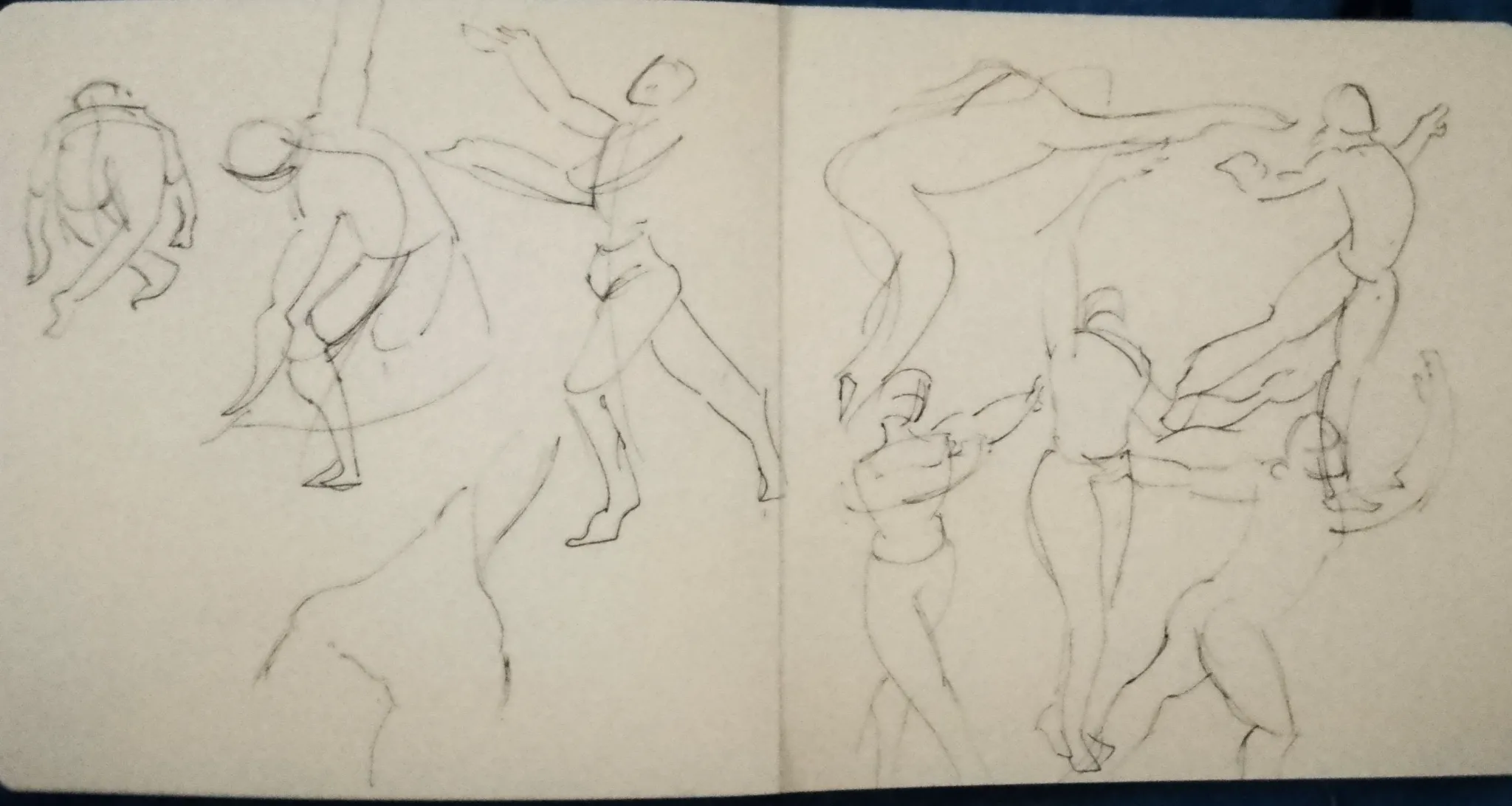
Figure
No responses yet
Figure drawing practice
Hello, I'm a beginner and I was practicing figure drawing. I'd like to know if I need to have certain criteria or what I should consider.
5 hours ago
View