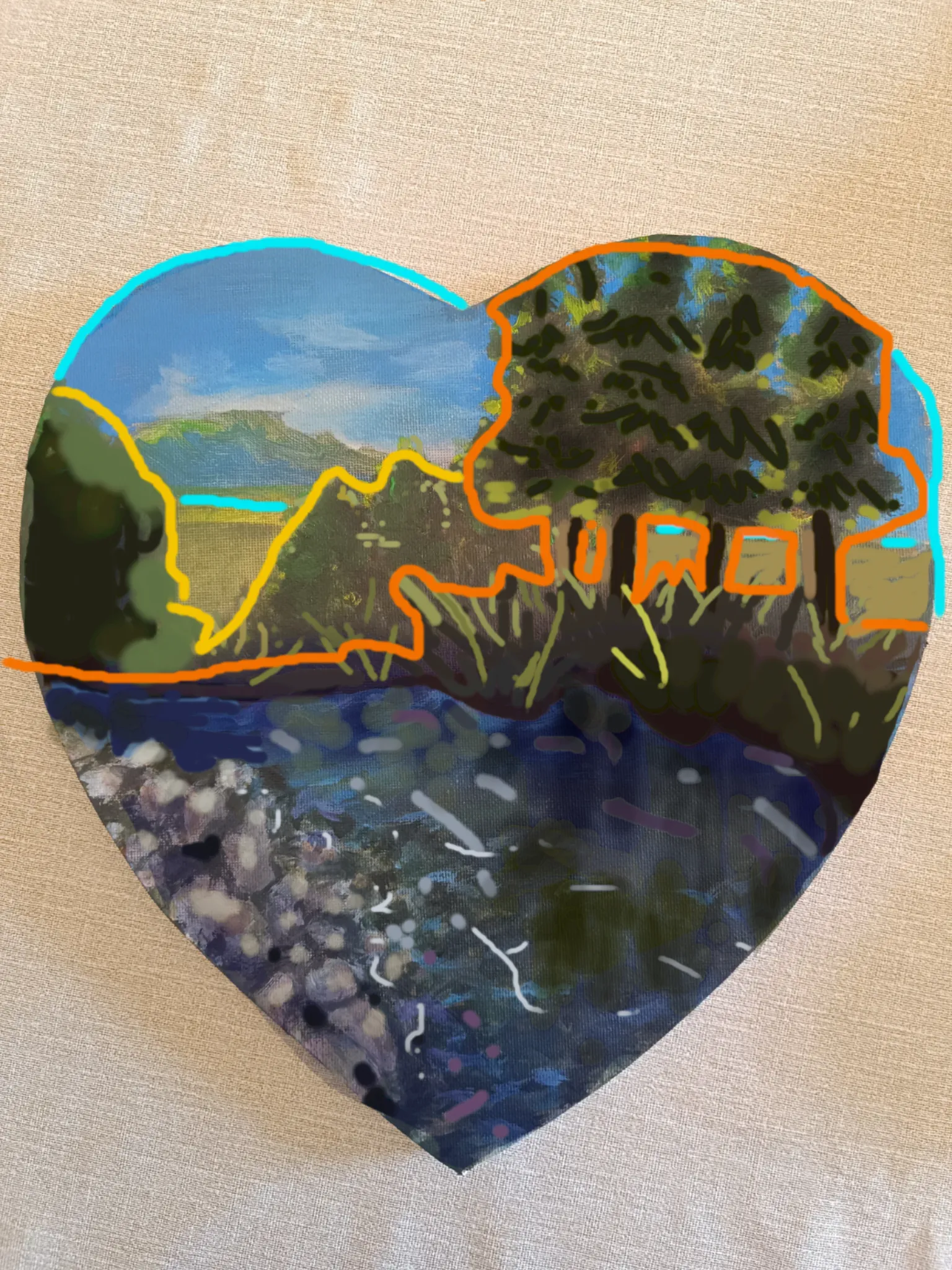

Hi! I feel like the overall color scheme works well, but everything is flattened out by the values, since they are all very close, meaning it lacks a bit of contrast. I left in orange all that I understand as foreground, yellow for midground and cyan for background. Is this a sunset? a morning? midday? depending on that, the lighting could vary quite a bit, but since I assumed the light came from behind the trees, maybe a rim light in some areas could separate the background from the foreground a bit at the tree line, on top of darkening the entire foreground. To make the rocks and water a bit more defined, you could shine some bright highlights on and around them, since moving water tends to have that kind of shine. Also, add a bit of a reflection of the landscape colors on the water. That way, it will seem like a reflective surface. The composition could benefit a bit from some curves, since the riverbank where the trees sit looks too flat to be natural. I added a bit of lighter background behind the trees so the trunks can contrast a bit more. You could still go for a darker background and a lighter foreground if you wanted to make it less moody, or more of a dawn, maybe. I hope this helps you! I had only my mouse to paint with but I did my best :) Love your piece, keep working!
Paintovers (1)
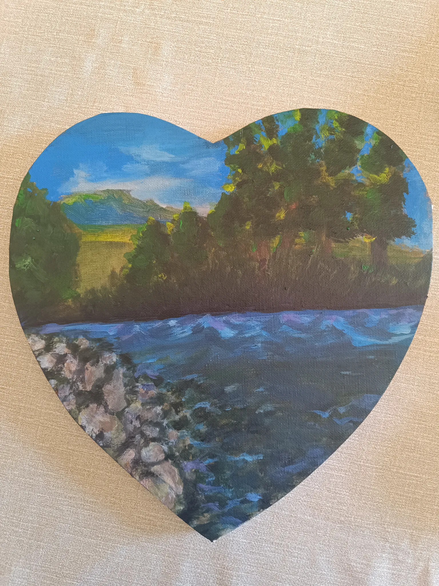
The Riverbank
Artist's notes:
I'm having trouble figuring out where to place the lighting and how to position it on the trees and plants. I feel like the painting looks very dull. The water and stones don't convince me either. Any suggestions on how to improve it, please?