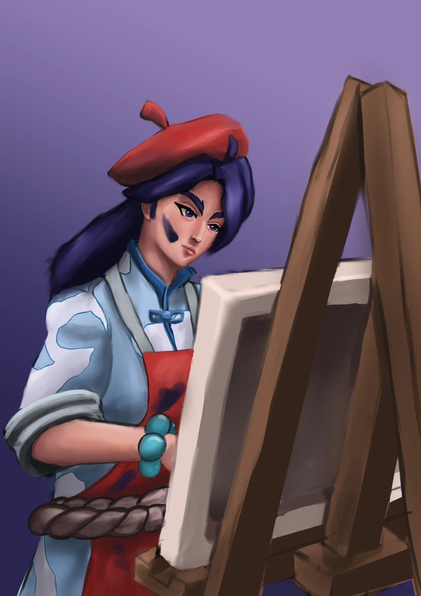

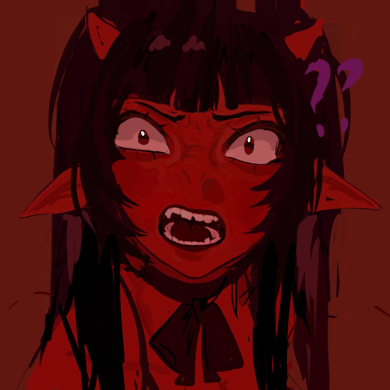
Dont use gray shadows for ur artwork. Suggest using more purple and pinkish tones. Perhaps orange between light and shadow for vibrant depth
Violet from Deadlock
Künstlernotiz:
The colours look muddy, also idk how to make smooth colour transitions without making them blurry. Same goes for soft/hard edges, the soft edges feel too blurry (e.g. cheek to neck transition), and the hard edges are either blurry too (e.g. chin-neck) or too sharp (e.g. nose side-bridge)