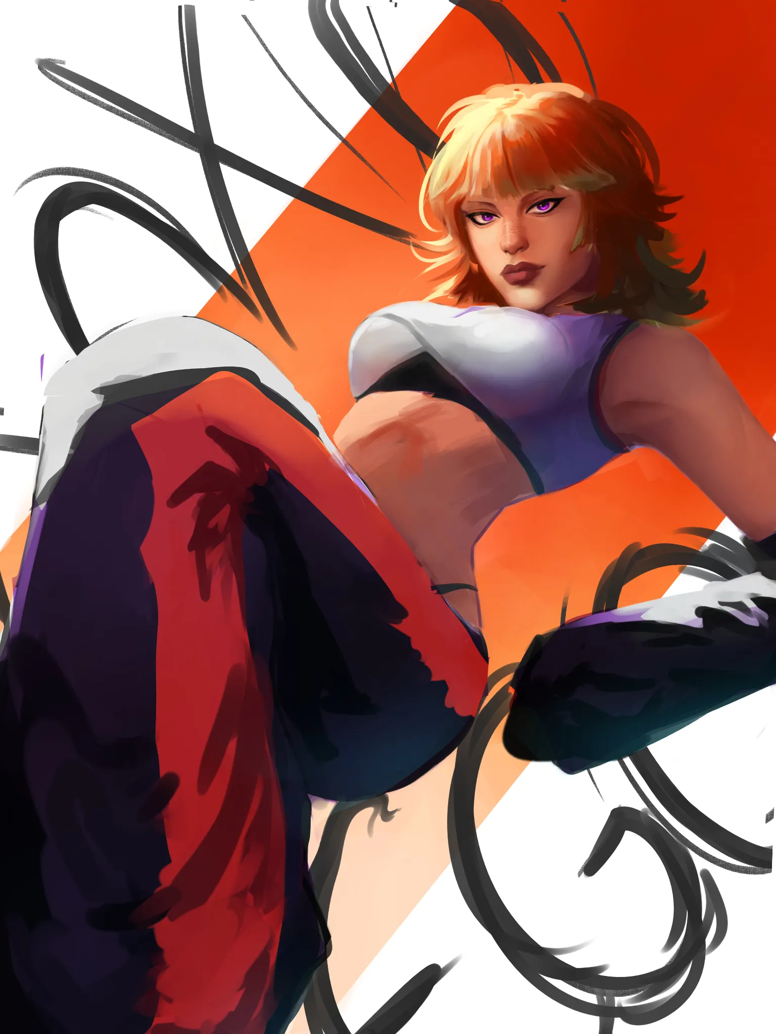
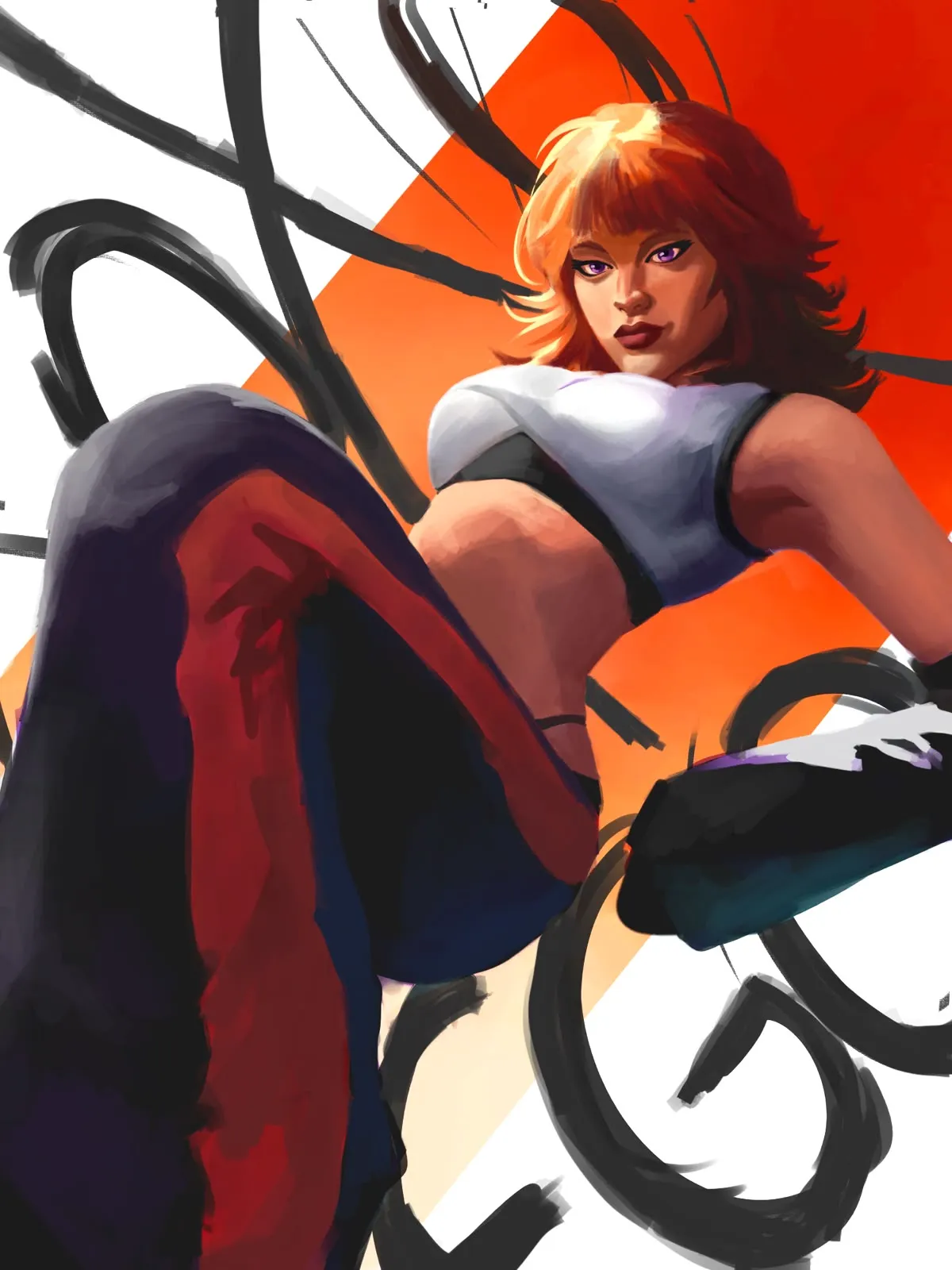
Hello there Mika, I checked out your work and it's lovely, keep doing more you are doing great. So the main thing I've changed here is the brushwork, You want to make sure you get good transitions on your forms and the brushstroke follows the contours. About the Focal point that you asked, I'll tell you, the word 'contrast' is the single most important word there is in art making. That's light contrast, color contrast, size contrast, texture contrast, level of detail contrast, and so on, any type of contrast can help you make the viewer look were you want. You need to nail down the amount of contrast (usually we think of light and dark contrast only but keep in mind there are other types) here I went with the ol' reliable light and dark contrast though, made stronger shadows on the face, a better read on the forms et voilà. With the text I just followed the "make it look cooler" rule but there might be better solutions to that. Color scheme looks alright to me. For the muddy shadows you just need to darken the color by adding saturation and lowering brightness a bit, not just lowering the brightness, cause it tends to gray out the color relationships (this is a type of contrast too btw). Most other changes I made are quite self explanatory but I need to say one last thing, and it's that I absolutely love the pose and angle, you really got that working quite nicely. Hope this was helpful, keep it up.
Anstriche (1)
EGO
Künstlernotiz:
Stuck on the readability of the face and adjusting the values in a way that suggest it's the focal point. The color of the skin in shadow appears muddy and I'm unsure of the overall color harmony/correct palette, as well as picking out the right color/value for painting in the shadow on the top and folds on the pants (and the correct position/form of the folds) Adjusting the value/thickness/position of the text in the background always seems to mess with the readability of the pose and I'm struggling to compose the background in a way that makes the character pop out. Any help greatly appreciated 🙏