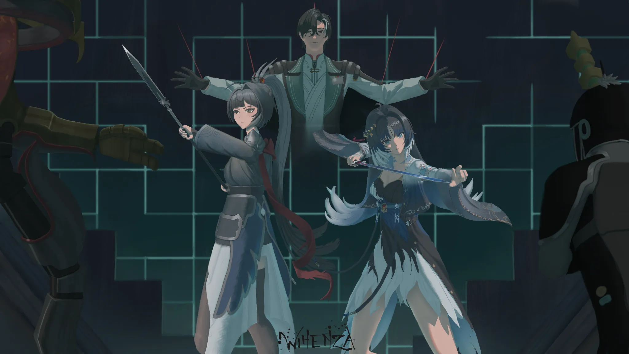
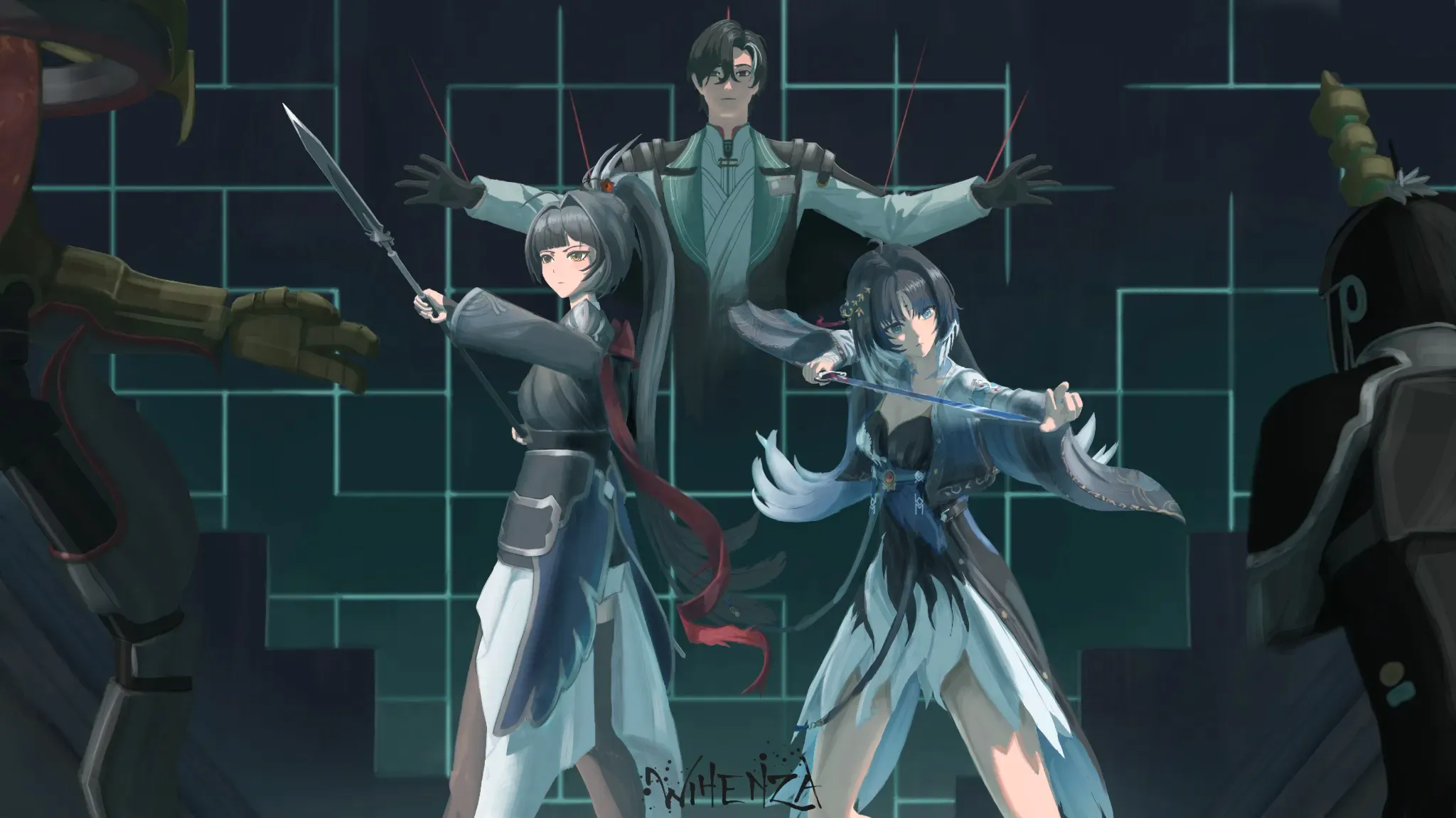
Hi there! This is such an epic setup! I think the characters could be slightly more defined in terms of value with the background and layers. One other thing to consider is that in your scenen, every character is affected by a different lightsource, but the other characters around them, aren't affected by each other's lights, so I don't fully believe they are standing in the same space just yet. (So for example, the light on the left character should also fall onto the character in the right a little bit, and the light shining from above on the middle character should also shine on the top of the 2 characters in front, etc,...). I hope this helps you out! Again, really awesome piece! c:

Thank you so much for taking the time to help me improve and for sharing your perspective! I really appreciate it, and I’m sorry for the trouble. I actually forgot to explain the concept beforehand. The original idea was to create a key visual by combining three different scenes into one composition. Unfortunately, I don’t think my current skills are quite there yet to pull that off convincingly, especially when it comes to making the lighting and space feel cohesive. Also, I just wanted to say that I’m a huge fan of Mr. Antonio and Ms. Hannah! It’s really awesome to be able to receive feedback from you. c:
I think your current level is very close to reaching that goal, so keep it up! And no problem, that's what we built this whole community for (we actually do this for fun, so thank *you*!) ^^