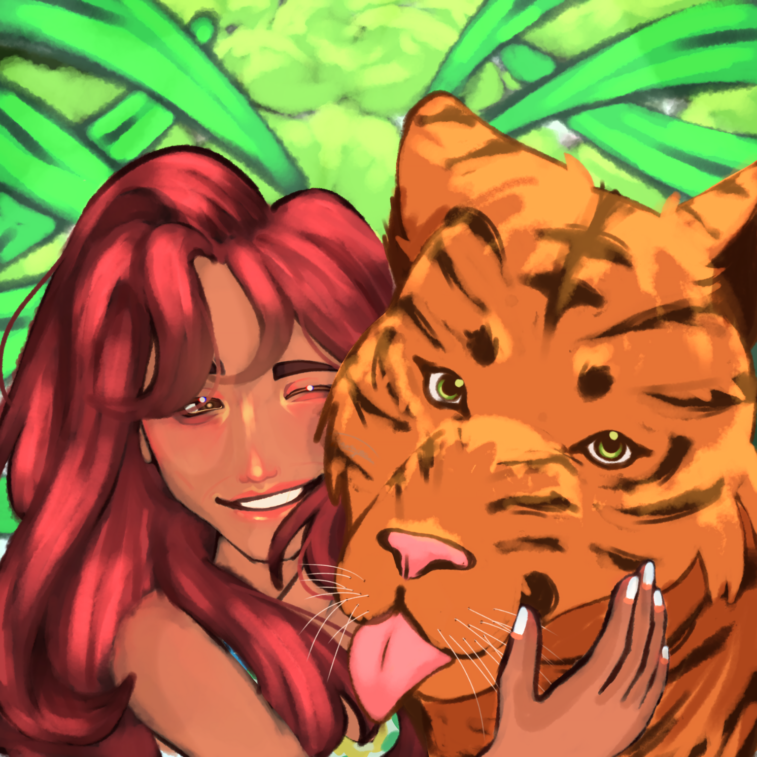
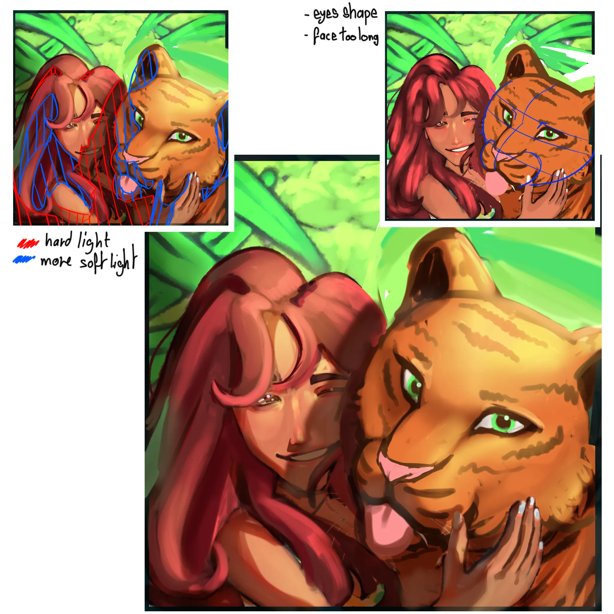
Hiii ! I'm not a pro but I try something, hope this help ! and also, english is not my first language so I might do somes mistakes, if you don't understand, feel free to ask me and I explain it again. So first thing that I saw is the tigger's face that was disproportionate. his whole head is too oval, so I ronded it by shorten his forehead and nose. His eyes were too little and didn't follow the line of his nose, so I sharped them and placed them better. On the top right of my submission, I made a simple line work to show you how it should be in "3D". The person next to him need some rework with the soulder but I m bad with human anatomy so, I couldn't do it sorry. Hope someone will help with it. For your rendering, I put your light en top right as I thought it was and I prononced more the shadows. On top left of my submission, I made some explaination where red line are darker and hard shadows and blue line are more softer shadows with some occlusion on it. (a airbrush with light gray blue work perfectly) Your hair were too bright, we cannot see exatly where the light come from, so I suggest to you to not use highlight everywhere but only to show more some strand of hair. I did not touch the background, I just shadow the left part to balance more your whole drawing. I hope this will help you, I really like your style, you just need to study more pictures. If you need, feel free to ask me everything !
Anstriche (0)
Meow :3
Künstlernotiz:
Something JST feels off please help😭
Kommentare 3
The snout did feel a bit long, and the tongue and nose felt a bit pushed towards the sky. Otherwise I love this drawing! Keep it up
The snout did feel a bit long, and the tongue and nose felt a bit pushed towards the sky. Otherwise I love this drawing! Keep it up